Practice CSS Grid
Six CSS Grid drills, from a three-column layout to a responsive card grid with no media queries and a dashboard with a collapsing sidebar. Each ships with starting code and a solution to check your work against. Run them in any Scrimba editor, free or Pro. Built for developers who know CSS but reach for Flexbox out of habit when a layout needs two dimensions.
Before you start
You should know CSS selectors, the box model, and basic Flexbox already. Keep a scrim open in another tab as scratch paper: the Learn CSS Grid course (opens in a new tab) (Pro, 1.1 hrs, Per Borgen; see our course notes) if you have a subscription, or the free Learn HTML and CSS course (opens in a new tab) if not; any scrim's editor works for these drills. Learn CSS Grid's first three scrims (the intro, "Your first grid", and "Fraction units and repeat", about 11 minutes) open without a subscription; the other 14 do not.
A Scrimba scrim works as a scratchpad: pause, edit the code pane, and run it to see the result. Free courses need no card, and the one-time 20% banner that appears via our links can be dismissed.
Drills
Drill 1: A three-column grid with gaps
Turn this stacked list into three evenly sized columns with a gap.
<div class="cards">
  <div class="card">One</div>
  <div class="card">Two</div>
  <div class="card">Three</div>
</div>
.cards {
  /* add grid rules */
}
What you should see: three even boxes side by side, gaps between them, none at the outer edges.
This drill is ours, not Scrimba's, and the box above only renders CSS. To practise the same properties in a full editor with the course's own challenges, open Learn CSS Grid on Scrimba (opens in a new tab) (Pro course; the free tier includes other CSS courses).

Solution
.cards {
  display: grid;
  grid-template-columns: repeat(3, 1fr);
  gap: 1rem;
}
repeat(3, 1fr) divides the row into three equal fractions; gap spaces the tracks without adding outer margin. The common mistake, 33% 33% 33%, ignores the gap and overflows the container.
Drill 2: A page layout with grid-template-areas
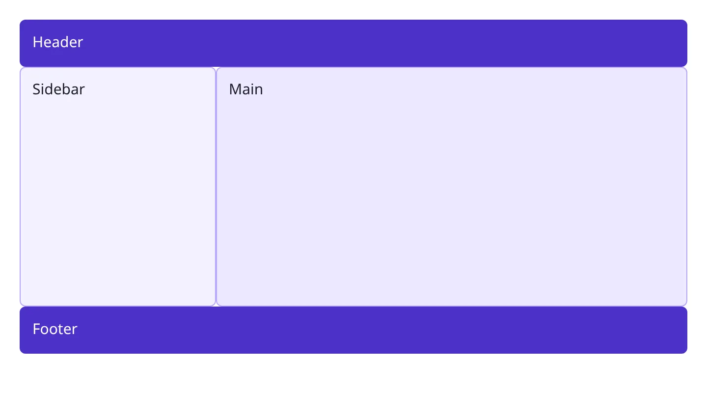
Arrange a header, sidebar, main area, and footer using named areas.
<div class="page">
  <header>Header</header>
  <nav>Sidebar</nav>
  <main>Main</main>
  <footer>Footer</footer>
</div>
.page {
  display: grid;
  min-height: 100vh;
  /* define columns, rows, and areas */
}

header { }
nav { }
main { }
footer { }
What you should see: a header on top, a narrow sidebar on the left, main filling what's left, a full-width footer at the bottom.
This drill is ours, not Scrimba's, and the box above only renders CSS. To practise the same properties in a full editor with the course's own challenges, open Learn CSS Grid on Scrimba (opens in a new tab) (Pro course; the free tier includes other CSS courses).
Solution
.page {
  display: grid;
  min-height: 100vh;
  grid-template-columns: 200px 1fr;
  grid-template-rows: auto 1fr auto;
  grid-template-areas:
    "header header"
    "sidebar main"
    "footer footer";
}

header { grid-area: header; }
nav     { grid-area: sidebar; }
main    { grid-area: main; }
footer  { grid-area: footer; }
Each row is a string; each word names the area filling that cell, and repeating a name merges cells. Elements match by grid-area, not HTML order. A mismatched column count anywhere invalidates the whole declaration.
Drill 3: Spanning rows and columns
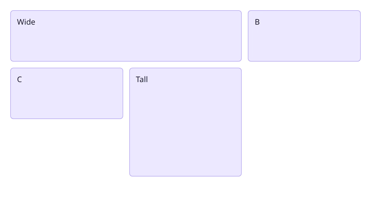
Make the first card span two columns, and the last card span two rows.
<div class="grid">
  <div class="card wide">Wide</div>
  <div class="card">B</div>
  <div class="card">C</div>
  <div class="card tall">Tall</div>
</div>
.grid {
  display: grid;
  grid-template-columns: repeat(3, 1fr);
  grid-auto-rows: 100px;
  gap: 0.75rem;
}
What you should see: "Wide" spanning two of the three columns on row one, "Tall" stretching through two row heights on the right.
This drill is ours, not Scrimba's, and the box above only renders CSS. To practise the same properties in a full editor with the course's own challenges, open Learn CSS Grid on Scrimba (opens in a new tab) (Pro course; the free tier includes other CSS courses).
Solution
.wide {
  grid-column: span 2;
}

.tall {
  grid-row: span 2;
}
span 2 occupies two tracks from wherever auto-placement lands, without naming exact line numbers. People often try grid-column: 2 expecting "two columns wide," but a bare number is a line position, not a count.
Drill 4: An auto-fit, minmax card grid with no media queries
Build a card grid that adds or drops columns as the viewport resizes, no @media rule.
<div class="grid">
  <div class="card">1</div>
  <div class="card">2</div>
  <div class="card">3</div>
  <div class="card">4</div>
  <div class="card">5</div>
</div>
.grid {
  display: grid;
  gap: 1rem;
  /* columns go here */
}
What you should see: cards at least 200px wide, wrapping onto new rows as the window narrows, stretching to fill space on wide screens.
This drill is ours, not Scrimba's, and the box above only renders CSS. To practise the same properties in a full editor with the course's own challenges, open Learn CSS Grid on Scrimba (opens in a new tab) (Pro course; the free tier includes other CSS courses).

Solution
.grid {
  display: grid;
  gap: 1rem;
  grid-template-columns: repeat(auto-fit, minmax(200px, 1fr));
}
auto-fit recalculates how many tracks fit at the current width; minmax(200px, 1fr) sets each track's floor while letting it grow. Swapping in auto-fill is the near-miss: identical with a full row but leaves empty phantom tracks with too few items.
Drill 5: Aligning items inside grid cells
Center a badge inside its cell, then push a button to the right edge of its own cell.
<div class="grid">
  <div class="cell badge">New</div>
  <div class="cell">
    <button class="save">Save</button>
  </div>
</div>
.grid {
  display: grid;
  grid-template-columns: repeat(2, 1fr);
  gap: 1rem;
}

.cell {
  border: 1px solid #ccc;
  min-height: 80px;
}
What you should see: "New" centered inside its box, and "Save" sitting against the right edge of its box rather than stretched across it.
This drill is ours, not Scrimba's, and the box above only renders CSS. To practise the same properties in a full editor with the course's own challenges, open Learn CSS Grid on Scrimba (opens in a new tab) (Pro course; the free tier includes other CSS courses).

Solution
.grid {
  display: grid;
  grid-template-columns: repeat(2, 1fr);
  gap: 1rem;
  place-items: center;
}

.save {
  justify-self: end;
}
place-items: center centers content on both axes for every cell at once; justify-self overrides that on one item. The Flexbox habit is reaching for align-items alone and wondering why content is only centered vertically.
Drill 6: A dashboard with a spanning panel and a collapsing sidebar
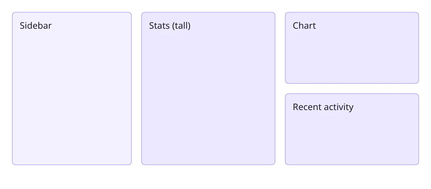
Build a dashboard where the stats panel spans two rows, and the sidebar drops above the content past 700px.
<div class="dashboard">
  <nav class="sidebar">Sidebar</nav>
  <div class="panel stats">Stats (tall)</div>
  <div class="panel">Chart</div>
  <div class="panel">Recent activity</div>
</div>
.dashboard {
  display: grid;
  gap: 1rem;
  /* layout and responsive rules go here */
}
What you should see: a sidebar beside a two-column panel area with stats spanning both rows; under 700px, the sidebar sits above one stacked column.
This drill is ours, not Scrimba's, and the box above only renders CSS. To practise the same properties in a full editor with the course's own challenges, open Learn CSS Grid on Scrimba (opens in a new tab) (Pro course; the free tier includes other CSS courses).
Solution
.dashboard {
  display: grid;
  gap: 1rem;
  grid-template-columns: 200px repeat(2, 1fr);
  grid-template-rows: repeat(2, minmax(120px, auto));
}

.sidebar {
  grid-row: span 2;
}

.stats {
  grid-row: span 2;
}

@media (max-width: 700px) {
  .dashboard {
    grid-template-columns: 1fr;
  }

  .sidebar,
  .stats {
    grid-row: auto;
  }
}
Both .sidebar and .stats get grid-row: span 2 to stretch through two rows. Below 700px, a single column makes "span 2" meaningless, so it resets to auto in the media query. Forgetting that reset is the usual bug: the spans stay active and swallow rows the other panels needed.
Common mistakes
- Percentages instead of
frunits. Percentages ignoregapand overflow the container. - Mismatched
grid-template-areasstrings. Row and column counts must match, or the declaration is dropped. - Confusing
auto-fitandauto-fill.auto-fitcollapses empty tracks;auto-fillkeeps them, leaving gaps. - Leaving spans active after a collapse. A
span 2written for a multi-column layout needs resetting toautoat the single-column breakpoint.
Where to practice next on Scrimba
CSS Grid sits inside the frontend developer path.
| Course | What it drills | Access | Length |
|---|---|---|---|
| Learn CSS Grid | 17 scrims that map onto these drills: grid-template-columns and fr (Drill 1), template areas (Drill 2), span and -1 line numbers (Drill 3), repeat(auto-fit, minmax()) (Drill 4), justify-items and align-items (Drill 5). No graded challenges; Per asks you to pause and change the values. Three scrims free, then Pro; the BBC News clone solo project is Pro | Pro | 1.1 hrs |
| Learn Responsive Web Design | Module 5, CSS Grid (97 min, 19 scrims): one property per scrim, grid-template-areas redrawn inside a media query, and repeat(auto-fill, minmax(200px, 1fr)) with no media query at all. Four sample scrims free, the other 170 Pro | Pro | 15.1 hrs |
| Learn HTML and CSS | The box model, classes, margins and padding, and flexbox, taught inside a Google clone, a business card and a birthday site. No grid. All six modules free; Pro gates three Solo Projects | Free | 5.7 hrs |
| Intro to UI Design Fundamentals | White space, alignment, contrast and scale on cards, a hero and a dashboard fragment; the final challenge is nine lines of CSS starting with grid-gap: 2em. All 20 scrims and five challenges free | Free | 1.2 hrs |
Related practice guides
- Practice CSS Flexbox: pair with Grid for one-dimensional alignment.
- Practice Tailwind CSS: the same concepts as utility classes.
- Practice Coding on Scrimba: the full index of drill pages.
Not strictly, but it helps. Grid handles two dimensions at once; Flexbox handles one. Most layouts use both: Grid for structure, Flexbox for aligning items inside a cell.
Usually a mismatch between the area names in each row string and the columns in grid-template-columns. Every row needs as many names as columns, or the browser ignores the property.
Yes. Tailwind's grid classes wrap the same CSS Grid properties, so the underlying model makes the utility classes click, and it is the only option for custom areas Tailwind has no class for.
Most people who know CSS layout basics get functional with Grid in a few focused hours, enough to build layouts like the ones above.
Practice Grid inside a real course
Start in the free HTML and CSS course, no card required. Learn CSS Grid itself is a Pro course.