Learn CSS Grid
Per Borgen's Learn CSS Grid is an hour-long, 17-scrim Pro course that takes you from display: grid to a 12-column page layout, a responsive image grid, and named grid lines, ending in a BBC News clone solo project. It teaches grid well for its length, but the framing around it is dated.
Reviewed inside the course with a Pro account, September 2026: all 17 scrims and their transcripts.
Quick answer
Take it if you know basic CSS and want grid to click in an evening. It runs as a five-scrim layout section, a three-scrim responsive section, five bonus scrims and a wrap-up with the Pro solo project; the first three scrims are free samples. It is not a full CSS education and does not pretend to be.
Learn CSS Grid
ProTaught by Per Borgen (opens in a new tab)
One hour on CSS Grid, taught by building a 12-column page layout and a responsive image grid, ending in a BBC News clone solo project.
View on Scrimba (opens in a new tab)Is it worth your time?
Grid is the CSS feature the scrim format was made for. You change grid-template-columns from 100px auto 100px to repeat(12, 1fr) and the preview on the right reflows before Per has finished the sentence. By the end of the fourth scrim you have a header, sidebar, content area, and footer sitting on a 12-column grid. You also understand why grid-column: 1 / -1 is the trick that survives you changing the column count later. That is a lot of working knowledge for 23 minutes of video.
The caveat is age. This is one of Scrimba's oldest courses and it shows. The intro compares grid to Bootstrap 3.3.7 (with jQuery loaded in the head), and Per says browser support "is climbing quickly" as if that were still in question. Every lesson uses grid-gap rather than the gap shorthand browsers have accepted for years.
None of that makes the teaching wrong, because grid itself has barely moved. grid-gap still works, and everything Per shows you still renders. But subgrid, container queries, and aspect-ratio are nowhere in sight, and there is no Pro-era polish such as AI-checked challenges.
The other thing to know before you pay: the course page still says "For free, of course" in its About text and "14 interactive screencasts" in its description. Both are leftovers. The header says Pro, the structured data says it is not free and counts 20 lessons, and I count 17 timed scrims. Three of them (the intro, "Your first grid", and "Fraction units and repeat") are marked SAMPLE and open without a subscription, so you can try 11 minutes of it before deciding.
What you'll learn
Course curriculum
4 sections (my grouping, from Per's own section transitions) · 17 scrims plus the certificate
- Section 1: Your first grids and a website layout
- Section 2: Responsive grids and the image grid
- Bonus: Named lines, alignment, and grid with flexbox
- Wrap-up and Solo Project: BBC News Clone
Scrimba renders this course as one flat list of 18 items with no module headers, so the four sections above are mine. Per says "you have finished the first section" at the end of "Template areas", opens "Auto-fit and minmax" with "welcome to the second section", and calls "Named Lines" a "bonus screencast". The 17 scrims are the timed items I counted in the table of contents in September 2026; the 18th is an untimed "How to Utilize Your Certificate" clip. Scrimba's structured data says 20 lessons, and other pages on this site that quote 20 are using Scrimba's number.
Inside the course, section by section
1. Your first grids and a website layout (23 min, 5 scrims)
The intro (4:44) is half sales pitch, half demo. Per opens with why grid beats a framework, comparing the same header-menu-content-footer mockup written in Bootstrap and in grid: "gone are all the unnecessary row items and the ugly class names." The point he lands is source order. A media query moves the grid menu to the top row, while the Bootstrap version needs its markup cut and pasted.
He also tells you, in the first minute, to edit the CSS in the running scrim "so that you make sure that you properly understand what we're going through". That instruction comes back at the end of each first-section lesson. It is the only kind of challenge the course has.
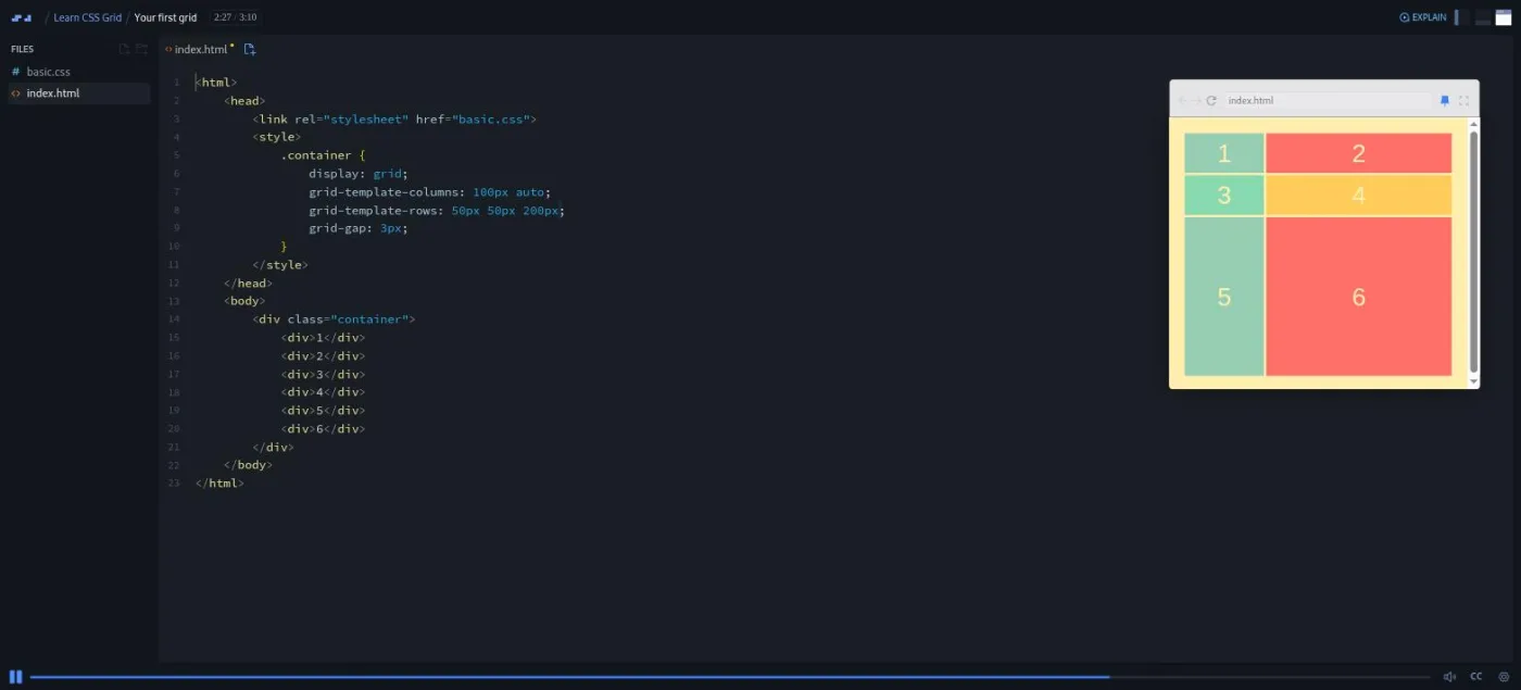
"Your first grid" (3:10) is six numbered divs. You add display: grid, then grid-template-columns: 100px auto 100px, then grid-template-rows: 50px 50px, then grid-gap: 3px. Per then flips it to two columns and three rows to make the point stick: "in the grid template columns property, you define the width of the columns. And in the grid template rows, you define the height of the rows."
"Fraction units and repeat" (3:38) moves the CSS out of the HTML into index.css and replaces the pixel values with fr. The fr unit is a fraction of the free space in the container. Three 1fr columns share the width equally; change the middle one to 2fr and the grid "has split the entire width into four fraction units", so the middle column is always twice as wide. repeat(3, 1fr) follows, then the grid-template shorthand with rows before columns. Per remembers the order by "drawing an L": down the rows first, then right across the columns.
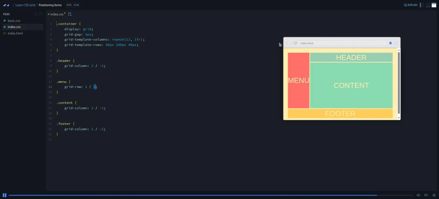
"Positioning items" (6:36) is the longest scrim in the first section and where the real layout work happens. Per builds the website mockup on three rows (40px 200px 40px) and makes the header span two columns with grid-column: 1 / 3. Those numbers are grid line numbers, not column numbers: line 1 is the left edge, line 3 is the right edge of the second column. He then rewrites it as span 2, and then as -1, which means "the last line" whatever the count.
The payoff comes when he switches to repeat(12, 1fr). The -1 versions keep working while the hard-coded ones break. He finishes with grid-row: 1 / 3 to pull the menu up beside the header, and sets homework: "try to make the menu span all the way to the bottom. Or alternatively, make it appear on the right hand side."
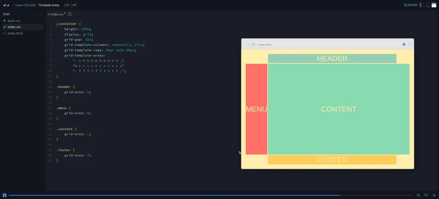
"Template areas" (4:48) closes the section with grid-template-areas, a property that lets you draw the layout as strings of letters. The header row is twelve hs, the middle row is one m and eleven cs, and the footer is twelve fs. Per's argument for it is prototyping speed: "just as easy as that, we have changed layout without having to fiddle around with the values in the item classes." He also breaks it on purpose, making a non-rectangular area to show that "you have to use rectangles".
After these five scrims you can build a fixed page layout three ways: with line numbers, with spans, and with template areas. You cannot yet make it respond to the window size. That is section two.
2. Responsive grids and the image grid (12 min, 3 scrims)
"Auto-fit and minmax" (3:44) starts from six fixed 100px columns and works toward repeat(auto-fit, minmax(100px, 1fr)). Per shows the failure modes in order. auto-fit with 100px columns leaves a gap on the right. auto-fit with 1fr collapses to one column. Only minmax gives you columns that "will always be at least a hundred pixels. But if there's more available space, it'll simply distribute that equally across all the columns."
"Implicit rows" (1:55) narrows that grid until items spill past the two rows you defined. Grid creates extra rows for the overflow (the implicit rows), but they are "only as tall as the content inside of them force them to be". grid-auto-rows: 100px fixes that, and at that point the explicit row definition can go entirely.
"An awesome image grid" (6:45) is the payoff. The starter has 18 photos in a grid with grid-auto-rows: 75px, and the lesson is about making some of them span: grid-column: span 2 for the wide ones, grid-row: span 2 for the tall ones, both for the three "big" ones. That leaves holes. Per walks through why grid's auto-placement algorithm (the rules it uses to slot items you have not positioned) skips cells, then shows grid-auto-flow: dense, which lets later items backfill the gaps.
His summary is the reason to learn grid at all: "we simply use markup for what it's supposed to be used for, markup for content, and we're using the CSS for what it's supposed to be used for, styling." I did not screenshot this lesson because the grid is made of stock photographs.
3. Bonus: named lines, alignment, and grid with flexbox (18 min, 5 scrims)
"Named Lines" (5:25) rebuilds the website layout on a two-column grid and names the lines with square brackets: [main-start] 1fr [content-start] 5fr [content-end main-end]. Naming a pair of lines -start and -end lets you write grid-column: content instead of numbers. Once the row lines are named the same way, a single grid-area: content places the item. Per also shows what happens when an area is not boxed in on all four sides: "it breaks the entire layout."
Two short scrims cover alignment, which in grid means where items sit inside cells and where the whole grid sits inside its container. "justify-content and align-content" (2:49) puts a black border around a container much bigger than its items and walks through start, end, center, space-between, space-evenly, and space-around. The useful bit is his explanation of why space-around leaves only a half-size gap at the edges.
"justify-items and align-items" (3:13) goes back to the 12-column website layout. The default is stretch; Per centers everything until each item is "a tiny rectangle in the center of the grid cells", then targets one item with justify-self and align-self. He admits he has "no idea why you'd wanna create a website layout like this". The scrim is about the properties, not the design.
"Auto-fit vs. auto-fill" (2:00) is the clearest explanation of that distinction I have seen in a beginner course. Both add column tracks when there is spare width. But "auto fit actually collapse those new columns to zero pixels in width", so your four items stretch to fill, while auto-fill leaves the empty tracks standing.
"Grid vs. Flexbox" (5:02) is the scrim to send to anyone who asks which to learn. Per's rule: "if you're going to create layout which has a direction, either row or column, then use flexbox," and grid for anything with rows and columns. He then drops a flexbox nav inside the grid header, with margin-left: auto on the logout link, and calls that "the best of both worlds". Flexbox is not taught here; the lesson assumes you have it, which is why Learn Flexbox is the natural companion.
4. Wrap-up and Solo Project: BBC News Clone (10 min, 4 scrims)

A slide-based "Why are Solo Projects important?" clip (2:31) leads into the Solo Project (3:10). It is the only Pro-gated lesson and the only scrim with a title card. The starter files are an index.html with one featured article (a "LIVE" headline and a large hospital photo), a "Who are the royal family?" bullet, and five regular articles with images. The index.css already handles fonts, colors, and the small clock icon.
What is missing is any grid at all: <main class="grid"> has no rule. The target design in the slides puts the featured story and its photo across most of the top row, one smaller story beside it, the bullet underneath, and four stories across the bottom. Your job is the layout. There is no walkthrough.
The course then closes with a "Congrats" scrim (2:12), a slide deck starting on "You rock!", and a Scrimbassador clip (1:59). In the latter Per pitches Scrimba's referral program: a revenue share on the first year of each referral, a Discord channel, and occasional early course access. Neither teaches any grid. After that come the certificate and a short clip on using it.
One thing I could not find: the About text promises "article layouts with CSS Grid" in the bonus section. There is no article-layout lesson in the current table of contents. The article grid is the solo project, and you build it yourself.
What a lesson feels like
Scrims run from two to under seven minutes. The layout is Per's editor on the left and a live preview on the right. He types, the preview updates, and he narrates in the present tense ("boom, there the menu item jumped up to the top row").
None of the 17 scrims has a numbered-comment challenge brief, and I saw no Challenge with Instant Feedback markers in the table of contents. Instead, the first-section scrims end with an instruction to pause and edit: change the values, move the menu, add a row. The later scrims mostly stop asking (the alignment scrim ends with "feel free to play around with this yourself"), but the same move works in every one of them. If you do not do it, the course is a one-hour video. If you do, it is closer to three.
Every coding scrim has captions, a timestamped transcript under the settings menu, and subtitles in ten languages. Three slide-based clips at the end (the solo project pitch, the project brief, and the Congrats slides) did not load a transcript panel for me; the Scrimbassador clip did. Per's delivery is quick and a little clipped, with the occasional transcript casualty ("previous screen cost" for "screencast").
He does not write bugs on purpose the way he does in Learn JavaScript. He does break layouts deliberately, though: a non-rectangular template area, an unboxed named area. You see what the error looks like before you make it yourself.
Free or Pro: exactly what is gated
The course is listed as Pro, and the JSON-LD on its page says it is not accessible for free. Three scrims carry a SAMPLE badge and open without a subscription: "Intro to the CSS Grid course", "Your first grid", and "Fraction units and repeat", about 11 minutes in total. The remaining 14 scrims, from "Positioning items" onward, need Pro.
Within the Pro course, the one item Scrimba labels separately is "Solo Project (PRO) - BBC News Clone": starter files, a design in the slides, no solution. Pro also unlocks the certificate and the two career paths this course sits in. Scrimba's Discord server is open on the free plan (the pricing page lists basic Discord access as free); Pro adds the Pro-only channels. See current plans (opens in a new tab) for what Pro costs in your region.
My read: do the three free scrims first. If the format works for you and you are going to take other Pro courses anyway, this hour is an easy add. Paying for Pro to get this course alone would be hard to justify. The free Learn HTML and CSS covers the basics, and Learn Responsive Web Design includes grid inside a much longer course.
How long it takes
The 63 minutes is video runtime. Because the exercises are "pause and change the values" rather than graded challenges, the multiplier depends on you. Watching straight through with a few edits takes about 90 minutes.
Doing what Per asks at the end of the early scrims, and the equivalent in the later ones, brings it to two to three hours over two or three sittings. Those exercises include rebuilding the menu on the right, spanning the big images, and renaming the lines. The BBC News clone is the real test. It will take most people another one to two hours from the starter files, longer if you want it to match the design closely.
Who it's for, and who should skip it
It fits developers who already write CSS and want grid to make sense fast: people who have copied grid-template-columns from Stack Overflow without knowing why 1 / -1 works. It also fits anyone on the Frontend Developer Path who wants a short, low-stakes course between the bigger ones.
Skip it, for now, if your CSS basics are shaky. It assumes you know selectors, classes, the box model, and what a media query is; do Learn HTML and CSS first. Skip it if you want the current edge of CSS layout, because subgrid, container queries, and the gap shorthand are not here. And if you already use grid daily, the only new thing may be the auto-fit vs. auto-fill explanation, which you can watch in two minutes.
Prerequisites
Basic HTML and CSS: selectors, classes, the box model, and simple media queries. Flexbox helps for the last bonus scrim, where Per drops a flex container inside a grid cell, but he does not stop to explain it. No JavaScript is used anywhere in the course.
Where it fits
This is a short skill course inside the Frontend Developer Path and the Fullstack Developer Path. Its pair is Learn Flexbox: grid for two-dimensional layout, flexbox for one direction, and the "Grid vs. Flexbox" scrim is where Per draws the line. If you take Learn Responsive Web Design, you will meet grid again in a broader context. This course works either as a warm-up for it or as a quick refresher after it.
Strengths and limits
What it does well: it teaches grid by building layouts rather than listing properties. The 12-column layout and the -1 line trick arrive by lesson four. The image grid lesson explains auto-placement and dense better than most written references, and the auto-fit vs. auto-fill scrim settles a question people argue about in two minutes.
Where it is limited: it is old, and the Bootstrap 3 comparison, the grid-gap property, and the browser-support line make that visible. There are no graded or AI-checked challenges, only "pause and try". The promised article-layout lesson is not in the table of contents. And the one project with a spec, the BBC News clone, is Pro-only with no solution walkthrough.
Related courses and comparisons
- All Scrimba CSS courses, the full CSS category hub
- Learn Flexbox, the companion one-dimensional layout course
- Learn Responsive Web Design, which covers grid inside a deeper course
- Learn HTML and CSS, the free foundation to do first
- CSS Challenges, to practise what you learn
- Practice CSS Grid, our own drills on the same properties
No. It is a Pro course, and the structured data on its page says it is not accessible for free, although the About text still says 'for free' from an earlier version. Three scrims are free samples: the intro, 'Your first grid', and 'Fraction units and repeat', about 11 minutes together.
Per Borgen, Scrimba's co-founder, teaches every scrim. The teacher card on the course page and the transcripts both confirm it.
A header, menu, content, footer website layout on a 12-column grid (rebuilt three ways: line numbers, template areas, named lines), a responsive image grid of 18 photos with spanning and dense packing, and, as the Pro solo project, a BBC News article grid from starter HTML and CSS.
Not in the graded sense. I saw no AI-checked challenge markers in the table of contents and no numbered-comment briefs in any of the 17 scrims. The first-section scrims end with Per asking you to pause and change the values yourself, and the solo project gives you starter files and a design with no solution.
63 minutes of video. Plan for two to three hours if you stop and edit the code in each scrim, plus one to two more for the BBC News clone.
Yes. Every coding scrim has captions, a timestamped transcript panel under the settings menu, and subtitles in ten languages. The three slide-based clips at the end (solo project pitch, project brief, Congrats) did not show a transcript panel when I opened them.
The grid techniques still work, but the course is old: it compares grid to Bootstrap 3, uses grid-gap rather than gap, and does not cover subgrid or container queries. The core of grid has not changed, so the teaching holds up; the framing around it has aged.
No. Everything runs in the browser inside the scrim. The lessons use plain HTML and CSS files with no dependencies beyond the Bootstrap and jQuery CDN links in the intro comparison.
Either order works, and Per's own 'Grid vs. Flexbox' scrim assumes you know flexbox already: flexbox for one direction, grid for rows and columns. Learn Flexbox is the natural companion course.
For day-to-day layout work, yes. By the fourth scrim you have a 12-column page layout, and the bonus section covers named lines and alignment. Advanced features such as subgrid are not here.