Practice CSS Flexbox
Six flexbox drills you can run in the browser, each with starting code and a solution to check after. They go from centering a box to a navbar and a card row that stays equal-height with a footer pinned to the bottom, for anyone whose layouts "mostly work" until align-items exposes a gap.
Before you start
You need basic CSS selectors and the box model; flexbox itself is what these drills teach. Open the Learn Flexbox course or the free Learn HTML and CSS course (opens in a new tab) in a second tab as scratch paper: pause, edit the code pane, hit run. Free courses need no card, and the one-time 20% banner can be dismissed. Learn Flexbox is Pro, but its first four scrims (your first layout, main and cross axis, justify-content, and the positioning-items challenge) are free samples, which cover the axis model and justify-content; align-items, which Drills 1 and 2 also need, is in the Pro section.
Drills
Drill 1: Center a single box
Center the .box both horizontally and vertically inside its parent, without using margins.
<div class="container">
  <div class="box"></div>
</div>
.container {
  height: 300px;
  border: 1px solid #ccc;
}

.box {
  width: 80px;
  height: 80px;
  background: coral;
}
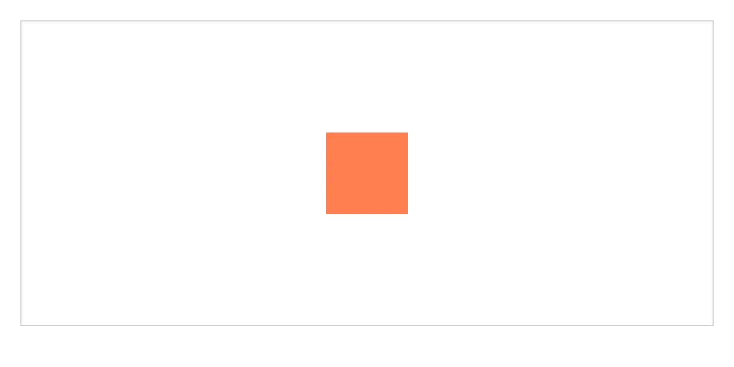
What you should see: the coral box centered both across and down.
This drill is ours, not Scrimba's, and the box above only renders CSS. To practise the same properties in a full editor with the course's own challenges, open Learn Flexbox on Scrimba (opens in a new tab) (Pro course; the free tier includes other CSS courses).
Solution
.container {
  height: 300px;
  border: 1px solid #ccc;
  display: flex;
  justify-content: center;
  align-items: center;
}
display: flex turns on both alignment axes: justify-content for the main axis, align-items for the cross axis. The common mistake is text-align: center, which only centers inline content, not a block-level child like .box.
Drill 2: Justify-content vs align-items
Arrange three .item boxes at opposite ends and the middle of the row, vertically centered.
<div class="row">
  <div class="item"></div>
  <div class="item"></div>
  <div class="item"></div>
</div>
.row {
  display: flex;
  height: 150px;
  border: 1px solid #ccc;
}

.item {
  width: 60px;
  height: 60px;
  background: steelblue;
}
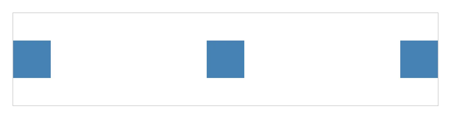
What you should see: the first item at the left edge, the last at the right edge, the middle one between them, all three vertically aligned.
This drill is ours, not Scrimba's, and the box above only renders CSS. To practise the same properties in a full editor with the course's own challenges, open Learn Flexbox on Scrimba (opens in a new tab) (Pro course; the free tier includes other CSS courses).
Solution
.row {
  display: flex;
  height: 150px;
  border: 1px solid #ccc;
  justify-content: space-between;
  align-items: center;
}
justify-content: space-between spreads items along the main axis, pushing first and last to the edges. align-items: center centers every item on the cross axis: "along the row" versus "across the row."
Drill 3: flex-grow, flex-shrink, and flex-basis
Make the middle .panel take twice the leftover space of the side panels, starting from an equal 100px basis.
<div class="panels">
  <div class="panel">Left</div>
  <div class="panel middle">Middle (grows 2x)</div>
  <div class="panel">Right</div>
</div>
.panels {
  display: flex;
  width: 600px;
  border: 1px solid #ccc;
}

.panel {
  flex-basis: 100px;
  background: #eee;
  border: 1px solid #999;
}

.panel.middle {
  background: #ccc;
}
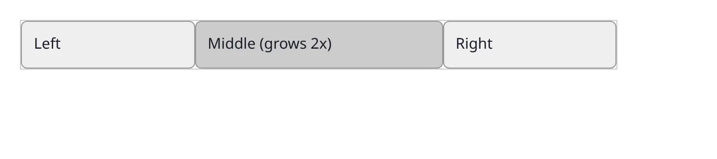
What you should see: three panels filling 600px, the middle one visibly wider.
This drill is ours, not Scrimba's, and the box above only renders CSS. To practise the same properties in a full editor with the course's own challenges, open Learn Flexbox on Scrimba (opens in a new tab) (Pro course; the free tier includes other CSS courses).
Solution
.panel {
  flex: 1 1 100px;
}

.panel.middle {
  flex: 2 1 100px;
}
flex shorthand is flex-grow flex-shrink flex-basis. Grow divides leftover space by ratio (2 against 1 here), shrink controls compression, basis sets starting size. A frequent error: setting only flex-grow, forgetting items can overflow narrow screens without a shrink value.
Drill 4: flex-wrap with gap
These six .tile elements are stuck on one line, overflowing. Make them wrap onto multiple rows with consistent spacing using gap.
<div class="grid">
  <div class="tile"></div>
  <div class="tile"></div>
  <div class="tile"></div>
  <div class="tile"></div>
  <div class="tile"></div>
  <div class="tile"></div>
</div>
.grid {
  display: flex;
  width: 400px;
  border: 1px solid #ccc;
}

.tile {
  width: 120px;
  height: 80px;
  background: seagreen;
}
What you should see: two rows of three tiles, an even gap between every tile, no overflow.
This drill is ours, not Scrimba's, and the box above only renders CSS. To practise the same properties in a full editor with the course's own challenges, open Learn Flexbox on Scrimba (opens in a new tab) (Pro course; the free tier includes other CSS courses).

Solution
.grid {
  display: flex;
  width: 400px;
  border: 1px solid #ccc;
  flex-wrap: wrap;
  gap: 12px;
}
flex-wrap: wrap lets items that no longer fit drop to a new line instead of overflowing. gap spaces items on both axes without the margin-collapsing quirks of margin-right on every tile but the last. Forgetting flex-wrap is the top reason a "responsive" layout still overflows on mobile.
Drill 5: order and a navbar layout
Rebuild this navbar so the logo stays left, the links sit centered, and "Sign up" moves right, without changing the HTML order.
<nav class="navbar">
  <button class="signup">Sign up</button>
  <div class="logo">Brand</div>
  <ul class="links">
    <li>Home</li>
    <li>Docs</li>
    <li>Pricing</li>
  </ul>
</nav>
.navbar {
  display: flex;
  padding: 16px;
  border-bottom: 1px solid #ccc;
}
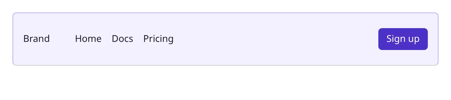
What you should see: logo, then links, then sign-up button, left to right, despite "Sign up" being first in the markup.
This drill is ours, not Scrimba's, and the box above only renders CSS. To practise the same properties in a full editor with the course's own challenges, open Learn Flexbox on Scrimba (opens in a new tab) (Pro course; the free tier includes other CSS courses).
Solution
.navbar {
  display: flex;
  align-items: center;
  padding: 16px;
  border-bottom: 1px solid #ccc;
}

.logo { order: 1; }
.links { order: 2; display: flex; gap: 16px; list-style: none; }
.signup { order: 3; margin-left: auto; }
order reflows the visual position of flex items independently of DOM position, exactly what this navbar needs. margin-left: auto on the last item pushes everything after it to the far edge. The trap: order changes appearance only, so tab order still follows the HTML.
Drill 6: A holy-grail card row with a sticky footer
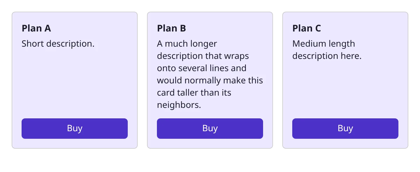
Build three cards that stay the same height regardless of content length, with each "Buy" button pinned to the bottom.
<div class="cards">
  <div class="card">
    <h3>Plan A</h3>
    <p>Short description.</p>
    <button>Buy</button>
  </div>
  <div class="card">
    <h3>Plan B</h3>
    <p>A much longer description that wraps onto several lines and would normally make this card taller than its neighbors.</p>
    <button>Buy</button>
  </div>
  <div class="card">
    <h3>Plan C</h3>
    <p>Medium length description here.</p>
    <button>Buy</button>
  </div>
</div>
.cards {
  display: flex;
  gap: 16px;
}

.card {
  border: 1px solid #ccc;
  padding: 16px;
}
What you should see: three cards of identical height, each "Buy" button flush with the bottom edge regardless of description length.
This drill is ours, not Scrimba's, and the box above only renders CSS. To practise the same properties in a full editor with the course's own challenges, open Learn Flexbox on Scrimba (opens in a new tab) (Pro course; the free tier includes other CSS courses).
Solution
.cards {
  display: flex;
  gap: 16px;
  align-items: stretch;
}

.card {
  border: 1px solid #ccc;
  padding: 16px;
  flex: 1;
  display: flex;
  flex-direction: column;
}

.card button {
  margin-top: auto;
}
Equal-height columns come free with flexbox: stretch is the default cross-axis behavior, so direct flex children match the tallest. The sticky-footer button is what people miss: make .card a column flex container, then margin-top: auto on the button pushes it down, the same trick as margin-left: auto on the navbar button. Without flex-direction: column, that margin has no space to consume.
Common mistakes
- Centering with
text-aligninstead ofjustify-content/align-items. Text alignment only affects inline content. - Confusing the main and cross axis. They swap under
flex-direction: column. - Using margins where
gapwould do the job. Margins on every item but the last break when items change. - Setting
flex-growwithoutflex-basis. Items grow from an inconsistent content-based width. - Forgetting
flex-wrapon responsive layouts. Without it, items shrink past readability or overflow.
Where to practice next on Scrimba
Flexbox is core to the frontend developer path. Four courses build on what you just drilled:
| Course | What it drills | Access | Length |
|---|---|---|---|
| Learn HTML and CSS | Flexbox arrives when two block-level buttons in the Google clone refuse to sit side by side, then returns in the business card (justify-content, centering the card) and the birthday site header (align-items, flex-direction). All six modules free; Pro gates three Solo Projects | Free | 5.7 hrs |
| Flexbox Tutorial | 15 scrims by Per Borgen. The 8:38 lesson on flex-grow, flex-shrink and flex-basis is Drill 3; order is Drill 5; the bonus responsive navbar is about 20 lines of CSS. Six marked challenges, checked by comparing your preview with his. Four scrims free, 11 Pro | Pro | 53 min |
| Responsive Web Design | Module 4, Taking flexbox to the next level (78 min, 17 scrims): one property per scrim, then a card that goes from stacked to side by side above 600px with one flex-basis. Four sample scrims free, the rest Pro | Pro | 15.1 hrs |
| CSS Challenges | Brief-then-solution pairs from Treasure Porth: a GitHub profile card, a pure-CSS toggle, playing cards, an Instagram stories row. The France flag is built twice, once with flex-grow: 1 and once with grid. First 11 scrims (five complete challenges) free, the other 43 Pro | Pro | 2.6 hrs |
Related practice guides
- Practice CSS Grid, for two-dimensional layouts
- Practice Tailwind CSS, the same flex properties as utility classes
- All practice guides
justify-content aligns items along the main axis (horizontal by default). align-items aligns them along the cross axis. flex-direction: column swaps the two.
Flexbox suits one-dimensional layouts like a navbar. Grid suits two-dimensional layouts where you control rows and columns at once, like a dashboard.
flex-grow distributes leftover space after items lay out at their flex-basis. With no extra space, there is nothing to grow into.
Set flex-shrink: 0 on the item. Every flex item defaults to flex-shrink: 1, which compresses it below content size.
Learn HTML and CSS, which covers flexbox fundamentals inside real project builds, is free. The dedicated Flexbox Tutorial and Responsive Web Design courses require Pro.
Open a flexbox scrim now
Start free with Learn HTML and CSS; add Pro for the dedicated flexbox and responsive courses.