Learn Responsive Web Design
Kevin Powell teaches Scrimba's biggest CSS course: about 15 hours across six modules, building four sites from a phone-width layout up to desktop, ending with a three-page company site that has a slide-out mobile menu. It is the strongest bridge from knowing some CSS to controlling layout on purpose, once you accept that a few details show their age.
Reviewed inside the course with a Pro account, September 2026: all six modules opened, transcripts read for 62 of the 174 scrims.
Quick answer
It fits developers who already write CSS but still cannot predict what it will do, since Kevin builds a layout, hits a problem on screen, and then teaches the property that fixes it. The catch: it is Pro-only apart from a handful of samples, and a few details (Adobe XD design files, a Chrome bug workaround, one stale promo) date the recording. Finish it and Learn Tailwind CSS is the natural next stop, since Tailwind's utilities map onto exactly what you learn here.
Learn Responsive Web Design
ProTaught by Kevin Powell (opens in a new tab)
Kevin Powell's 15-hour CSS course: units, flexbox, grid, media queries and mobile-first layout, taught by building four sites.
View on Scrimba (opens in a new tab)Is it worth your time?
Yes, if you have written CSS before and still cannot predict what it will do. That is the exact gap this course fills. Kevin does not teach properties in isolation; he builds a layout, hits a problem on screen, and then introduces the property that fixes it. Collapsing margins arrive because a heading moves its whole card down. box-sizing: border-box arrives in module 3 because a page grows a scrollbar it should not have. He says so himself in that lesson: he held it back "until you run into a situation where it actually becomes useful."
The other reason to take it is the mobile-first habit. Module 2 spends a lesson deleting a desktop-first media query and rebuilding the same layout from the phone up, and from then on every project starts small and adds columns with min-width queries. If you have only ever shrunk desktop layouts down, this is the module that rewires you.
Two caveats before you commit. It is long: 15 hours of video is closer to 40 hours of work if you do the challenges, and Kevin asks you to take a break after every module. And it was recorded a while ago. Design files are Adobe XD links, one lesson patches a Chrome bug that may no longer exist, and the class-naming lesson ends with a pre-launch "sign up for updates" pitch that nobody removed. None of that changes the CSS, which still holds up.
What you'll learn
Course curriculum
6 modules · 174 lessons
- CSS Fundamentals
- Starting to think responsively
- Stepping up our style
- Taking flexbox to the next level
- CSS Grid: The ultimate layout tool
- Taking it to the next level
Lesson counts are the scrims I counted after expanding each module in September 2026; with the "How to Utilize Your Certificate" scrim at the end they come to 175, which matches the figure in Scrimba's structured data, while the module headers on the course page show smaller numbers (16, 42, 35, 12, 10, 11) because they leave out intro and wrap-up scrims.
Inside the course, module by module
1. CSS Fundamentals (2.9 hrs, 25 scrims)
The first four scrims are free samples. The welcome explains the deal: "It's about doing not just the theory," and Kevin warns that "a whole bunch of times" he will stop and ask you to try something before he does it. The second scrim is a one-minute note that this course was "planned as the continuation" of his free four-hour HTML and CSS crash course, so if you have never written a stylesheet, start there.
The module then rebuilds fundamentals with an eye on the mistakes people make. Margins and padding take three scrims, and the collapsing margins one is the best of them: at 3:14 he adds margin-top: 100px to an h1 and the entire black card slides down instead. "Oh, my goodness. What just happened?" The fix, padding on the parent, becomes a challenge you do yourself. Styling links is a 12-minute lesson on :link, :visited, :focus, :hover and :active, why their order matters, and why you should never skip focus: "we can do it on the same selector. So there's no excuse not to do it."
Then comes a 22-minute Practice Time scrim where you build a blog card page from a blank file and a spec slide, followed by specificity (Kevin cannot pronounce the word and turns it into a running joke), compound selectors, and a lesson on naming classes that refactors four buttons into a generic .btn plus modifier classes. The module closes with a two-part build: a header and two sections with full-width backgrounds but content held to 620 pixels, which introduces the container pattern the rest of the course leans on.
2. Starting to think responsively (4.1 hrs, 45 scrims)

This is the longest module and the one the course is named after. It opens with the pitch: a design now has to work "from sometimes a watch screen up to an eighty inch television." Units come first. Percentages, then em, then a two-and-a-half minute lesson that nests em font sizes three levels deep until a list item balloons to several times its size.
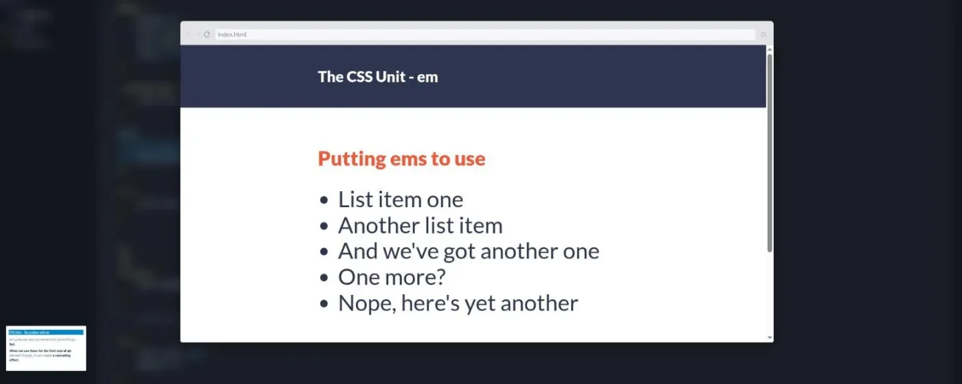
Flexbox arrives as a tool, not a topic. You build a two-row column layout, then make it stack with a flex-direction: column media query, then build a header with a navigation and make that responsive at a 675-pixel breakpoint. His advice in that lesson is to attempt it and fail first: "I want you to make mistakes. Because making mistakes is how you're going to learn."
The second half is the first real project, a three-page blog called "Living the simple life" (home, recent posts, about me), designed in Adobe XD. The key lesson is "Starting to think mobile first," where he deletes the desktop-first query, makes the stacked layout the default and adds a min-width query for two columns. "The problem with working on the big screen first is you're writing a bunch of code, and then you're overriding it all." Later lessons cover order in flexbox, object-fit, and a lesson on breakpoints with the line I would put on a poster: "breakpoints are not device specific, they are layout specific." The module ends with an "important note" scrim admitting he never added the viewport meta tag during the build, and showing you the one line you must put on every page.
3. Stepping up our style (2.9 hrs, 38 scrims)
Typography polish first (line-height, text-transform, letter-spacing, rgba()), then background images and a warning that Scrimba's flat file layout hides the ../images/ path problem you will meet on your own machine. "I've literally tried to debug a problem for like forty five minutes once because I forgot this."
The project is a one-page barbecue splash page with a form. It teaches viewport units, then the scrollbar bug that box-sizing: border-box fixes, with a demo that adds a 110-pixel fuchsia border to show what content-box does to your math. Two lessons compare ways to stop content stretching on very large screens (a * selector with max-width, then a more conventional fix). Forms get three scrims: the basics of label, input types and button type="submit", with a challenge to wire for and id so clicking a label focuses its field. The form does not submit anywhere; he says up front that a server is out of scope.
The tail of the module is the fun part: gradients (including hard color stops that make stripes), transitions, a short lesson on why transform and opacity are the properties to animate, and background-blend-mode. As he puts it in the transforms lesson, the hover scale without a transition "looks terrible," and with transition: transform 250ms it is "a million times better."
4. Taking flexbox to the next level (78 min, 17 scrims)
The reference module. Each scrim covers one or two properties: flex-wrap and flex-flow, justify-content versus align-items, align-content, flex-grow and flex-shrink on a set of colored boxes, flex-basis, the flex shorthand, align-self, and margin: auto inside flex. Kevin says in the intro that it is built to come back to: "the lessons are really split up across all the different properties."
The build is a single card component that stacks on phones and goes side by side above 600 pixels. The trick is flex-basis, which acts as a height in a column and a width in a row, so one declaration handles both layouts. That lesson also patches a Chrome bug with flex-basis on images using min-width: 0 and min-height: 0; treat it as history rather than something you need today. The wrap-up ends with a line that sums up his attitude to pacing: when the scrim tries to auto-advance, "hit cancel, close your window, go relax a little bit, you deserve it."
5. CSS Grid: The ultimate layout tool (97 min, 19 scrims)
Grid gets the same one-property-per-scrim treatment. display: grid, grid-template-columns and rows, line-based placement, spans, the gap property, implicit versus explicit tracks, then the lessons Kevin clearly loves: grid-template-areas, where you draw the layout as strings, and the follow-up where a media query only needs to redraw those strings. "I love this so much. I'm excited just thinking about this. And that's maybe a little sad."
minmax(), the fr unit, repeat() and auto-fit versus auto-fill close the module, and the last one is the moment grid earns its subtitle.
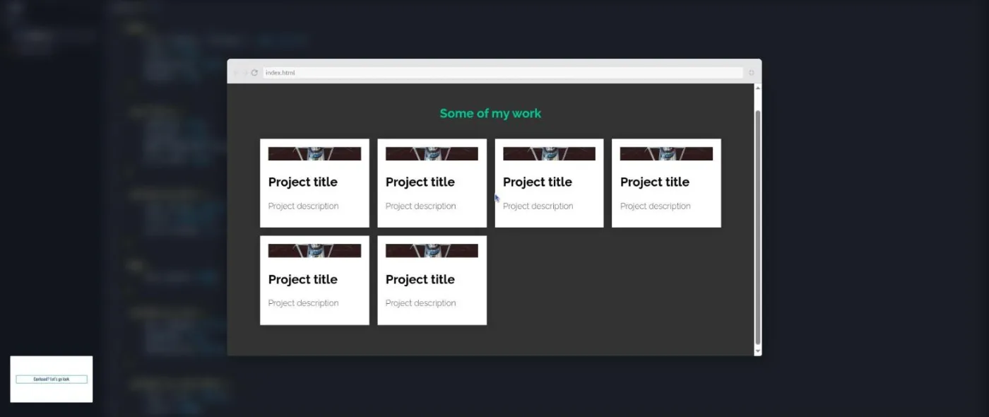
Two "Putting grid to use" lessons rebuild the blog article component from module 2 with grid instead of flexbox and negative margins, and the module ends there with no wrap-up scrim. One slip to know about: in the minmax() lesson he calls it "exclusive to Flexbox" when he means grid.
6. Taking it to the next level (2.2 hrs, 30 scrims)
The final project is a three-page company site (home, about, contact) with a hero image, a footer with Font Awesome icons, and a mobile navigation that slides in from the side. Kevin starts with a lesson on analysing the design before touching code: "the biggest mistake people do is they just start building without really thinking about it." Every section then reuses one grid, minmax(1em, 1fr) minmax(260px, 500px) minmax(1em, 1fr), with children placed on column 2 to -2, which is how he handles side gutters without a container div.
The navigation is where positioning finally appears. He has held it back on purpose: "the problem with teaching people it early on is they start abusing it." The nav becomes position: fixed with all four sides at zero, a flex column, and links at 3rem.
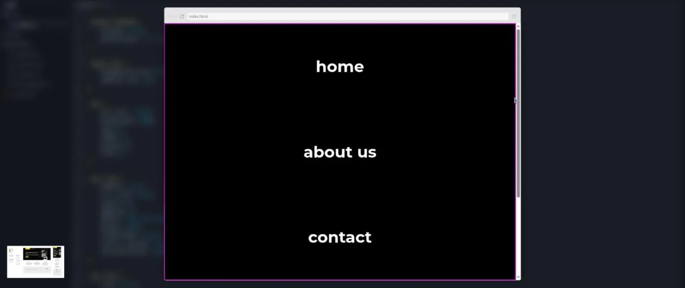
That next scrim is the only JavaScript in the course: a script.js with two querySelector calls and a click listener that removes a navigation-open class. He is clear it is a taste, not a lesson, and the first time it works he says "Doing JavaScript is literally like magic." The remaining scrims add the open button, the large-screen nav, the about and contact pages, box shadows on images, ::before and ::after pseudo-elements for decorative yellow lines, and a form styled for two screen sizes. The loose-ends lesson keeps one of his own mistakes in, a subtitle that inherited the wrong color, because "it's an important type of thing that you run into." The last scrim is a three-minute send-off: "Most people don't finish courses ... This was six courses."
What a lesson feels like
Most scrims run three to seven minutes, with a few long builds (the module 1 practice page is 22 minutes, the forms intro is 11). Kevin talks over a live editor with the preview usually tucked into a small thumbnail; you press Ctrl+L or the browser icon to pop it open, which is what the screenshots above show. Every module opens on a plain blue title slide and most projects come with a spec slide you can click to enlarge.
Challenges are verbal and frequent. Roughly every second or third scrim he stops with "go ahead and try that now" and expects you to pause. There are no numbered challenge comments in the files, no AI-checked challenges and no solo projects; you police yourself. Each lesson has captions, a full timestamped transcript in the settings menu, subtitles in ten languages, and speed control. The recordings show their age in small ways: the Scrimba UI he refers to has changed, and the design files are Adobe XD share links.
The voice is the reason people like Kevin Powell. He is patient to a fault, keeps his own bugs in, and ends nearly every module telling you to stop: "please, please take a break ... a couple days off." Whether that is charming or slow depends on you; at 1.25x it is fine.
Free or Pro: exactly what is gated
Almost everything. The first four scrims of module 1 (welcome, the note about the crash course, the module intro, and the first margins lesson) carry a SAMPLE badge and open without a subscription; I also saw the badge on the background-images scrim in module 3. The other 170 scrims, all six projects, and the certificate of completion need Scrimba Pro.
There are no separate "Solo Project (PRO)" items here, because the whole course is Pro. The pricing page lists basic access to the Discord community as free and the Pro-only channels as Pro, so the server itself is not part of what you are buying. See current plans (opens in a new tab) for what Pro costs in your region. The Frontend Developer Path teaches its own responsive design module rather than embedding this course, if you plan to go that way.
How long it takes
The 15.1 hours is video. Because the format expects you to pause and build before every solution, and because the longest module is over four hours of code-along on one project, plan on two to three times that: 30 to 45 hours. At an hour a day that is six to nine weeks, and Kevin's own advice adds a day off after every module. Module 2 alone (4.1 hours of video, the full three-page blog) will take most people a fortnight at that pace. If you rebuild each project from the design file without watching, as he keeps suggesting, add another ten hours and you will get more out of it than from the video.
Who it's for, and who should skip it
It fits people who know basic HTML and CSS and want to be able to look at a design and know how to build it. That usually means self-taught developers whose layouts work by trial and error, and career changers a few months in who want flexbox and grid to become tools rather than search terms. It is also a good fit for busy professionals because the scrims are short and every module ends at a natural stopping point.
Skip it, for now, if you have never written CSS; start with the free Learn HTML and CSS. Skip it if you only need one tool quickly; Learn Flexbox and Learn CSS Grid are each about an hour. And skip it if you want a modern tooling stack: there is no Sass, no Tailwind, no build step, and the only JavaScript is a handful of lines.
Start Learn Responsive Web Design on Scrimba (opens in a new tab)Prerequisites
Basic HTML and CSS: you should be able to write a page from a blank file, link a stylesheet, and use selectors and the box model. The first module refreshes all of that but at an intermediate pace. Kevin's second scrim says outright that this course continues his free HTML and CSS crash course; in today's catalog, Learn HTML and CSS is the equivalent starting point. No JavaScript is needed.
Where it fits
This course is not part of the Frontend Developer Path or the Fullstack Developer Path; both teach responsive design through their own modules instead. It stands on its own as the longest CSS course in Scrimba's catalog. Modules 4 and 5 cover the same ground as the standalone flexbox and grid courses in more depth, so once you have finished this you can treat those as optional refreshers. Learn Tailwind CSS makes more sense after this, not instead of it, because Tailwind's utilities map onto exactly the properties you learn here.
Strengths and limits
What it does well: it teaches layout by hitting real problems on screen and then fixing them, the mobile-first habit is drilled through four projects rather than explained once, modules 4 and 5 double as a property-by-property reference you can return to, and the transcripts and short scrims make it easy to find a single lesson later.
Where it is limited: it is Pro-only apart from a handful of samples, the challenges are honor-system pauses with no checking, the recordings are several years old (Adobe XD files, a Chrome bug fix, a stale promo at the end of one lesson), the forms never submit and the only JavaScript is a single toggle, and Kevin's pacing, with a break recommended after every module, will feel slow to anyone who already knows half the material.
Related courses and comparisons
- All CSS courses, the full category this course anchors
- Learn HTML and CSS, the free foundation to do first
- Learn Flexbox and Learn CSS Grid, the lighter alternatives if you only need one topic
- CSS Challenges, to harden the skills afterward
- Learn Tailwind CSS, the natural next step once the underlying properties make sense
- Scrimba vs Frontend Masters, if you are comparing serious CSS platforms
No. Only the first four scrims of module 1 (and one background-images lesson in module 3) are marked SAMPLE and open without a subscription. The other 170 scrims, the projects and the certificate need Scrimba Pro.
Kevin Powell, the CSS educator known from YouTube. He teaches all six modules himself; there are no guest sections.
A blog card page and a three-section landing page in module 1, a three-page blog built mobile first in module 2, a barbecue splash page with a form in module 3, a responsive card component in module 4, a portfolio grid and a rebuilt article component in module 5, and a three-page company site with a slide-out mobile menu in module 6.
Not as a first course. It is rated Intermediate, moves through the box model and selectors quickly, and Kevin says it was planned as the continuation of his free HTML and CSS crash course. Do Learn HTML and CSS first.
Yes and no. Every few scrims Kevin pauses and asks you to try the next step before he shows it, but nothing is graded. There are no AI-checked challenges and no solo projects in this course.
Yes. Module 4 has a scrim per flexbox property and module 5 does the same for grid, including grid-template-areas, minmax(), repeat() and auto-fit versus auto-fill. Both modules are built to be used as a reference afterwards.
Barely. One scrim in the final module writes a few lines to close the mobile menu and the next adds the open button. Kevin says it is a taste, not a lesson.
No. Everything runs in Scrimba's editor. Two lessons point out things that differ on your own machine: relative image paths from a CSS folder and the viewport meta tag.
15.1 hours of video. Plan for 30 to 45 hours with the challenges, or six to nine weeks at an hour a day, plus the breaks Kevin recommends after each module.
Yes. Every scrim has captions, a timestamped transcript panel in the settings menu, and subtitles in ten languages.
Somewhat. The design files are Adobe XD links, one lesson works around a Chrome bug with flex-basis on images, and the class-naming lesson ends with a pre-launch promo that was never cut. The CSS itself is still current.