Intro to UI Design Fundamentals
Gary Simon's free Intro to UI Design Fundamentals runs 70 minutes across 20 scrims, fixing one bad layout at a time with plain CSS. You get seven design principles and five pause-and-fix challenges, no Figma, no JavaScript. It's the fastest way to learn why your CSS-correct pages still look off.
Reviewed inside the course with a Pro account, September 2026: every transcript, and a sample of the lessons stepped through firsthand.
This page is part of our Scrimba CSS courses catalog. Scrimba's course page does not list it under any career path; it is a standalone free course and the taster for the Pro-only Learn UI Design.
Quick answer
Take it if your pages look slightly wrong and you do not know why. Each principle is followed by a "Design Challenge" where you fix a broken layout in index.css, with no Figma, no design tool and no JavaScript: just an HTML page and a CSS file with a comment marking where your fixes go. It is rated Intermediate because it assumes you already write CSS, not because the material is hard.
Intro to UI Design Fundamentals
FreeTaught by Gary Simon (opens in a new tab)
Seven UI design principles, each shown by fixing a bad layout in CSS, with five pause-and-fix design challenges.
Start free on Scrimba (opens in a new tab)Is it worth your time?
Yes, and it costs you about an hour. The course teaches the thing developers rarely get taught: why one card looks fine and an identical card next to it looks cheap. Gary's answer is never "taste". It is a named principle plus two or three CSS properties.
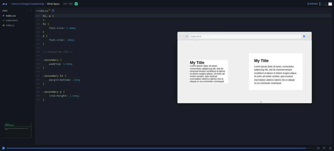
The white space lesson is the clearest example. The two cards start out pixel for pixel the same. By 4:37 the second one has padding, a margin-bottom on the heading, and line-height: 1.5em on the paragraph, and it looks like a different product. He is also willing to put numbers on things: the contrast lesson measures a subheading at a 1.82 to 1 ratio, fixes it, and measures again at 7.6 to 1.
In the Course Introduction, Gary calls the course "just a small sample from my upcoming UI design boot camp releasing here on Scrimba." That boot camp is now the 8.6 hour, Pro-only Learn UI Design, and this course is its free front door.
So you get seven principles and five challenges. You do not get responsive layouts, dark versus light interfaces, components, or building a design from a blank page; Gary lists all of those as "in the full course" in the closing scrim. Treat it as an hour that tells you whether the bigger course is for you, plus a checklist you will keep using, and you will not be disappointed.
What you'll learn
Scrimba presents the course as one flat list of scrims with no modules. The grouping below is mine: each row is a principle (or two) plus the challenge that tests it, so the bars show where the time goes.
Course curriculum
20 scrims in one flat list, grouped here by principle · 70 min
- Welcome, design roles aside, course introduction
- White space, alignment, Design Challenge 1
- Contrast, scale, Design Challenge 2
- Typography, color, Design Challenge 3
- Visual hierarchy, Design Challenge 4
- The Final Challenge, deploy, closing and three wrap-up scrims
I counted 20 toc-scrim-item rows in the expanded table of contents in September 2026. Seventeen of them show a duration; the last three (congratulations, a Scrimbassador referral pitch, and "How to Utilize Your Certificate") show none, but they are recorded scrims too, of 56 seconds, about two minutes, and 53 seconds when you open them. Scrimba's header says 70 minutes and its structured data says 21 lessons. Adding up the 17 listed durations myself gives about 73 minutes, or about 77 with the three unlisted ones, and the 21 most likely counts the certificate row. When other pages on this site quote 21 lessons, that is Scrimba's number.
Inside the course, scrim by scrim
1. Welcome, design roles, course introduction (7 min, 3 scrims)

The course does not open with Gary. "Welcome to Learn UI Design" (2:16, marked SAMPLE) is a Scrimba narrator introducing a three part module: "the fundamentals of UI design, specifically the seven core principles", then "experimenting with a very simple layout", then "a full project refactoring" of a company dashboard. Only the first of those three parts is in this free course. The module framing was recorded for a path, which is why the slide says "Learn UI design" rather than the course name.
The narrator also sets the goal, and it is a good one: the module should "help you speak the design language more effectively, enabling productive conversations with designers." Gary is introduced as having "roughly one million followers" and "over one hundred courses".
The second scrim, "Aside: Common Design & Non-dev Roles" (3:17), is Gil from Scrimba, not Gary. It is a careers talk on what user researchers, UX designers, and UI designers do and which tools they use (Balsamiq, Figma, Adobe XD, Optimizely, Hotjar). Its one line to keep: "design isn't just about making things look good." It also mentions "solo projects in this path", which tells you where it was recorded for.
Gary arrives in "Course Introduction" (1:06) with twenty years as a UI designer and front end developer, the DesignCourse YouTube channel, and the audience in one sentence: "front end developers who have at least a basic understanding of HTML and CSS." He also asks you to leave your email for the upcoming boot camp, a link that has aged now that the boot camp exists.
2. White space and alignment, then Design Challenge 1 (12 min, 3 scrims)
"White Space" (4:45) is the template for every principle lesson. A definition slide, a mini browser with a broken example, then Gary types into index.css under a comment while the preview updates. Here it is two identical cards, and he says up front that "there isn't one UI design fundamental that's more important than the other"; he just starts here.
He adds padding to the second card and argues for em units, which scale with the body font size, so one change to font-size later resizes every gap. Then he tunes it out loud: "zero em would be objectively horrible", and anything from 1.3 to 1.9 is "a sweet spot". Then margin-bottom on the h1 and line-height on the paragraph, which he names as leading, the printer's word for the space between lines. The framing of the whole course is in this lesson: "there is a lot of subjectivity in terms of the choices you make... But there's also objectivity."
"Alignment" (3:06) uses a trick I liked. A hidden column overlay in the CSS has its opacity flipped from 0 to 1, and suddenly you can see that a logo, a headline, a paragraph, and a button sit on three different left edges. "You need to think of every element that is in your user interface as having a series of rows and columns", as he puts it. The fix is uncommenting one block of CSS.
"Design Challenge: 1" (4:20) is the first pause point. A comment at the bottom of index.css lists suggested properties and three empty rule sets. You pause, fix the white space and alignment of a card, then play to compare.
His solution is padding: 2em on the body, 1em on the content box, text-align: left on a centered date, and two zeroed margins so the space above and below the content is equal. The reassurance at the end is characteristic: "if you didn't, don't stress. This is the very first coding challenge."
3. Contrast and scale, then Design Challenge 2 (16 min, 3 scrims)
"Contrast" (4:26) is the most concrete lesson in the course. Gary explains the WCAG 2.0 guidelines, the accessibility standard for web content, at two levels: AA needs 4.5 to 1 for text and 3 to 1 for large text, AAA needs 7 to 1 and 4.5 to 1. He points you at browser plugins and Figma or Sketch plugins to measure it.
Then he fixes a hero section, the big banner at the top of a page. Its subheadline measures "only one point eight two to one" and its Explore Now button 2.46 to 1. After changing one text color and the button's background and text, he measures again: 7.6 to 1 and 5.3 to 1. That is the kind of before and after a developer can act on.
"Scale" (4:29) fixes a color palette page that leaves a third of the layout empty because its grid is repeat(3, 150px). Three rule sets later it fills the page: grid columns set to auto, the h1 from 1.2em to 2.2em, and the color codes larger and bold.
He also flags, for the first time, that a headline that is barely bigger than its subheading is "really suffering" in visual hierarchy, the principle he saves for last.
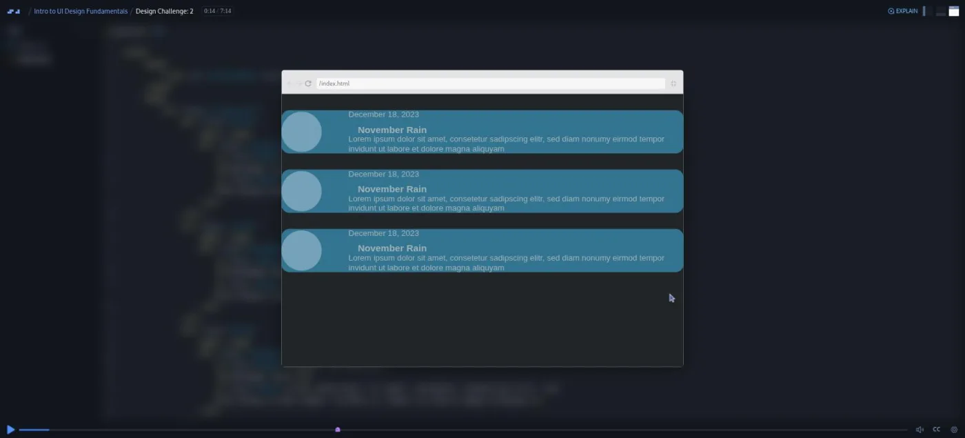
"Design Challenge: 2" (7:14) is the mid-course exam for the first four principles and the longest scrim so far. Gary's own description: "it's the most ugly thing I've presented to you so far." Three saturated blue cards, no padding, a title jammed against a date. The brief names the properties his solution used (width, background, padding, margin, text-transform, font-size, letter-spacing, color) and then adds the sentence that makes these challenges fair: "your result may look different than mine, but it still may be effective UI design."
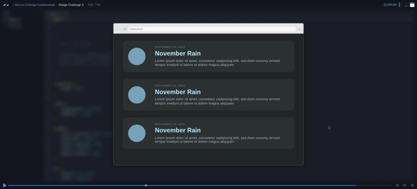
His solution is worth knowing because it contains the course's best rule about contrast. The container gets width: 90% for breathing room, the cards get a dark grey background and padding: 1.5em, the date is shrunk, uppercased and letter spaced, and the title grows to 1.8em in pale blue. The rule: "you want a lot of contrast on important elements that a person has to interact with or use or read", but a container "can have very little contrast, and it would still look good."
4. Typography and color, then Design Challenge 3 (16 min, 3 scrims)
"Typography" (6:12) starts with the rule that does most of the work: "you don't wanna use more than two font families. In fact, most of the time, you can get away with just one." The example is a three card testimonial section importing three Google fonts. One font-family: Montserrat rule fixes most of it.
Then the visual hierarchy work: the heading grows to 2em, the quote gets line-height: 1.5em, and the oversized author name is shrunk, bolded, then dimmed to dark grey so it stops competing with the quote. His reasoning is user focused: people "are just interested in what a person has to say about a given service and not about necessarily who they are."
"Color" (5:41) is half slides and half code. The slides cover color psychology (green for wealth and growth, black for luxury) with the warning that meanings change by culture, the too-many-colors mistake ("too many colors will really destroy the quality"), and using lighter and darker values of one hue to separate blocks. The code part turns a garish "Know your code" page around with three rule sets: a purple background, white text, and a yellow call to action, the button you most want people to click.
"Design Challenge: 3" (4:07) is the color challenge. You get a grayscale contact form with a five swatch key at the bottom, and you may only use those five hex codes (the six character color values listed in the CSS) to give it a scheme. Gary then pastes in three solutions of his own: two dark schemes that swap which swatch is the background, and one light scheme. That is the best argument in the course that constraints are not the enemy, and he warns that later challenges "may not provide you with any of the color options at all."
5. Visual hierarchy, then Design Challenge 4 (14 min, 2 scrims)
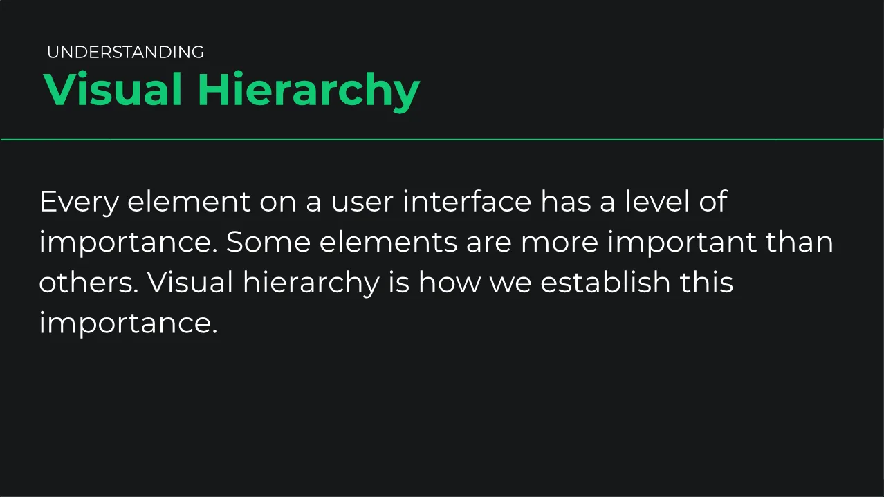
"Visual Hierarchy" (7:42) is the longest lesson and the one that ties the others together. It opens on slides of five identical squares, then makes one stand out in turn with white space, contrast, color, scale, and finally all of them at once. Then the real example: a "Join the mailing list" form where, as Gary says, "you're not exactly sure which text element you should be looking at."
Each fix reuses a principle from earlier in the course. The h1 goes to 3em, the form gets a background one shade lighter than the page, and the label is bolded at 1.2em. The submit button turns a saturated yellow with dark bold text and no border, and the "we won't share your email" note is dimmed. Afterwards you know where to look, which is the whole point.
"Design Challenge: 4" (6:22) hands you a card with a down arrow icon that grabs the eye and a headline ("Pay your debts") that does not. The rule sets are there with auto placeholders; you replace the values. His solution shrinks the icon from 5em to 2.7em and makes the headline 1.2em and bold. It loosens the paragraph to line-height: 1.9em and turns the "Find out how" link into a button with a light grey background and padding.
His guidance is the sentence to remember from the whole course: "for every UI element you have, compare it in terms of its importance in relation to the other elements." He also notes that the dimmed paragraph "would still be dark enough" to pass WCAG, a reminder that hierarchy and accessibility pull in opposite directions if you overdo it.
6. The Final Challenge, deploy, and wrap-up (12 min, 6 scrims)
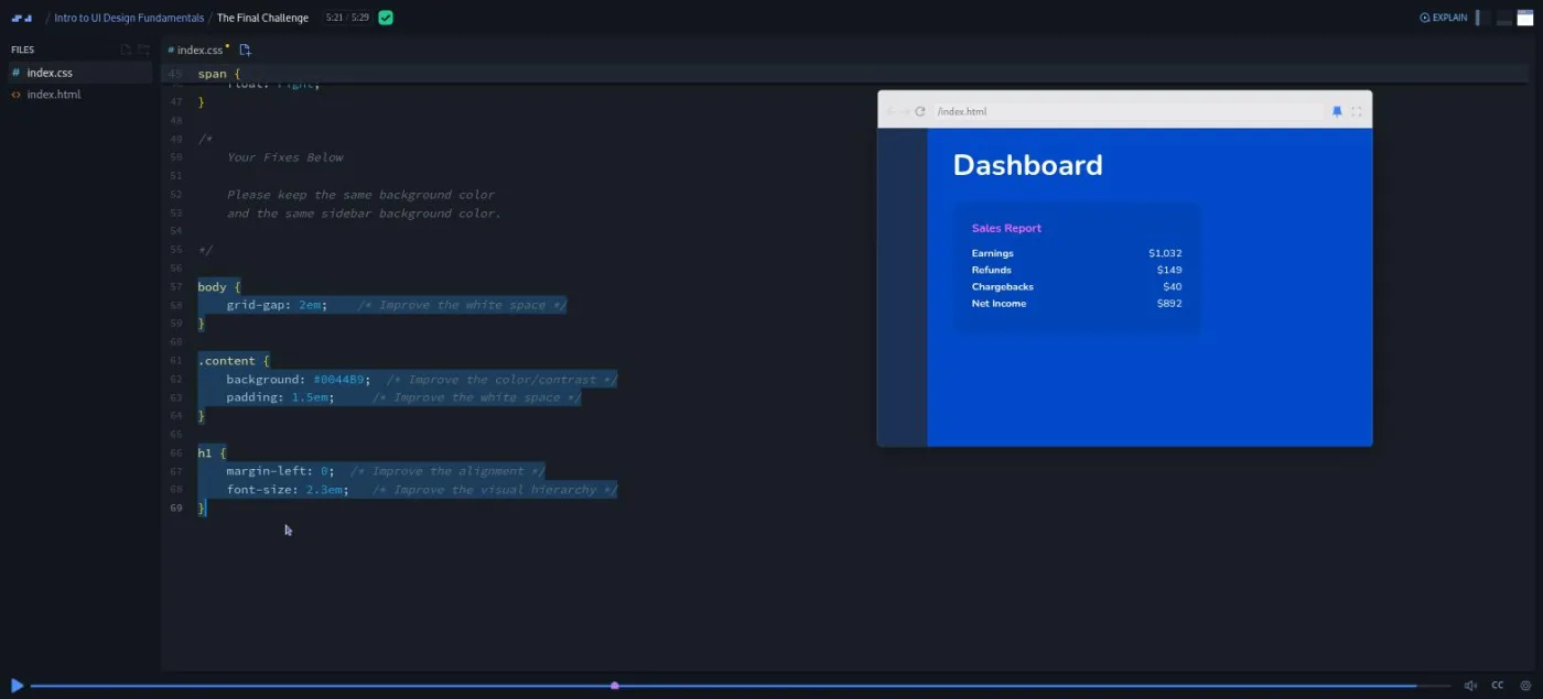
"The Final Challenge" (5:29) is a dashboard fragment: a sidebar, a Sales Report card, and a Dashboard heading, with problems in white space, color, alignment, and hierarchy. This time the brief is stricter and kinder at once. Keep the two background colors, use only three selectors, and every property is pre-filled with auto and a comment saying which principle it fixes.
His answer is grid-gap: 2em (the gutter between grid columns), a content background "either slightly darker or slightly lighter" than the page, and padding: 1.5em. Then an h1 at 2.3em and margin-left: 0 so the heading starts on the same column as the card. Nine lines of CSS, each one tagged with the principle it serves.
"Deploying to Netlify" (1:17) is a Per Borgen scrim shared across many Scrimba courses ("what use is your project sitting around locally on your computer or inside of a scrim?"). It links to two guides, GitHub to Netlify or drag and drop. "Closing Thoughts" (0:59) restates the seven principles and Gary's rule about them: "If UI design is lacking in just one of these areas, it seriously degrades the quality of the design."
The three wrap-up scrims have no duration in the table of contents but are short recordings. In the congratulations scrim (0:56) Leanne from Scrimba pitches the boot camp by naming its projects: "this ultimate tea website, this sign up flow form, and this forest vacation page." The Scrimbassador scrim (about two minutes) is Per explaining the referral programme, and "How to Utilize Your Certificate" (0:53) is Per suggesting you link the certificate from your resume and LinkedIn.
What a lesson feels like
Lessons run from under a minute to under eight, with most between four and six. Gary talks over a Scrimba editor with index.html and index.css, and the mini browser preview updates as he types. Every principle lesson has the same shape: a slide with a one line definition, a broken example, a fix under a comment at the bottom of the CSS file, then a before and after where he deletes his rules and puts them back.
The challenges reverse it. The comment is your brief, the rule sets are empty or filled with auto, and the recording pauses until you press play. There is no AI feedback: you compare your version with his and judge it yourself, which he addresses head on in every challenge scrim. The table of contents marks the five challenge scrims with a small icon next to the duration, but I could not get its tooltip to appear, so I will not tell you what it says.
Every scrim has captions, a timestamped transcript under the settings menu (toggle "Show Transcript" behind the gear icon), subtitles in the ten languages the header advertises, and playback speed.
Free or Pro: exactly what is gated
All 20 scrims, including all five challenges and the final challenge, are free. There are no "Solo Project (PRO)" items in this course, so there is nothing inside it to unlock. What Pro touches is around it: the Certificate of Completion row at the end of the table of contents, the Learn UI Design course, the career paths, and the Pro-only channels on Scrimba's Discord (the pricing page lists basic Discord access as free).
If you only want the seven principles, you can finish this course without a card. See current plans (opens in a new tab) for what Pro costs in your region.
How long it takes
The video is 70 minutes. Budget two to three hours. The five challenges are where the time goes: each one asks you to stop, write CSS, look at the result, and adjust. Plan on ten to fifteen minutes for Design Challenge 2 or the Final Challenge on its own.
If you skip the challenges you can watch the whole thing in a lunch break. But then you have watched a course about muscle memory without using your hands. One sitting of two hours, or two evenings, is the realistic plan.
Who it's for, and who should skip it
It fits developers who can build a layout but cannot say why it looks off. It also fits students partway through Learn HTML and CSS or Learn Responsive Web Design who want to stop shipping ugly projects. It also suits anyone weighing whether to pay for Learn UI Design. Designers coming from the code side will like it too, because the whole course speaks CSS rather than Figma.
Skip it if you cannot yet write CSS (do Learn HTML and CSS first). Skip it too if you already run contrast checkers and think in type scales, in which case the full course is your level.
Start Intro to UI Design Fundamentals for free (opens in a new tab)Prerequisites
Basic HTML and CSS. Gary's own line is "at least a basic understanding of HTML and CSS", which in practice means finishing Learn HTML and CSS or the equivalent. You need to be comfortable editing a rule set, not writing a layout from scratch. No design tool, no JavaScript, nothing to install.
Where it fits
This is a standalone free course, not a path milestone. Scrimba's course page lists no path membership, even though its first two scrims talk about "this module" and "this path" and were clearly recorded for one. The natural sequence is Learn HTML and CSS, then this, then Learn UI Design or Learn Responsive Web Design. If you are following the Frontend Developer Path, it is a useful hour to slot in before Learn UI Design.
Strengths and limits
What it does well: it teaches design with properties you already know, and it puts numbers on contrast instead of adjectives. The five challenges make you fix layouts rather than admire fixed ones, and Gary keeps saying out loud that your answer can differ from his and still be right.
Where it is limited: it is an hour, and it stops at the seven principles. Two of its twenty scrims are not about the course at all, and three more are Scrimba housekeeping. The challenges have no automatic feedback, so how much you learn depends on how closely you compare your version with his.
Related courses and comparisons
- Learn UI Design, the full Pro course this one is a sample of
- All CSS courses, the category hub
- Learn HTML and CSS, the free foundation to do first
- Learn Responsive Web Design, the deep CSS course
- Learn CSS Animations, for adding motion once the layout is right
- Scrimba for designers, if you are coming from the design side
Yes. All 20 scrims, including the five design challenges, are free with no card required. Pro only touches the certificate, the paths, and Learn UI Design.
Gary Simon of the DesignCourse YouTube channel teaches everything from Course Introduction to Closing Thoughts: the seven principle lessons and the five challenges. The welcome scrim is a Scrimba narrator, the design roles aside is Gil from Scrimba, the Netlify, Scrimbassador and certificate scrims are Per Borgen, and the congratulations scrim is Leanne from Scrimba.
White space, alignment, contrast, scale, typography, color, and visual hierarchy, in that order, each with its own lesson and a definition slide.
No. Every example and challenge is an index.html and an index.css file in the Scrimba editor. The contrast lesson points you at browser, Figma, and Sketch plugins for measuring contrast ratios, but you never open a design tool.
A comment at the bottom of index.css gives the brief and empty or auto-filled rule sets; you pause, write CSS, then play to see Gary's solution. There is no automatic checking; you compare your result with his.
Nothing you would ship. You fix a card, a hero, a palette page, testimonial cards, a mailing list form, a contact form, a card with an icon and a headline, and a dashboard fragment, each a small HTML page designed to be broken in one way.
70 minutes of video by Scrimba's count, about 77 if you include the three unlisted wrap-up scrims. Plan on two to three hours if you do the five challenges.
Yes. Every scrim has captions, a timestamped transcript behind the gear icon in the player bar, and subtitles in ten languages.
No. Gary says in the introduction that this is a small sample of his UI design boot camp, which is now the 8.6 hour Pro course Learn UI Design. This free course covers the fundamentals section only.