Learn Flexbox
Per Borgen teaches this 53-minute Scrimba course on CSS Flexbox around a single example: a navbar with Home, Search and Logout. Twelve teaching scrims and three wrap-up scrims cover every core property, with six pause-and-solve challenges, a responsive navbar rebuild, and an image grid bonus. It turns Flexbox from guesswork into muscle memory, fast.
Reviewed inside the course with a Pro account, September 2026.
Quick answer
Take it if you already know basic CSS and Flexbox still feels like guesswork; skip it if you have never written CSS, or if you already reach for flex: 1 and align-items: center without thinking. The catch is scope: one navbar the whole way through, no page layout, no media query until the very end. Follow it with Learn CSS Grid for two-dimensional layouts.
Learn Flexbox
ProTaught by Per Borgen (opens in a new tab)
The core Flexbox properties taught on one navbar, with six pause-and-solve tasks and a responsive navbar and image grid at the end.
View on Scrimba (opens in a new tab)This course has no chapter title cards: every scrim opens straight on the code, so the images on this page are moments from the lessons themselves.
Is it worth your time?
Yes, if Flexbox is the specific gap. The course does one thing a reference page cannot: you type justify-content: space-around and watch the three boxes spread out, then try space-between and see the difference. Per names which values he reaches for on the job. On flex-direction: column he says, "I've found that I've used the default direction much more often than the column direction when building websites," and the course time follows that pattern.
The caveat is scope. The whole course is one navbar. You never build a page, never combine Flexbox with a grid, and never write a media query until the bonus scrim near the end. That is fine for learning the properties, but it will not make you a confident layout developer. Per says so himself in the final scrim, pointing you to Kevin Powell's responsive web design course because, in his words, "there's a lot of nuance" in building professional layouts.
What you'll learn
Scrimba lists the 15 scrims as one flat list with no modules. The four groups below are mine, so you can see how the time is spent.
Course curriculum
4 modules · 15 lessons
- Containers, axes and justify-content
- Sizing, aligning, direction, wrapping and order
- Bonus builds: responsive navbar and image grid
- Wrap-up: next steps, Scrimbassador, certificate
My count is 15 scrims totalling 53 minutes 26 seconds. Scrimba's header says 52 minutes, its About text says "12 interactive screencasts" (the teaching scrims, without the three wrap-up clips), and the catalog data this site uses says 16 lessons, which includes the certificate item at the bottom of the list.
Inside the course, scrim by scrim
1. Containers, axes and justify-content (9 min, 4 scrims)
The first scrim is under two minutes. You get a nav with three divs inside it, add display: flex to the container, and watch the divs go from stacked to side by side. Per's one rule for the whole course is stated here: "As long as they are direct children of the Flexbox container, they turn into flex items."
Scrim two introduces the main axis and cross axis. This is the idea everything else depends on: the main axis runs in the direction items are laid out (left to right by default), and the cross axis runs the other way. He flips flex-direction to column once to show the axes swap, then flips it back.
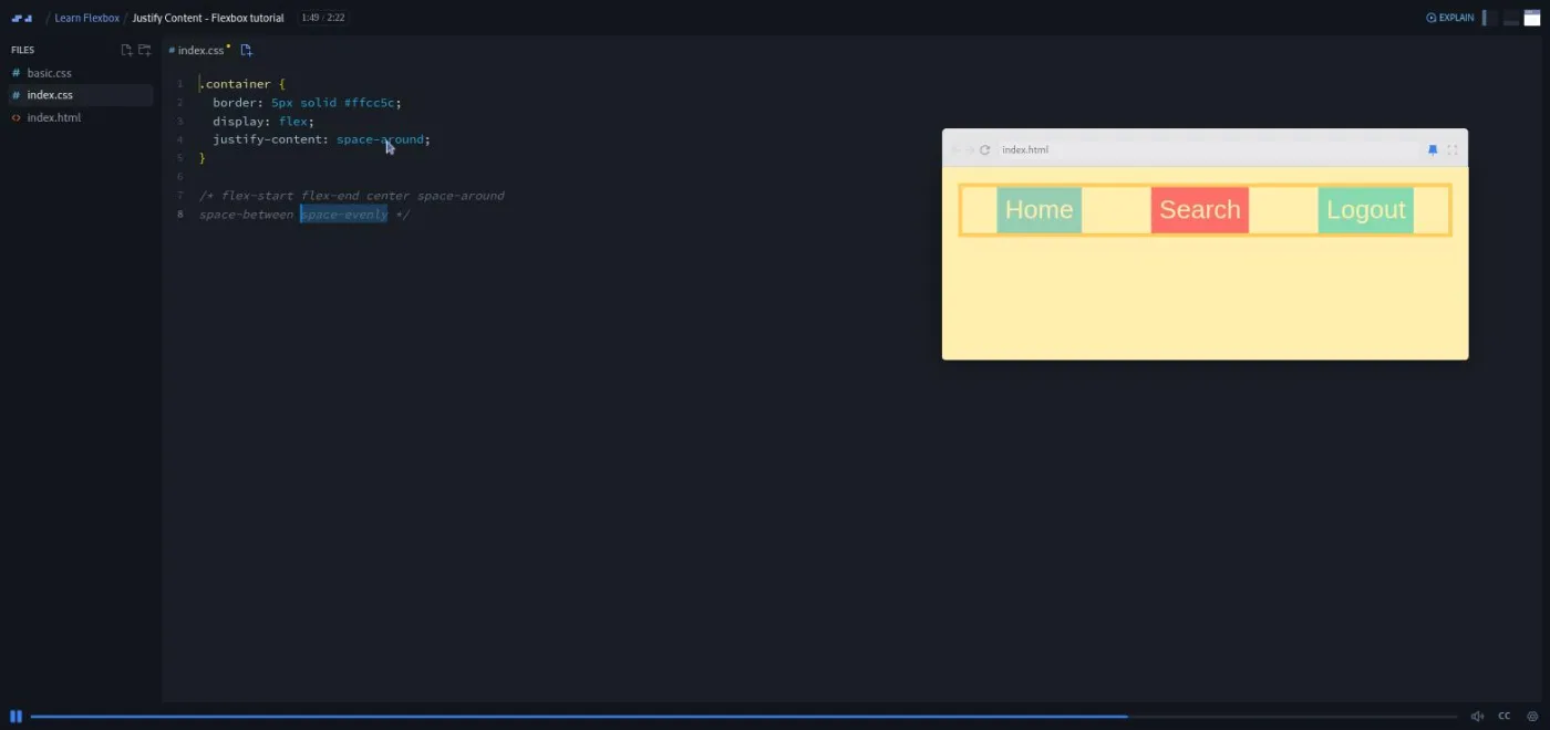
Scrim three is justify-content, which positions items along the main axis. Per pastes all six values into a comment, walks through flex-start, flex-end, center and space-around, then tells you to "pause the screencast" and try space-between and space-evenly yourself. It is not marked as a challenge in the table of contents, but it works like one.
Scrim four, "Positioning items", is the first marked challenge. Per removes justify-content and shows that margin-left: auto on the Logout item pushes it to the far right on its own. His reason for teaching it: the justify-content values "are nice and handy, but they don't always do what you want them to do." The task is to send Home to the left when everything else is pushed right (answer: margin-right: auto).
2. Sizing, aligning, direction, wrapping and order (27 min, 6 scrims)
This group has five of the six marked challenges, and it is where the course earns its Intermediate label.
"The flex property" (5:33) gives every item flex: 1 and shows them share the width equally, then adds a fourth item to prove you do not have to redo any maths. There is a short detour into CSS specificity when .container > .search beats .search. The pattern Per uses on the job is one flexing item with fixed-width neighbours: "What I've found to be a more realistic use case is to have one of the items doing all the flexing while the others stay at a fixed width." The challenge is to invert that so Search is fixed and the other two flex.
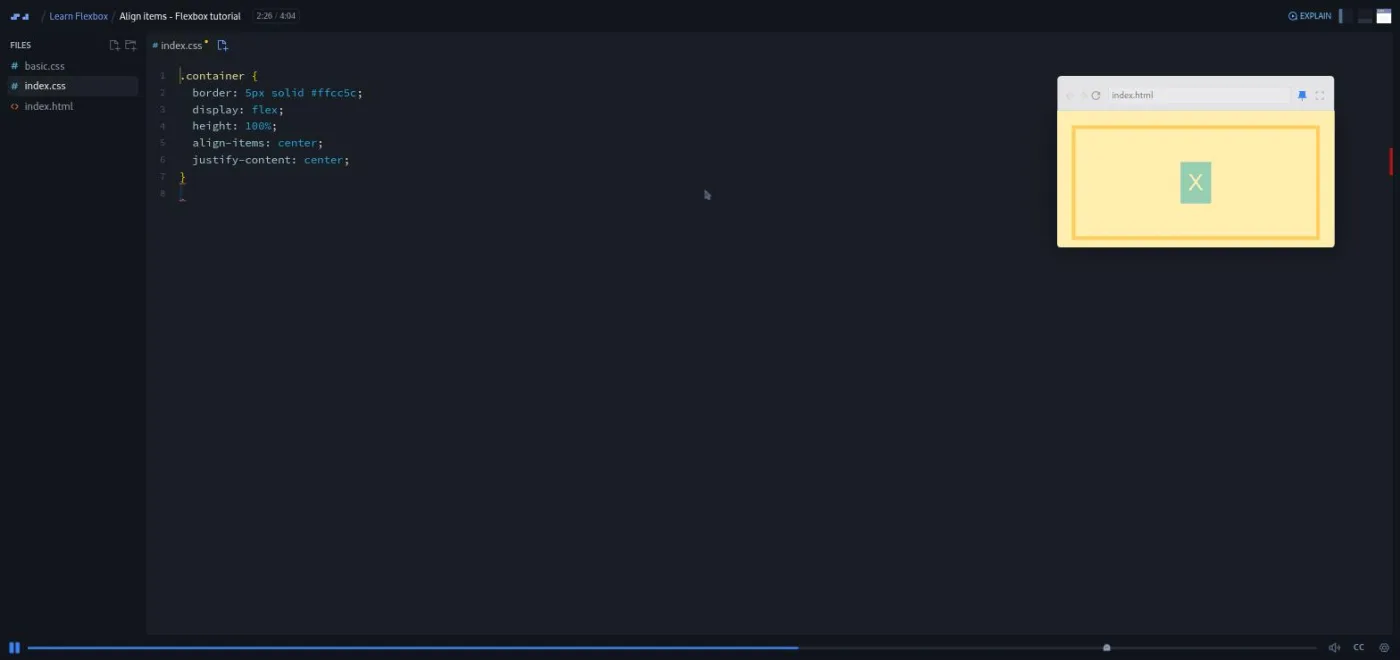
"Align items" (4:04) moves to the cross axis. align-items defaults to stretch, and Per first sets the container to height: 100% so you can see it (with a note that this only works because html and body are also 100% tall). Then comes the trick most people remember from this course: align-items: center plus justify-content: center puts a single button dead centre of any box.
The challenge here uses align-self to drop one item to the bottom, producing what Per calls "kind of a diagonal navbar" and admits nobody would want. That is typical of the course. The tasks exist to make you type the property; nobody would ship the result.
"Flex direction column" (3:55) repeats justify-content and align-items with the axes swapped, and explains why justify-content: flex-end does nothing until the container has a height. Challenge: put the items in the bottom right corner.
"Wrapping" (2:02) is the only scrim in this group without a task. Items get width: 300px, Flexbox shrinks them to fit, then flex-wrap: wrap lets them drop to a new row.
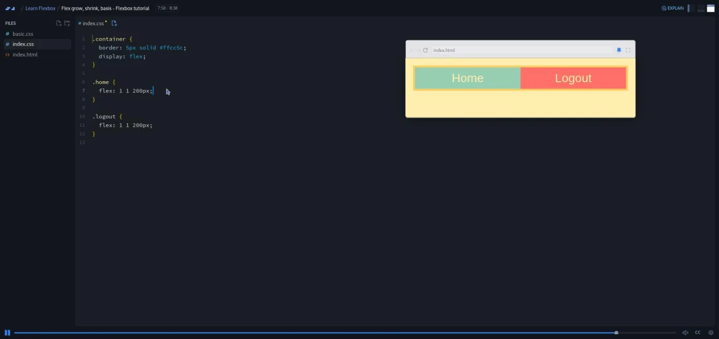
"Flex grow, shrink, basis" (8:38) is the longest scrim in the course and the one worth rewatching. Per unpacks flex: 1 into flex-grow: 1, flex-shrink: 1 and flex-basis: 0, then isolates each with two items set to flex-basis: 200px. Grow decides who gets the spare space above 400px; shrink decides who gives way below it. The line that makes it click: "these numbers work in relation to each other," so you have to read both values to predict what either one does on the page.
"Order" (3:09) finishes the core. Items default to order: 0; anything above goes to the end, anything below goes to the front. The challenge is to reverse three items using one positive and one negative value. Per closes with "You've completed the main section of this Flexbox course," so treat this as the real end.
3. Bonus builds: responsive navbar and image grid (11 min, 2 scrims)
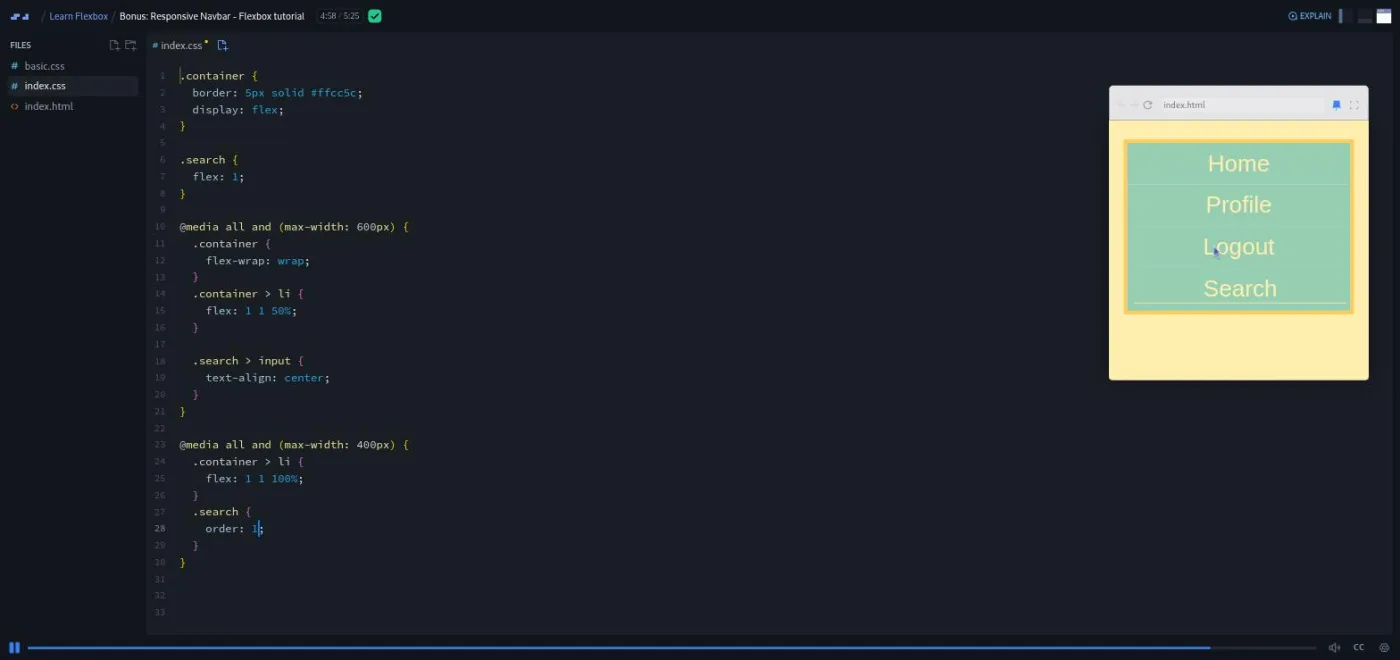
"Bonus: Responsive Navbar" (5:25) is the payoff. The markup switches to a ul with li items and a real input for search. Only the search item flexes. At 600px a media query turns on flex-wrap: wrap and gives each item flex: 1 1 50%, so you get two per row. At 400px each item becomes flex: 1 1 100% and .search gets order: 1, which drops it to the bottom of the stack. Everything from the earlier scrims shows up in about 20 lines of CSS.
"Bonus: Creating a Flexbox image grid" (6:01) is, by Per's own account, a scrim borrowed from his CSS Grid course. Twelve photos get flex: 1 1 150px (or 250px for the "big" ones) with object-fit: cover, and they reflow as you resize. He is upfront that this is the wrong tool: "I actually do recommend you to create image grids in the CSS Grid as that is made for two dimensional layouts, while Flexbox is mainly one dimensional." Watch it for the flex-basis practice, then do Learn CSS Grid.
4. Wrap-up (6 min, 3 scrims)
"Congrats & next steps!" is a two and a half minute pitch for the responsive web design course, with Per saying the examples here "have taught you the basics of CSS Flexbox" and that professional layouts take more. "Want to become a Scrimbassador?" explains Scrimba's referral programme. "How to Utilize Your Certificate" is under a minute on adding the certificate to LinkedIn. None of these teach CSS; skip them if you are short on time.
What a lesson feels like
Every scrim opens on the same three files: basic.css (colours and padding you never touch), index.css (where you work) and index.html. There are no dependencies and nothing to install. The preview is a small floating window over the editor rather than a split pane, and Per drags its edge constantly to show items growing and shrinking. That dragging is most of the teaching, so keep your eyes on the preview window.
Scrims run from under two minutes to eight and a half. When a task comes, Per says "pause the screencast," you edit the CSS in place, then you press play and he types his answer over yours. Six scrims carry a small ghost icon in the table of contents whose tooltip reads "Challenge". There is no automatic checking in this course: you compare your preview to his.
Every scrim has captions and a full timestamped transcript in the settings menu, with subtitles in ten languages. The transcripts are auto-generated and a little rough (flex-basis comes out as "flex aces" in one place), but they are good enough to search.
Free or Pro: exactly what is gated
The first four scrims are marked SAMPLE and open without a subscription: your first layout, main and cross axis, justify-content, and the positioning-items challenge. That is nine minutes and enough to learn the axis model.
The remaining 11 scrims are Pro, and that includes all the material on flex, align-items, wrapping, flex-grow and flex-shrink, order, and both bonus builds. The certificate of completion is Pro too. There are no separate "Solo Project (PRO)" items here; the gate is simply the second half of the list.
Pro also unlocks the career paths and the Pro-only channels on Scrimba's Discord (basic Discord access is free). See current plans (opens in a new tab) for what Pro costs in your region. If you only want this course, the free Learn HTML and CSS covers Flexbox basics in a longer context, and the practice Flexbox page on this site has drills you can do without an account.
How long it takes
Fifty three minutes of video, six short tasks and one bonus build. Budget two to three hours: one evening if you go straight through, two if you stop to resize the preview and try every value. The flex-grow, shrink and basis scrim is the one to give extra time, because the shorthand only makes sense once you have watched two items fight over the same 400 pixels a few times. There is no project to build afterwards, so nothing pushes the total past three hours.
Who it's for, and who should skip it
It fits developers who know basic CSS and want Flexbox to stop being trial and error. It is a good targeted top-up before Learn React or any component-based work, where you lay out small pieces constantly. The short scrims suit busy professionals who can only spare 20 minutes at a time.
Skip it if you have never written CSS (do Learn HTML and CSS first; the About page says the same) or if you already use flex: 1 and align-items: center without thinking. Also skip it if you want the full responsive picture in one course: Learn Responsive Web Design covers Flexbox inside real page layouts and is what Per himself recommends at the end.
Prerequisites
Basic HTML and CSS: selectors, the box model, margins. One scrim touches specificity (why .container > .search beats .search) and one uses height: 100%, so knowing how the cascade works helps. No JavaScript.
Where it fits
This is a focused skill course on the Frontend Developer Path and the Fullstack Developer Path, per Scrimba's course page. It pairs with Learn CSS Grid: Flexbox for rows and columns of items, Grid for two-dimensional layouts. Both become optional once you take Learn Responsive Web Design, which folds them in.
Strengths and limits
What it does well: one example carried through every property, so nothing is abstract; six tasks that force you to type the property before you see the answer; a teacher who says which values he uses often and which he does not; and a bonus navbar that ties the whole thing together in 20 lines.
Where it is limited: it is Flexbox alone, with no Grid and no page layout. The tasks are checked by eye, not by any automated feedback. The material dates from an earlier version of Scrimba (Q and A section, Twitter link). And the image grid bonus teaches a pattern Per himself tells you not to use.
Related courses and comparisons
- All Scrimba CSS courses, the full CSS category hub
- Learn CSS Grid, the companion two-dimensional layout course
- Learn Responsive Web Design, which covers Flexbox inside a deeper course
- Learn HTML and CSS, the free foundation to do first
- CSS Challenges, to practise what you learn
- Practice Flexbox, drills on this site
Partly. The first four scrims (about nine minutes) are marked SAMPLE and open without a subscription. The other eleven, including flex-grow and flex-shrink, align-items, order and the two bonus builds, need Pro, and so does the certificate.
Per Borgen, Scrimba's co-founder and CEO. He teaches all 15 scrims himself.
One navbar with Home, Search and Logout, which you restyle in every scrim. The bonus scrims turn it into a responsive navbar with two media queries and build a wrapping image grid from twelve photos.
Six scrims carry a Challenge icon: positioning items, the flex property, align items, flex direction column, flex grow/shrink/basis, and order. Per says 'pause the screencast', you edit the CSS, then he shows his solution. There is no automated checking.
Yes. Every scrim has captions, a timestamped transcript in the settings menu, and subtitles in ten languages. The transcripts are auto-generated, so a few property names come out garbled.
No. Every scrim uses three files (basic.css, index.css, index.html) in the browser editor, with no dependencies.
53 minutes of video. With the six tasks and some resizing of the preview, plan on two to three hours in one or two sittings.
Either works, and most developers use both. Flexbox suits a row or column of items and Grid suits two-dimensional layouts. Per says in the image grid bonus that grids belong in CSS Grid, so pair this with Learn CSS Grid.
Yes. It assumes selectors and the box model, and one scrim leans on specificity. Beginners should do Learn HTML and CSS first, which Scrimba's own course page also recommends.