CSS Challenges
Scrimba's CSS Challenges, taught by Treasure Porth, hands you 25 recreate-this-component briefs and recorded solutions in about 2.6 hours: a gradient button, GitHub's expanding search bar, seven country flags, Instagram's stories menu, and more. It won't teach you CSS, but as a way to pressure-test what you already know, it delivers.
Reviewed inside the course with a Pro account, September 2026: 43 of its 54 scrims opened (every challenge brief, most solutions, the intro and outro), with transcripts read throughout.
Quick answer
This fits you if you already know flexbox, grid and positioning and want to find out how well you can apply them under a brief. It does not fit you if you are still learning those fundamentals; the challenges assume you can look up a property yourself, and there is no fallback teaching. Do Learn HTML and CSS first if that is where you are, then come back.
CSS Challenges
ProTaught by Treasure Porth (opens in a new tab)
Twenty-five recreate-this-component CSS challenges, each with a brief and a recorded solution, from GitHub's search bar to seven country flags.
View on Scrimba (opens in a new tab)Is it worth your time?
Yes, if you bring the CSS. The format gives you what a static tutorial cannot: a target on screen, a starter file with the HTML and a few color variables, and no walkthrough until you have tried. Treasure sets the tone in the welcome scrim: "all of these challenges are open book, so you're free to Google and research whatever you need," and "pixel perfection is a stretch goal." The point is to look at a component, break it into shapes and columns, and build it. After a dozen of these you stop reaching for a reference every time you need to center something or animate a width.
This is not where you learn CSS. The briefs assume you can read a requirement like "the gradient should be a hundred and fifteen degrees" and go look up linear-gradient yourself. The solutions explain what Treasure is doing, and they are good at flagging the traps (buttons ignoring the body font, border-image not working with rounded corners), but they do not teach flexbox or grid from scratch. Do Learn HTML and CSS or Learn Responsive Web Design first.
The second caveat is scope. Everything here is a single component in a mini browser. There is no page layout, no media query beyond a max-width, and no accessibility work beyond one hidden label. That is by design. Treasure says so in the CodePen tile brief: "this is one tile that in a real world situation would be part of a gallery of tiles." It means the course sharpens component work, not whole-page responsive design.
What you'll learn
The course is a flat list of 54 scrims with no chapters. The groups below are mine, made so the bars mean something; the durations are the sums of the scrim lengths in each group.
Course curriculum
5 modules · 54 lessons
- Welcome and first components (spoiler, button, search bar, CodePen tile)
- Loading animations, archery target, word carousel
- Seven country flags
- GitHub profile, toggle, playing cards, progress bar, flashcard
- Spinner, Instagram stories, animated bar, contributions graph, wrap-up
My count of 54 scrims matches Scrimba's listing, and my sum of their lengths (159 minutes) matches the 2.6 hours in the header. Treasure says "twenty five fun and practical CSS challenges" in the intro, and that is what I counted: 25 briefs and 25 solutions, plus the welcome, the congratulations scrim, and two Scrimba promos (a Scrimbassador referral pitch and a certificate tip from Per Borgen) that are not CSS content.
Nearly every solution I watched starts with the same flexbox centering, and from there the challenges spread across grid (repeat(), fr), calc() with CSS variables, pseudo elements with content, the :checked sibling trick, attribute selectors, transitions, keyframe animations, and the transform family (rotate, translateX, scaleY, rotateY). The flashcard adds backface-visibility and transform-style, which most CSS courses never reach.
Inside the course, challenge by challenge
1. Welcome and first components (30 min, 9 scrims)
The welcome scrim (3:18) is the most useful three minutes in the course, because it teaches the method. Treasure takes an empty progress bar, an archery target and a playing card and describes each before writing a line: the target is "actually a larger circle with a smaller circle on top with yet a smaller circle on top of that," and the card "I might break it down into columns and rows." She also sets expectations: she provides most of the HTML, the colors and fonts arrive as CSS variables, and "your approach, the way that you solve these challenges will likely be different than my solution, and that's totally okay."
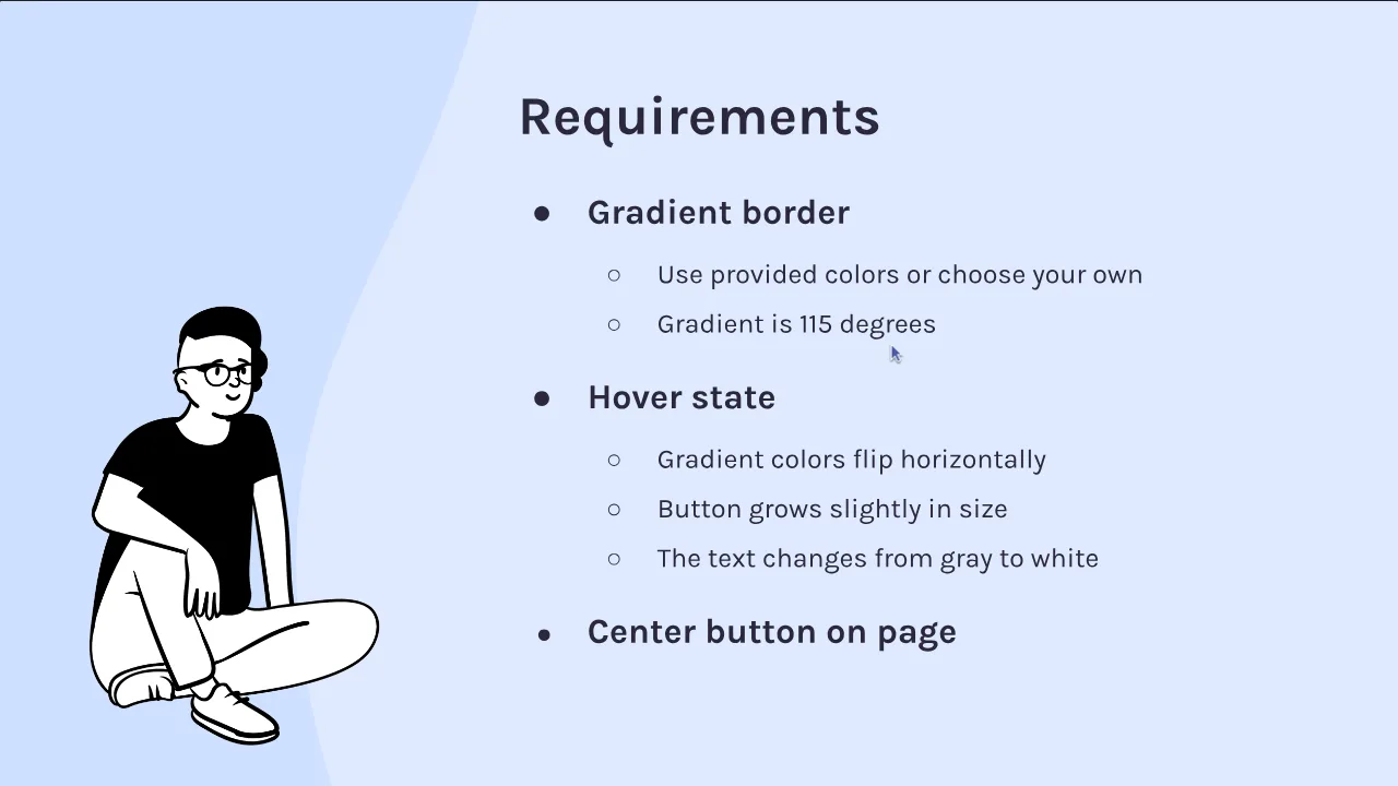
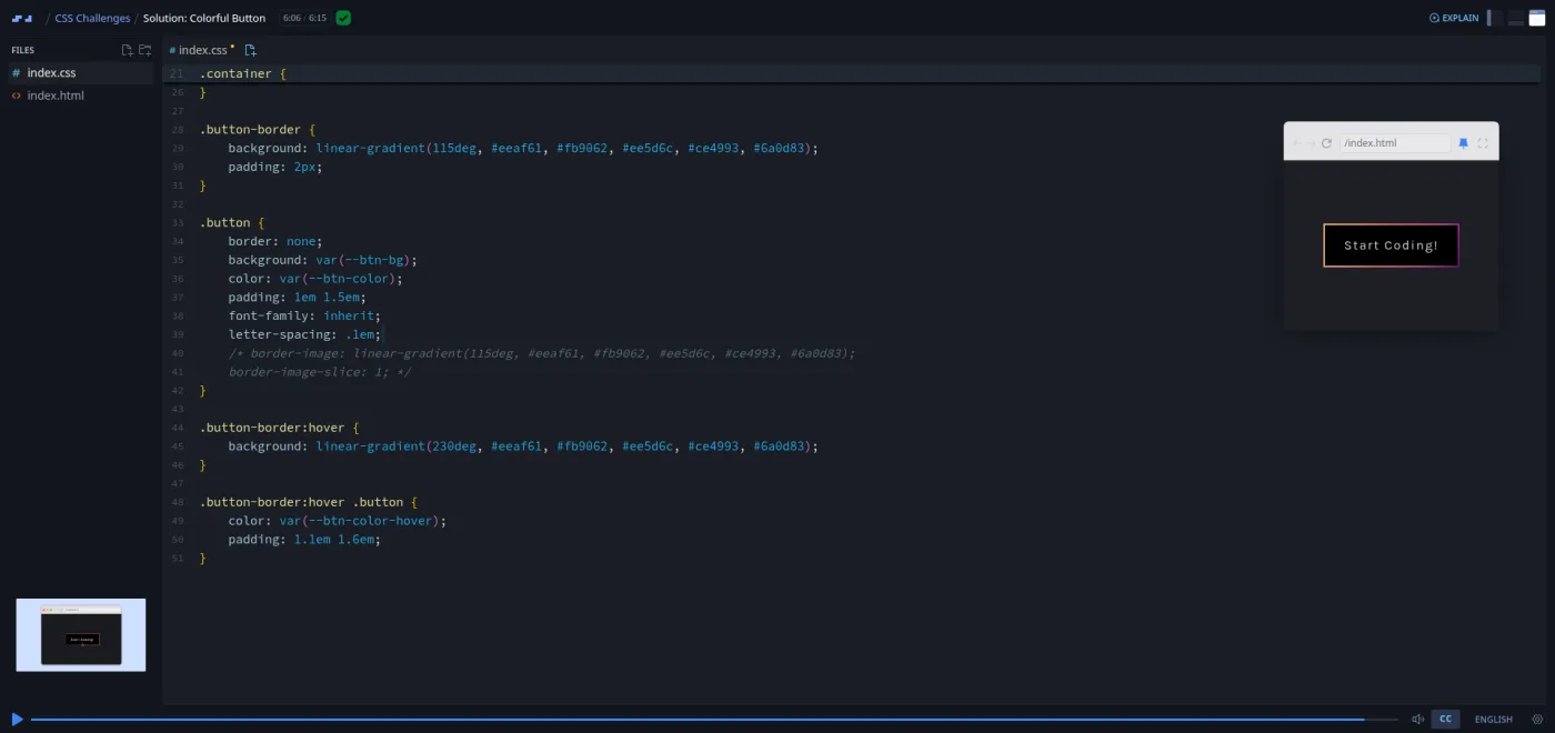
Then four challenges. Spoiler Revealer hides movie spoilers behind black bars that fade on hover ("you have had forty to fifty years to watch these films," she notes); the solution sets background and text to the same variable and adds transition: all .5s ease-in. Colorful Button asks for a gradient border at 115 degrees that flips on hover; the solution builds it with a wrapping div, then shows the border-image alternative and explains why she avoids it: "it's a little hard to grok if you ask me" and "it isn't compatible with border radius." Expanding Search Bar is modeled on GitHub's and is the one challenge with an accessibility requirement, a visually hidden label copied from the W3C. Treasure calls it "a research challenge, if you will." CodePen Tile adds object-fit: cover and a hover-only stats row, and ends with a warning: "this is a project that seems pretty simple at first but can actually be pretty fiddly."
2. Loading animations, archery target, word carousel (19 min, 9 scrims)
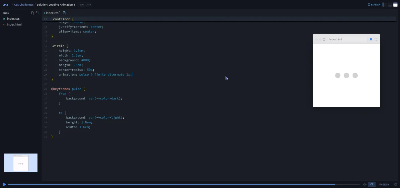
Loading Animation 1 introduces @keyframes with the smallest possible example: three circles that grow and lighten. The finished CSS is 37 lines. The memorable moment is the fix for circles that "are expanding and then immediately snapping back": the alternate keyword. Loading Animation 2 asks for three shapes rotating in unison and is deliberately open ("you can match the example, or you can use your own shapes"). The Archery Target is four stacked circles, and Treasure admits she "made it a little complicated by looking at these as rings" the first time; the solution centers each circle inside its parent with the same flexbox rules applied to every ring.
The Word Carousel is the first "wait, CSS can do that?" challenge: swap the words in a sentence on a loop with no JavaScript, by animating the content of an ::after pseudo element through keyframe percentages. The solution also teaches the course's most reused trick. Because "there isn't a way to delay the animation in between iterations, so we kind of have to fake it," the first and last keyframes hold the same word so the loop restarts without a visible skip. Between these sits a two-minute Scrimbassador referral pitch from Per Borgen; skip it.
3. Seven country flags (38 min, 14 scrims)
France, Germany, Madagascar, Switzerland, Japan, Sweden and Niger, each with a brief and a solution. The theme is proportion. Every brief repeats the same rule: "for every flag challenge, we are going to start with the height of the flag and use aspect ratio to calculate what the flag's width should be," so a 2:3 flag at --flag-height: 150px gets width: calc(var(--flag-height) * 3 / 2). The France solution builds the three stripes twice, once with flex-grow: 1 and once with grid-template-columns: repeat(3, 1fr), so you see both tools on the same problem.
The difficulty ramps. Germany and Madagascar are quick. Switzerland (the scrim is titled just "Flag Challenge") comes with a diagram of the 32-part grid behind the cross, then lets you off: "if your i's are crossing, no worries. Feel free to eyeball how big the cross should be. The really important part is that you're practicing CSS positioning." Sweden is the hardest of the set: a rotated, absolutely positioned vertical stripe placed by fractions of the flag width. At one point left lands the stripe on the wrong side, "which probably has to do with the fact that the stripe is rotated," and Treasure switches to right. She calls it "one of the trickier ones." One slip worth knowing: the Niger brief says "the flag of Nigeria" throughout, but the ratio, colors and orange disc described are Niger's, which the scrim title gets right.
4. GitHub profile, toggle, playing cards, progress bar, flashcard (40 min, 12 scrims)
This is the block that feels most like real front-end work. The GitHub Profile Layout brief points at things a careless clone would miss: "there is a subtle border around the profile image," the username is a different weight and color, the button has a faint border. The solution uses min-width and max-width for the "no wider than 400px, no narrower than 250px" rule and repeats the font-family: inherit lesson for the button.
The Toggle Switch is pure CSS and, in Treasure's words, "a pretty tricky challenge, so it might be good to stay around for some hints." The hint is the whole idea: a checkbox hidden inside a label still toggles :checked, so .toggle-input:checked ~ .toggle-switch can move the knob with translateX(calc(100px - 40px)). The solution then refactors the numbers into --toggle-width and --circle-size variables so the switch scales. The two playing cards (Ace of Spades, Four of Hearts) are layout drills: a 10% 80% 10% grid, a nested two-column grid for the pips, rotate(180deg) on the right column and scaleY(-1) on the bottom hearts. The Adjustable Progress Bar asks for four state classes (25, 50, 75, 100 percent) on an inner bar.
The Jeopardy Card Flip is the one Treasure warns about twice: "this challenge can be deceptively complex." The solution flips a card with rotateY(180deg) and a transition on transform, hits the bug where you glimpse the front text backwards mid-flip, and fixes it with backface-visibility: hidden and transform-style: preserve-3d. Her closing line is the course's attitude in one sentence: "if you got some kind of flip effect and you were able to get more familiar with transitions and using the transform property and the rotate function and all of that, you have succeeded at this challenge."
5. Spinner, Instagram stories, animated bar, contributions graph, wrap-up (31 min, 10 scrims)
Loading Animation 3 is the buffering spinner ("it's way more fun to build than it is to watch"), and the hint is that you are animating "actually the border of a circle," styling one side with border-top. The Instagram Stories Menu has the longest solution in the course at nine minutes and the most going on. A padded wrapper gives unread stories a gradient ring and viewed ones a gray ring. The red LIVE badge does not exist in the HTML; it is added with .live::after { content: 'LIVE' } and centered with what Treasure calls a "great little trick": left: 0; right: 0; margin: auto on an absolutely positioned element.
The Animated Progress Bar reuses the fake-pause idea from the carousel: the keyframes reach 100 percent width at 75 percent of the animation and hold it to the end, which Treasure notes makes the bar "slow in the beginning and then speed up, but I think that's okay. Progress bars often have variable speeds." The GitHub Contributions Graph is the only scrim with a JavaScript file; index.js generates 52 lists of seven squares with random data-value attributes, and you are told "you don't need to know how this code works." Your job is grid-template-columns: repeat(52, 1fr) and attribute selectors like [data-value="10"] for the four colors. Refresh the preview and the graph re-rolls. The congratulations scrim is under a minute ("thank you for flexing your Flexbox skills with me"), followed by Per Borgen's certificate tip.
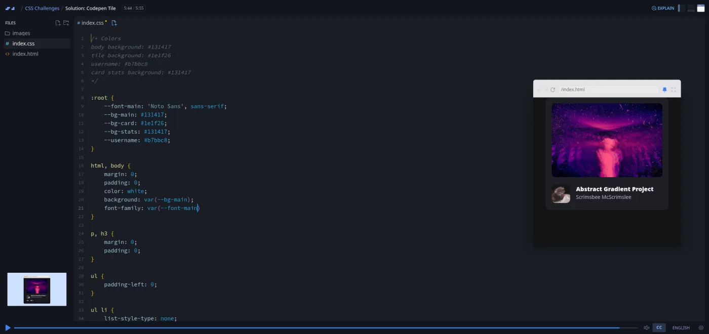
What a lesson feels like
Each challenge is two scrims. The brief runs one to three minutes: Treasure shows the finished component in the mini browser (often as a looping animation), reads a requirements slide, offers a hint slide you can skip ("if you don't want hints, go ahead and pause"), and points at the starter files. The starter is always the same shape: an index.html with the structure already written and an index.css with a :root block of color variables, sometimes a font, sometimes a --flag-height or --card-height. Then the scrim stops and you work in the same editor.
The solution runs three to nine minutes and is a plain build-along: Treasure types, the preview updates, she says what she is looking at. She thinks out loud in a way that is more useful than a polished tutorial. A typo produces "nothing is showing up because I have a typo here. We need a dash." She forgets var() around a variable and says "this is something that I always forget." You are watching someone solve a problem rather than present a finished answer.
There is no auto-grading in this course. None of the 54 scrims carries Scrimba's "Challenge with Instant Feedback" marker, so checking your work means comparing your preview with hers. Every scrim has captions, a timestamped transcript under the settings menu, subtitles in ten languages, and playback speed.
Free or Pro: exactly what is gated
The first eleven scrims are free samples: the welcome, Spoiler Revealer, Colorful Button, Expanding Search Bar, CodePen Tile, and the Loading Animation 1 challenge and solution. That is five complete challenges with solutions, enough to know whether the format works for you before paying.
Pro gates the other 43 scrims: Loading Animation 2 onward, which means the archery target, the word carousel, all seven flags, the GitHub profile, the toggle, the cards, the progress bars, the flashcard, the spinner, the Instagram menu, the contributions graph, and the certificate. There are no Solo Projects in this course; the Pro-only content is simply the rest of the challenge list. Pro also unlocks the certificate and the Pro-only Discord channels; basic Discord access is on the free plan according to Scrimba's pricing page. See current plans (opens in a new tab) for your region.
How long it takes
2.6 hours is the video. The video is mostly Treasure's solutions, and the whole point is to attempt each challenge before watching hers, so budget 20 to 40 minutes of your own work per challenge for the harder ones (Sweden, the toggle, the flashcard, the Instagram menu) and five to ten for the easy flags. That puts the real total at six to nine hours: two weeks at half an hour a day, or two long weekends. If you only watch the solutions, it is an afternoon, and you will retain little of it.
Who it's for, and who should skip it
It fits you if you have finished a CSS teaching course, can center a div without looking it up, and want to find out where your knowledge is thin. It is also good preparation for the "rebuild this component" tasks that show up in front-end interviews, and the GitHub and Instagram challenges are close to that format. People who learned CSS years ago and never used grid, calc() or CSS variables will get a compact tour of all three.
Skip it if you are still learning CSS; do Learn HTML and CSS first and come back. Skip it if what you need is responsive page layout, media queries, or design systems; the course is about single components, and Learn Responsive Web Design covers the page-level work. And skip it if you want graded feedback: there is none here beyond your own eyes and Treasure's solution.
Try the free CSS Challenges samples on Scrimba (opens in a new tab)Prerequisites
Working CSS: the box model, flexbox (justify-content, align-items, flex-grow), the basics of grid, position: absolute and relative, and pseudo classes like :hover. CSS variables help but are taught in passing (Treasure links to a primer in the welcome scrim, and there is a short Learn CSS Variables course on Scrimba). You do not need any JavaScript; the one scrim that contains a JS file tells you to ignore it. Nothing to install: everything runs in Scrimba's editor.
Where it fits
Scrimba's course page lists CSS Challenges under the Frontend Developer Path and the Fullstack Developer Path. The natural order is a teaching course first (Learn HTML and CSS, then Learn Responsive Web Design), this pack to harden it, and then the animation-heavy challenges point toward Learn CSS Animations. Treasure also teaches Scrimba's JavaScript Interview Challenges, which has the same brief-and-solution shape.
Strengths and limits
What it does well: the briefs are short and testable, the starter files remove busywork without doing the CSS for you, the solutions show two approaches where two exist (flex and grid for the flags, wrapper and border-image for the button), and Treasure's habit of describing a component in shapes before coding it is a transferable skill. The free sample covers five full challenges.
Where it is limited: there is no grading or instant feedback, so you are your own reviewer. The 54 scrims include two promos. The Niger brief misnames the country. And everything is one component in a mini browser, so it will not teach you page layout, media queries, or how these pieces fit into a real site.
Related courses and comparisons
- All Scrimba CSS courses, the full CSS category hub
- Learn Responsive Web Design, the deep teaching course to do first
- Learn HTML and CSS, the free beginner foundation
- Learn Flexbox and Learn CSS Grid, the layout tools these challenges lean on
- Learn CSS Animations, if the loading animations were your favorite part
- Practice flexbox and practice CSS grid, quick drills on this site
- Scrimba vs Frontend Masters, if you are comparing platforms
Partly. The first eleven scrims are free samples: the welcome plus five complete challenges with solutions (Spoiler Revealer, Colorful Button, Expanding Search Bar, CodePen Tile, Loading Animation 1). The remaining 43 scrims, including the flags, the GitHub and Instagram challenges, and the certificate, need Pro.
Treasure Porth (scrimba.com/@trezp). She also teaches Scrimba's JavaScript Interview Challenges. Two short promo scrims in the course are voiced by Scrimba's Per Borgen.
Twenty-five single components: a spoiler revealer, a gradient button, an expanding search bar, a CodePen tile, three loading animations, an archery target, a word carousel, seven country flags, a GitHub profile card, a toggle switch, two playing cards, an adjustable and an animated progress bar, a Jeopardy flashcard, Instagram's stories menu, and GitHub's contributions graph.
No. The briefs assume you can read a requirement and look up the property yourself, and the solutions explain choices rather than teach fundamentals. Do Learn HTML and CSS or Learn Responsive Web Design first, then use this pack to test what stuck.
No. None of the scrims uses Scrimba's instant-feedback challenge format. You build in the editor, then compare your preview with the recorded solution.
No. Every challenge is CSS only; the one scrim with a JavaScript file (the GitHub contributions graph) tells you to ignore it. Everything runs in Scrimba's browser editor.
About 2.6 hours of video, but the video is mostly solutions. Attempting each challenge yourself first puts the real total at six to nine hours, or about two weeks at half an hour a day.
Yes, for the rebuild-this-component style of front-end exercise. The GitHub profile, Instagram stories menu, toggle switch and progress bars are close to what those tasks ask for. It does not cover page layout or responsive design questions.
Yes. Every scrim has captions, a timestamped transcript under the settings menu, and subtitles in ten languages.