Learn Bootstrap
Scrimba's Learn Bootstrap is a 56 minute tour of Bootstrap 4 by Neil Rowe: 13 scrims on the grid, navbars, modals, forms, and the rest of the component set, with nothing to build and no challenges. It's an hour well spent for a Bootstrap 4 codebase, skippable if you're choosing a framework for new work.
Reviewed inside the course with a Pro account, September 2026.
Quick answer
It's a fast, Pro-gated primer on Bootstrap 4 classes, best for anyone who already has a Bootstrap codebase to read or extend. The catch: it teaches the January 2018 release with jQuery and Popper, and Bootstrap 5 renamed several of the classes it uses. For a framework worth learning today, start with Tailwind instead.
Learn Bootstrap
ProTaught by Neil Rowe (opens in a new tab)
Ten short screencasts on Bootstrap 4: the twelve column grid, collapsing navbars, modals, forms, cards, and the rest of the component set.
View on Scrimba (opens in a new tab)Is it worth your time?
For the right person, yes, and the right person is narrow. You have a Bootstrap codebase in front of you, or a team or job listing that expects it, and you want the vocabulary fast. Neil is good at that job. Each lesson starts from an empty page or a prebuilt example, adds one class at a time, and refreshes the preview after each one. You see exactly what navbar-expand-lg or list-group-flush changes.
He also tells you which numbers matter and which do not. "Don't worry about remembering the actual number of pixels," he says of the breakpoints in lesson 2. "You kinda get used to where these breakpoints are the more you use Bootstrap." A breakpoint is the screen width at which a layout changes, and Bootstrap 4 has five of them.
The problem is age. The course was recorded for Bootstrap 4.0.0 and links that exact build from the old maxcdn domain. Underneath it sit jQuery 3.2.1 slim and Popper 1.12.9, the two JavaScript libraries Bootstrap 4 needed for dropdowns, modals, and the collapsing navbar. Bootstrap 5 dropped jQuery, renamed data-toggle to data-bs-toggle, replaced ml-auto with ms-auto, and swapped no-gutters for g-0. Several of the exact classes you type here will not work on a current project. The concepts survive (the twelve column grid, breakpoint suffixes, the component naming pattern), the details do not.
And because there are no challenges, the interactive part is entirely on you. Neil says it himself in the intro: "you can literally just pause the video, edit the code, play around with it, and then go right back to the video." Do that in every lesson and the course is worth an afternoon. Only watch, and you have watched a YouTube playlist inside a code editor.
What you'll learn
The course has no modules; Scrimba lists all 13 scrims flat. The grouping below is mine, so you can see how the time is spread.
Course curriculum
13 scrims in a flat list, grouped here by topic
- Intro, grid, navbars, and modals
- Forms, list groups, cards, tables, and alerts
- Navigation options and the wrap-up scrims
I counted 13 scrims in the table of contents, which sum to 56 minutes and 32 seconds. Scrimba's own numbers disagree with each other. The course header rounds the runtime to 55 min. The structured data says 14 lessons, which appears to count the certificate entry. The About text still says "ten interactive screencasts," which is the number Neil actually recorded.
By the end you can read a Bootstrap 4 template and know what each class does. You will lay out a page on the grid, collapse a navbar behind a burger icon, open a modal, style a form and a table, and wire up a dropdown. You will not have built anything you can show, because the course never asks you to.
Inside the course, scrim by scrim
1. Intro, grid, navbars, and modals (23 min, 4 scrims)
All four of these are SAMPLE scrims, so you can watch this whole block before paying. The introduction (3:21) opens on the title card above and is Neil talking over a demo site: the grid stacking on mobile, a collapsing navbar, buttons, cards, modals. His pitch for version 4 is that it is customizable. "I always saw Bootstrap two and three as prototyping tools, but now Bootstrap four is actually a full fledged framework that you can really customize."
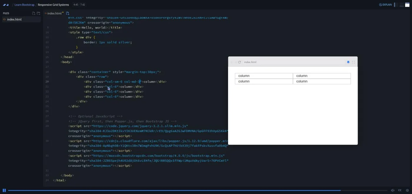
Responsive Grid Systems (7:42) is the longest lesson and the one to do carefully, because everything else builds on it. Bootstrap's grid divides any row into twelve columns, and a col-4 class means "take four of the twelve." Neil arrives with six prebuilt examples in one file, each under an h5:
- Basic
colcolumns that share the width. col-4pluscol-8set sizes ("these must always add up to twelve," and he shows what happens at eleven and thirteen).col-smbreakpoints.- Set sizes and breakpoints combined.
no-gutters, which removes the padding between columns.offset-sm-3, which pushes a column three slots to the right.
Then he codes the one that matters live. Four col-6 boxes make a two by two grid at every width. He changes them to col-sm-6 col-md-3 so they go four across on medium screens and two by two below it. That is the pattern you will copy in every Bootstrap layout you ever touch.
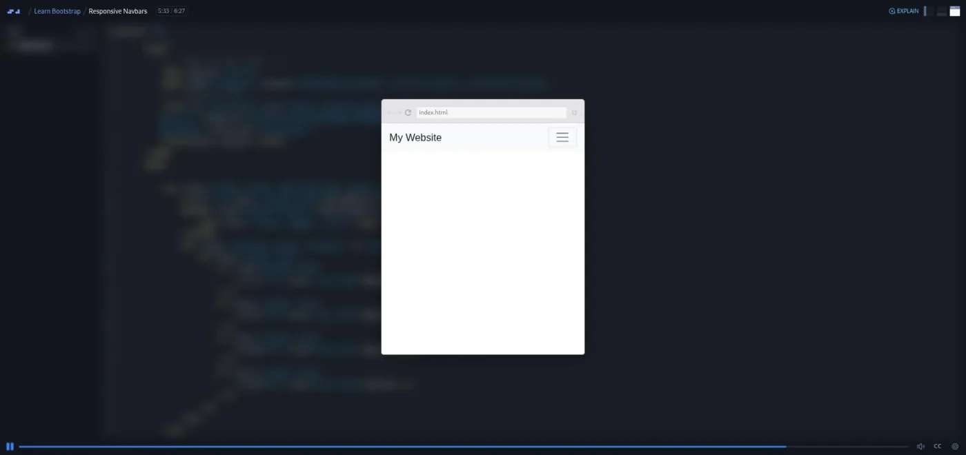
Responsive Navbars (6:27) is, in Neil's words, "the kitchen sink of nav bars." It starts from a bare nav and adds navbar, navbar-brand, navbar-light bg-light, and a navbar-nav list with nav-link items. Then comes the collapse, the part that hides the links behind a burger icon on small screens. A collapse navbar-collapse wrapper goes around the links. A navbar-toggler button is wired to it with data-toggle and data-target. Then navbar-expand-lg makes the menu horizontal above the large breakpoint and a burger below it.
The last three minutes are polish. Neil swaps the button text for navbar-toggler-icon, pushes the links to the right with ml-auto, and mentions fixed-top for a navbar that stays put when you scroll.
Modals (5:33) starts from a btn btn-primary trigger and an empty div.modal. A modal is the dialog box that pops over the page and dims everything behind it. Neil nests modal-dialog and modal-content, wires the button with data-toggle="modal" and data-target="#myModal", and adds fade for the animation. Then he fills in modal-header, modal-title, modal-body, and a modal-footer whose Cancel button uses data-dismiss.
The close cross in the corner is pasted in rather than typed. Neil waves off its aria-label, the attribute that tells a screen reader what the button does: "it's kind of up to you whether you wanna use it." That is the one piece of advice in the course I would not follow.
2. Forms, list groups, cards, tables, and alerts (23 min, 5 scrims)
Forms (6:18) is a login form built up from plain HTML that Neil describes as "looking a little bit Windows XP." The fix comes in the order you would apply it on a real project. First btn btn-primary on the button and form-control on the inputs. Then a form-group row around each label and input, split col-sm-3 col-form-label and col-sm-9. Finally a row with col-sm-9 offset-sm-3 so the button lines up under the inputs.
He makes a real mistake on the way. He types col-md-9 "by habit," notices the button jumping at the medium breakpoint, and corrects it to sm. That slip is more useful than a clean take, because it shows what a mismatched breakpoint looks like. The lesson ends on for attributes and matching ids, which is the right note.
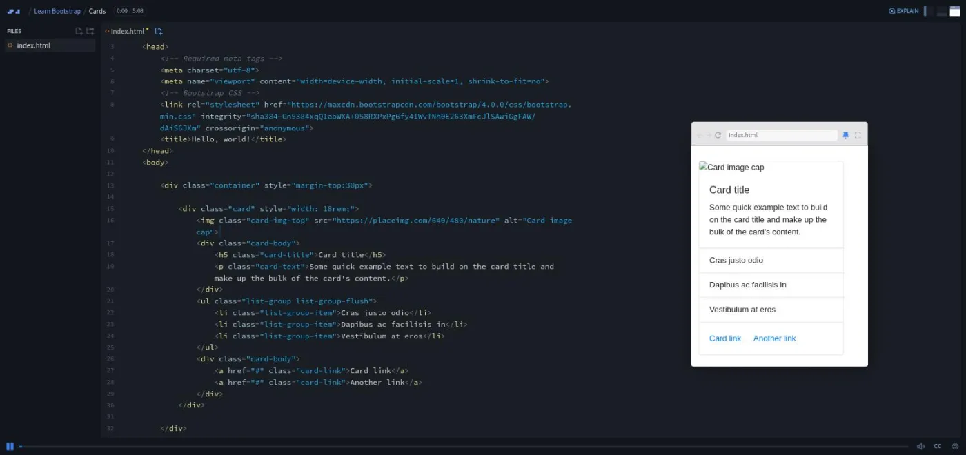
Cards (5:08) is the one I would rewrite if I ran the course. It opens on a finished card with an image, title, text, a flush list group and two links, and Neil rebuilds it from a bare card div. In order: card-body for padding, card-title (with a detour into mb-0, the utility that removes bottom margin), card-text, two buttons, then card-img-top. A list-group list-group-flush goes between two card-body blocks so the list runs edge to edge. The teaching is fine. The problem is the placeholder image host, which is gone.
List Groups (5:44) starts from a list-group div full of anchor tags with list-group-item. Neil layers on list-group-item-action for the gray hover state and active for the current page ("you should only really have one active at a time"). The useful part is the Notifications row. A span holding the number 3 becomes badge badge-primary, then badge-pill to round it. Neil pushes it to the right edge with d-flex justify-content-between align-items-center on the item.
That is the first time the course touches Bootstrap's flex utilities, the classes that wrap CSS flexbox, and he explains them in one line each. The lesson ends by swapping the anchors for a ul of li elements and stripping the action class: "there's your pretty plain boring list."
Tables (3:18) is a reference card in video form. Neil arrives with a plain three row table and adds table, which he stresses is opt in: "you have to add this class table." He is row one; John Doe and David Smith fill the rest.
Then he cycles through the modifiers with a refresh between each. table-dark, thead-dark, and thead-light for color. table-striped, table-bordered, and table-hover for readability. table-sm for density. Row colors last: table-success, table-danger, table-warning, table-primary.
"This wasn't a very complicated video," he says at the end. "It wasn't really meant to be." Treat it as a reference card you can scrub through.
Alerts (2:51) builds one div.alert.alert-info, flips it to alert-warning and alert-danger, then adds a dismiss button. The button takes class="close" and data-dismiss="alert", with the × entity for the cross. The last minute adds an h4.alert-heading, a paragraph, mb-0 to kill the bottom margin, and an hr. "This is exactly the same as Bootstrap two and three," Neil says of the whole component. That holds for Bootstrap 5 too, apart from the data-bs-dismiss rename.
3. Navigation options and the wrap-up scrims (10 min, 4 scrims)
Navigation Options (4:45) is Neil's last lesson and the only scrim with three files in its explorer. index.css and index.js sit next to index.html, though the lesson never opens them. It starts from a bare ul.nav with nav-item list items and nav-link anchors, then tries the variants in turn. nav-pills does nothing visible until an item gets active. nav-tabs draws the tab outlines. nav-fill spreads the items across the full width, and disabled grays one out.
The final two minutes turn item two into a dropdown. That takes dropdown-toggle on the link, data-toggle="dropdown", a dropdown-menu div of dropdown-item links, and a dropdown-divider (Neil types divider first, sees nothing, and corrects it). He mentions that the tabs can switch content with jQuery and says "I might do a follow-up video where I look at some of the sort of JavaScript parts to bootstrap." No such lesson exists in this course.
After it come three Scrimba house scrims. Two of them have ids outside the ~00 to ~0b sequence, so they look like later additions.
"Congrats & Next Steps!" (2:30) is Per Borgen, not Neil, on a "Well done!" slide, and it is a sales pitch for the Responsive Web Design course. "You need to understand how bootstrap works under the hood," he says. "And the only way to understand that is to understand how CSS works." He is right, and that course (15 hours, still Pro, on both the Frontend and Fullstack paths) has aged better than the one this pitch is attached to.
"Want to become a Scrimbassador?" (1:59) is the affiliate program. "How to Utilize Your Certificate" (0:56) is the generic certificate scrim that closes most Scrimba courses.
What a lesson feels like
Every lesson is one index.html with Bootstrap, jQuery, and Popper linked from CDNs in the head. A floating preview window sits beside the code, and Neil resizes it by hand to show the breakpoints. He types nearly everything, narrates the class he is about to add, refreshes, and points at what changed.
Neil's lessons run from 2:51 to 7:42, and there is no "your turn" anywhere: no challenge scrims and no solo project. The transcript panel (under the gear icon in the player) is complete and timestamped, captions work, and the language menu lists ten subtitle languages.
Neil's delivery is unpolished in a likeable way. "Um" and "sort of" are left in, the transcript renders "modal" as "model" more than once, and he numbers the lessons out loud ("this is episode seven") even though Scrimba's list does not. He moves quickly enough that pausing to type along is the only way to keep up.
Free or Pro: exactly what is gated
The four SAMPLE scrims play without a subscription: the introduction, Responsive Grid Systems, Responsive Navbars, and Modals. That is 23 minutes and the best material in the course. The remaining six lessons (Forms, List Groups, Cards, Tables, Alerts, Navigation Options), the three wrap-up scrims, and the certificate of completion need Pro.
There are no solo projects to gate because there are none in the course. Scrimba's pricing page lists basic Discord access as free and the Pro-only channels as Pro; see current plans (opens in a new tab) for what is included in your region.
How long it takes
Runtime is 56 minutes. If you pause each lesson, retype the classes into the editor, and resize the preview yourself to check the breakpoints, plan on two to two and a half hours. The grid, navbar, and forms lessons are the ones worth slowing down for.
Watching straight through takes an hour and teaches you the names of things and not much else. Budget a further hour if you are going to apply it to Bootstrap 5, because you will be looking up the renamed classes as you go.
Who it's for, and who should skip it
It fits you if you already write HTML and CSS and need to become useful in a Bootstrap 4 project quickly: an inherited site or a company template. It also works as a preview of what a component framework does before you commit to learning one, and the free sample scrims cover that on their own.
Skip it if you are picking a framework for new work. Tailwind is the framework Scrimba puts on its paths now, and its Tailwind course is more than twice as long. Skip it if your project is on Bootstrap 5 and you need exact syntax; the concepts transfer but you will be translating class names from the moment you start. And skip it if you have not learned CSS yet, because the course never explains what its classes do underneath. Take Learn HTML and CSS first, then this.
Watch the free sample scrims of Learn Bootstrap (opens in a new tab)Prerequisites
Working HTML and enough CSS to know what a margin, a block element, and a media query are. Neil explains the input's block behavior in the Forms lesson but assumes the rest. No JavaScript is written anywhere in the course, though jQuery and Popper are loaded for the navbar collapse and the modal. Nothing to install: every lesson runs in the browser.
Where it fits
This is a standalone course. It is not on any Scrimba career path, and the CSS courses that are (Learn HTML and CSS, Responsive Web Design, Flexbox, CSS Grid, Tailwind) do not depend on it. Its natural neighbor is Learn Responsive Web Design, the course Per pitches in the outro and the one that teaches what Bootstrap's grid is doing for you. If you finish this and want the grid without the framework, Learn Flexbox and Learn CSS Grid are the next hour.
Strengths and limits
What it does well: the sample scrims are free and they are the best ones. Neil builds each component class by class with a refresh after every change, so cause and effect are always visible. The grid lesson's six prebuilt examples make a good reference file to download. The whole thing fits in an afternoon.
Where it is limited: it teaches Bootstrap 4.0.0 with jQuery, two major versions of thinking behind current Bootstrap. There are no challenges, so nothing checks that you learned anything. The accessibility attributes are shrugged off. The placeholder image in the Cards lesson no longer loads, and nobody has swapped the URL.
Related courses and comparisons
- All Scrimba CSS courses, the full CSS category hub
- Learn Tailwind CSS, the more current styling skill
- Learn Responsive Web Design, CSS layout from the ground up
- Learn Flexbox and Learn CSS Grid, the native layout tools
- Learn HTML and CSS, if you need the fundamentals first
- Scrimba vs freeCodeCamp, if you are weighing platforms
Partly. Four scrims are marked SAMPLE and play without a subscription: the introduction, Responsive Grid Systems, Responsive Navbars, and Modals, about 23 minutes in total. The other six lessons, the wrap-up scrims, and the certificate need Scrimba Pro.
Bootstrap 4.0.0, loaded from a CDN in every lesson together with jQuery 3.2.1 slim and Popper 1.12.9. Bootstrap 5 renamed several of the classes used here (data-toggle became data-bs-toggle, ml-auto became ms-auto, no-gutters became g-0) and removed jQuery, so expect to translate.
Neil Rowe (@neil_rowe_ on the title card). The intro scrim is his; the Congrats scrim at the end is recorded by Scrimba's Per Borgen and the final two scrims are generic Scrimba clips about the affiliate program and the certificate.
No. None of the 13 scrims is a challenge, there are no AI-checked exercises, and there is no solo project. Neil suggests pausing and editing his code, and that is the only practice the course offers.
Nothing that persists across lessons. Each scrim is a single index.html demonstrating one component: a six-example grid file, a collapsing navbar, a modal with header, body and footer, a two-field login form, a card with an image and list group, a list group with a notification badge, a styled table, a dismissible alert, and a tab bar with a dropdown.
56 minutes of runtime. Pausing to retype the classes and resize the preview yourself takes it to two to two and a half hours.
No. Every lesson links Bootstrap, jQuery, and Popper from CDNs and runs in Scrimba's in-browser editor. The only thing that fails to load today is the placeholder image in the Cards lesson, because placeimg.com has shut down.
Yes. Every scrim has a full timestamped transcript under the player's gear menu, captions, and subtitles in ten languages.
Only with a reason: a legacy project, a team standard, or a job that lists it. For new work with a free choice, Tailwind is the more current skill and Scrimba's Tailwind course is the one to take.