Learn UI Design
Gary Simon's Learn UI Design runs about 8.6 hours of fixing bad interfaces in plain HTML and CSS, no design tool required. You build a refactored dashboard, a tea shop landing page, a signup form, and the Scenic Forests cabin rental site. It is the fastest way to learn why your layouts look unfinished and how to fix them.
Reviewed inside the course with a Pro account, September 2026.
This page is part of our Scrimba CSS courses catalog.
Quick answer
It fits developers who can build a layout but cannot say why it looks unfinished, and self-taught coders polishing a portfolio project. The one catch: nothing here touches a design tool, so if grid-template-areas or position: absolute are shaky, do Learn HTML and CSS first.
Learn UI Design
ProTaught by Gary Simon (opens in a new tab)
Seven design fundamentals applied through 45 fix-it challenges in HTML and CSS, ending in a multi-page cabin rental site.
View on Scrimba (opens in a new tab)Is it worth your time?
Yes, if you are a developer whose interfaces work but look amateur, and you want a fix you can apply in the code you already write. The course's whole method is repetition: Gary puts a bad design in front of you, asks you to pause and improve it, then walks through his own version. By the fourth or fifth round you start seeing the problems before he names them, which is the skill the course is selling. He says as much in the first challenge: "We're gonna go through so many more of these, and you're really going to start developing that eye."
This design course assumes solid CSS. Gary types fast, pastes in blocks of rules, and expects you to know what grid-template-areas, position: absolute, and ::before do. If those are shaky, do Learn HTML and CSS first.
The recordings show their age. Gary refers to Adobe XD alongside Figma, the JavaScript is old-school addEventListener code, and a couple of the tool links he reads out (a box-shadow generator, a layered-shadow generator) may have moved. None of the design advice has aged, because none of it depends on a tool.
What you'll learn
Course curriculum
12 modules · 100 lessons
- Course Introduction
- UI Design Fundamentals
- Building A Simple Layout
- Responsive Design
- Responsive Navigations
- Full Project Refactoring
- Tea UI Design Project
- Shadows
- Gradients
- Forms
- UI Animation
- Final Project
Lesson counts are the scrims I counted in each expanded module in September 2026: 100 in the twelve modules, plus a one-minute "How to Utilize Your Certificate" scrim outside them, for 101. Scrimba's listing says 102 lessons, and the 0/5, 0/2 counters in its module headers count only the scrims flagged as challenges (45 across the course), not every lesson.
Inside the course, module by module
1. Course Introduction (5 min, 3 scrims)
Three short slide scrims, all free to preview. Gary introduces himself ("I've been a UI UX designer for two decades as well as a front end developer") and sets the prerequisite ("you need to know basic HTML and CSS"). He also explains why the course lives in a code editor: "because I'm teaching UI design on the Scrimba platform, the only way to teach it is through the actual editor with HTML and CSS." The second scrim, Subjectivity vs. Objectivity, is the thesis of the course. "My subjective design preferences are not important," he says. "The way you become a great designer is to first understand these objective design fundamentals."
The third scrim answers the question everyone asks. "How on earth am I going to learn how to design user interfaces without working in an actual design app like Figma?" His answer: HTML and CSS are tools too, but for the bigger challenges he recommends sketching a mockup in Figma, XD, or Sketch first, because "these design tools allow you to quickly iterate."
2. UI Design Fundamentals (72 min, 17 scrims)

The core of the course and the module the rest of it refers back to. It opens with three scrims Scrimba added later for the Frontend Path. There is a narrated Welcome ("Your teacher for this module is Gary Simon, who you might know from YouTube"), an aside by Guil from Scrimba on design roles (user researchers, UX designers, UI designers, and the tools each uses), and a short Frontend Career Path scrim, which I did not open. Nine of the 17 scrims here are free previews, so you can try most of this module before paying.
Then Gary takes the fundamentals one at a time, each on its own small example: White Space (two identical cards, one fixed with padding, margin-bottom, and line-height), Alignment, Contrast, Scale, Typography (a testimonial section using three typefaces, cut down to one), Color, and Visual Hierarchy. That last one is a mailing list form where nothing stands out until the heading grows and the button turns yellow. Four Design Challenges are threaded between them, and The Final Challenge hands you a purple dashboard panel that breaks four fundamentals at once.
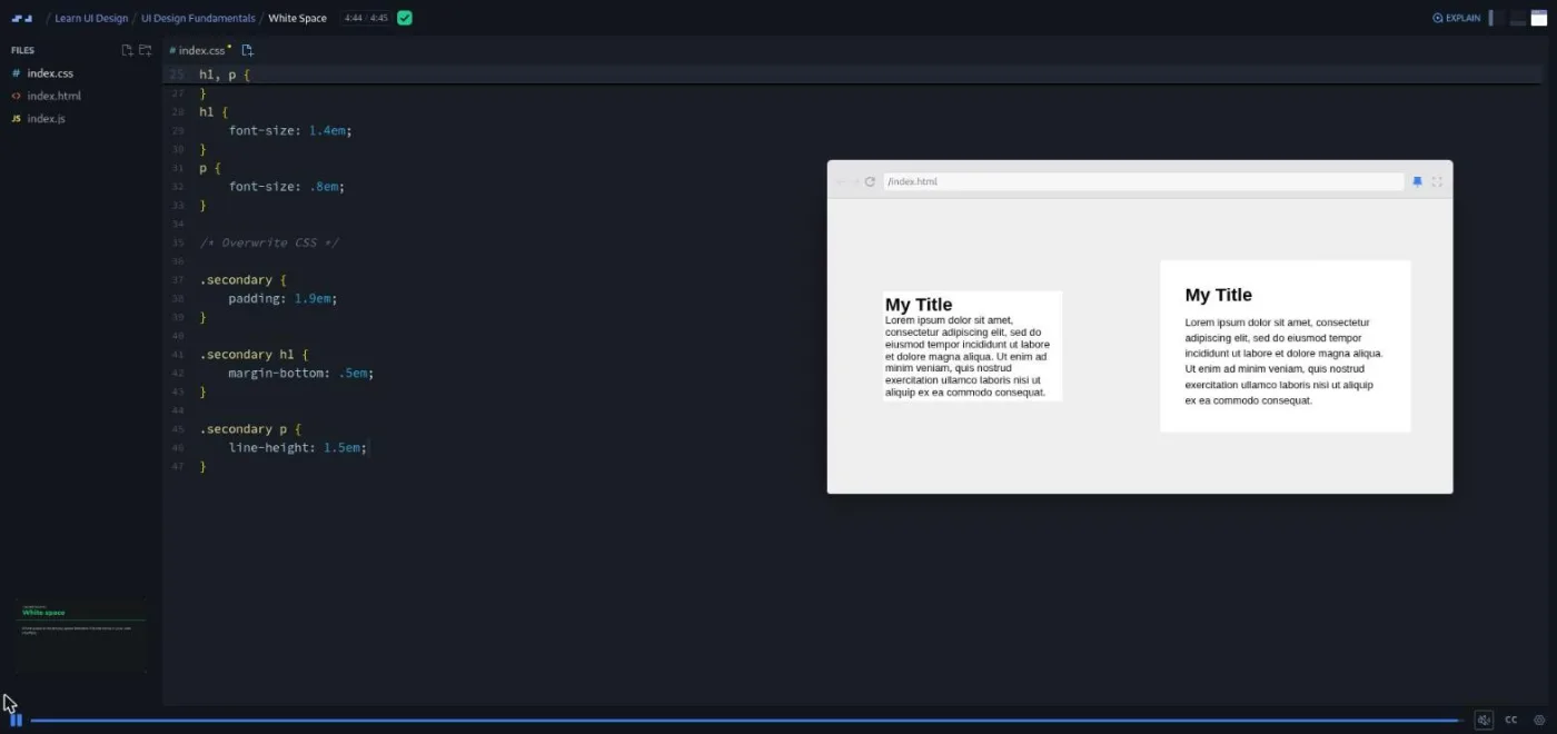
The challenge loop is set in Design Challenge 1: "go ahead and pause right now and then come up with your solution. And then hit play, and I'll show you what I would do." He is explicit that there is no single right answer: "as long as you're adhering to good white space and alignment fundamentals, then you're good to go."
3. Building A Simple Layout (37 min, 7 scrims)
The first time you build rather than fix, and Gary keeps the materials deliberately tiny. "Throughout this entire chapter, we're going to only work with these HTML elements you see here along with these rule sets of body, paragraph, heading one, and span," he says in the intro. "You're probably thinking I'm crazy, but you would be surprised how much you can do with so little."
Keeping it Ultra Simple centers a label and a headline with display: grid and place-content: center, then walks through all seven fundamentals to check the result. Making our Layout Dark, Challenge 1, Multi-Columns, and Working with Photographs add one ingredient each. The Final Chapter Lesson is the payoff: a title, a paragraph, and a photo of a stop sign become a two-column layout with a 5em headline, a ::before underline picked from a color in the photo, and a ::after circle. He also shows how to handle a busy photo: darken it into a watermark, or give the text its own column.
4. Responsive Design (52 min, 9 scrims)

A mobile-first build of a small food site called Tasty Bites. Defining the HTML comes first, then three Mobile First CSS scrims: Nunito as the font, a .wrapper class for padding, a pink logo, and a horizontal nav of pill-shaped links. Gary's reasoning for not using a hamburger here is typical of the course: "we have enough room, and then that reduces the amount of clicks a person has to take."
Responsive Design (Part 1) adds the first media query, Responsive Design Challenge 1 asks you to add the next, and the Final Chapter Challenge gives you a profile card with breakpoints at 500 and 1000 pixels already written in. Your job is to rearrange the avatar, name, paragraph, and button with grid-template-areas so the card stops looking like "an extremely long button" on wide screens. As Gary puts it at the end, "it's all about, I can't stress this enough, it's all about the UI design fundamentals."
5. Responsive Navigations (35 min, 8 scrims)
The intro is a rules slide deck: prioritize content, "you don't always need a hamburger menu," and "I've seen a lot of designers needlessly place a hamburger menu on desktop resolutions." Then you build one: HTML, two Mobile CSS scrims for a slide-out panel, and a Responsive CSS challenge for the desktop bar.
Making the Mobile Menu Work is the one JavaScript lesson in the first half of the course: a get() helper, three getElementById calls, and two click listeners that add and remove an open-nav class. Gary says "hopefully you will have a little bit of JavaScript experience," and that is all it takes. Animating the Mobile Menu adds the slide-in transition he promises at the end of that lesson, and the Sub Menu Design Challenge closes the module with a Services dropdown that has to work indented on mobile and as a hover panel with a box shadow on desktop.
6. Full Project Refactoring (44 min, 8 scrims)
My favorite module. Gary writes the HTML for a company dashboard, applies what he calls "our ugly CSS," and then spends six challenges fixing it one fundamental at a time. Fixing the Color & Contrast (his solution changes exactly two background colors), Fixing the Type & Visual Hierarchy, and Fixing White Space come first, then three media-query challenges for tablet and desktop. The last one turns the body into a CSS grid with grid-template-areas so the slide-out nav becomes a permanent sidebar at 850 pixels.
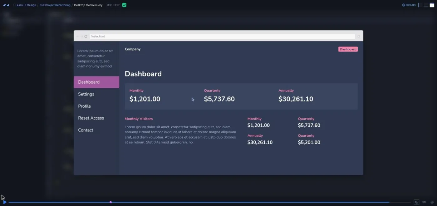
He is candid about difficulty here: "if you didn't, like I said, don't kill yourself over it. I mean, this is hard, and it takes a while to get used to." The module ends with a two-minute Scrimbassador promo from Per Borgen, which is not course content.
7. Tea UI Design Project (46 min, 9 scrims)
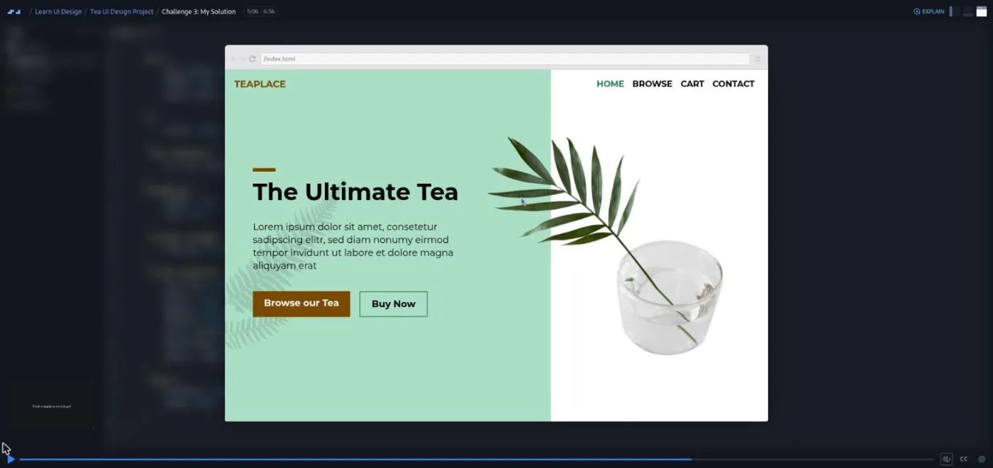
The first design from scratch with real constraints: a wireframe (logo, menu, headline, copy, two buttons), a three-color palette given as hex codes, a fern SVG, and a transparent PNG of a plant that both have to appear. Gary insists on a mockup first: "don't just jump into the code... That could be Figma. It's free, very popular."
Three challenges cover mobile, tablet, and desktop, each followed by a "My Solution" scrim (the mobile solution takes two scrims, 8 and 9 minutes). The desktop version puts a green column behind the text with an absolutely positioned div and lets the plant PNG overlap the edge for what he calls "a feeling of depth." He also checks his colors against WCAG 2.0 contrast on the way, and admits how he got there: "how do I know exactly how to use these certain properties to achieve what I want? And that's just because I'm experimenting with the properties."
8. Shadows (26 min, 6 scrims)
Shadows 101 is a two-minute history lesson that ends with a warning: "A bad drop shadow is a recipe for UI disaster." Then three challenges on one card: hard and soft shadows, shadows to define containers, and colored shadows. The useful numbers are in Challenge 1. For a soft shadow, keep the alpha at 12 percent or below ("for me, I like point one at ten percent"); a small hard shadow can go to about 20. The Quick Tip scrim shows layered, comma-separated box shadows from a generator site.
9. Gradients (30 min, 6 scrims)
Same shape as Shadows: a short intro on why gradients vanished with flat design and are creeping back, then four challenges. Basic Gradient, Button Gradient (white to a barely lighter purple, then a dark version on a light background), and two Card Gradient variations. Gary shows a glossy two-tone button and says, "I hate to say never do it, but it's just something that we don't see often at this current point in time."
10. Forms (52 min, 7 scrims)

Forms 101 lists the rules: consistent styling, labels rather than placeholders ("you should always use a label instead of relying on the placeholder value"), multi-step forms with a progress bar for anything long, inline validation, and keeping custom controls accessible to screen readers. The next six scrims build exactly that: a three-step "become a member" signup with a step indicator across index.html, step2.html, and step3.html.
Challenge 1 has you style the fields and design an error state (a softer red border with a "This field is required" badge, because "if it's too red, it just breaks the design"). Challenge 2 makes it responsive, Challenge 3 replaces the native radio buttons with appearance: none circles and a :checked::before dot, and Challenge 4 does the same for checkboxes. Challenges 1 and 3 both run past ten minutes, among the longest scrims in the course.
11. UI Animation (32 min, 5 scrims)
Shorter on animation than the title suggests. The intro is the useful part: keep most animations under a second, mind your easing, only animate what the user interacts with, and stick to opacity and transform for performance. The next three scrims build a landing page with a phone illustration (HTML, mobile CSS, an 11-minute responsive challenge), and only the last scrim animates anything. In A Simple Hover, Gary rejects a black hover background ("way too much of a jolt"), rejects transform: scale(1.2), tries a one-second transition that becomes "almost unnoticeable," and settles on an instant, slightly darker color. His summary, once he untangles the sentence, is that less is more when it comes to animation.
12. Final Project (86 min, 15 scrims)

Scenic Forests, "a fictional project for a company that rents cabins in the woods": responsive nav, a hero over a forest photo, three featured cabin cards, a testimonial, and a cabins.html sub page. Gary writes the HTML across two scrims, then the mobile CSS across five (navigation, two hero scrims, features, finishing). The challenges are the responsive steps: Small Tablet at 550 pixels (inline nav, three-column cabin grid), Desktop, Testimonials on Desktop, and Style the Sub Page. He gives fewer hints now: "I'm not gonna really help you that much this time because we're at the end of the course."
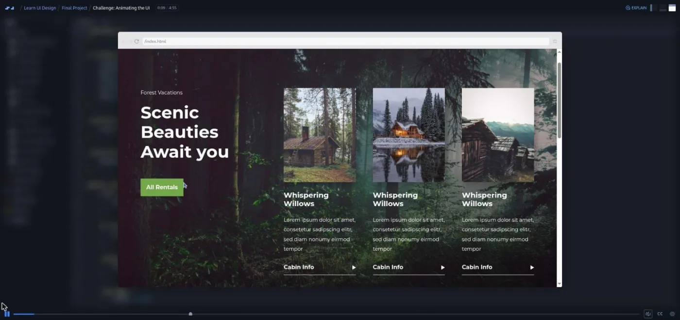
The last challenge, Animating the UI, brings in GSAP through a CDN script tag: a timeline that fades the copy up, reveals the headline words with clip-path, and staggers the cabin cards. "My solution is only four lines of JavaScript," Gary says, and you can do it in plain CSS if you prefer. A bonus scrim on pattern libraries, style guides, and design systems ends the course with a good analogy. A pattern library is "the unpainted pieces of a model airplane," the style guide decides what to paint them, and the design system is "the actual instruction manual on how to piece the whole thing together."
What a lesson feels like
Scrims run from 34 seconds to eleven minutes; most are three to seven. Chapter intros are slide decks in Gary's voice. Everything else is the Scrimba editor with the preview pane pulled out large, and Gary mostly typing, occasionally pasting a block of rules to save time. Challenges are not AI-checked here: the brief is a comment in index.css ("Use the following properties to fix the alignment and white space issues on the rule sets below this comment") and Gary telling you to pause. The solution is either the rest of the scrim or a separate "My Solution" scrim.
Gary ends most fixes with a before-and-after, deleting his new rules so you see the ugly version again, and he recites the fundamentals list so often that you start doing it yourself. He also assumes you have dev tools open; several solutions begin with a color picker in the inspector.
Every scrim has captions, a timestamped transcript under the settings menu, subtitles in ten languages, and playback speed. There are no dependencies to install: the whole course is HTML, CSS, a few image files, and one CDN script for GSAP.
Free or Pro: exactly what is gated
Twelve scrims carry the SAMPLE badge and open without Pro: the three Course Introduction scrims, and nine in UI Design Fundamentals (Welcome, the design roles aside, the chapter introduction, White Space, Alignment, Frontend Career Path, Design Challenge 1, Typography, and Color). That is enough to judge Gary's style and do one real challenge.
The other 89 scrims are Pro, which means every project (the dashboard refactor, TeaPlace, the signup form, Scenic Forests), the Shadows, Gradients, Forms, and Animation modules, and the Certificate of Completion. There are no Solo Projects in this course. The About text says Gary "will constantly encourage you to share the UI designs you create in Scrimba's Discord channel"; basic Discord access is free on Scrimba's pricing page, with Pro-only channels for subscribers. See current plans (opens in a new tab) for what Pro costs in your region.
How long it takes
8.6 hours is video runtime. Around 45 scrims ask you to pause and produce a design before the answer, and Gary wants a Figma mockup before the bigger ones (TeaPlace, Scenic Forests). Plan for 20 to 25 hours: three to five weeks at an hour a day. The Final Project alone is 86 minutes of video and will take most people a weekend. Skip the mockups and you can get through in about 15 hours, with less to show for it.
Who it's for, and who should skip it
It fits front-end developers who can build a layout but cannot tell why it looks off, self-taught developers assembling a portfolio, and people on the Frontend Developer Path who want the design module done properly. It also suits designers who want to pick up CSS through design work; Gary says in the intro that "you will definitely learn some HTML and CSS strategies."
Skip it, for now, if your CSS is not solid. Gary does not stop to explain grid areas or absolute positioning. Do Learn HTML and CSS or Learn Responsive Web Design first. Skip it if you want a Figma course; there is no design tool instruction here, only a recommendation to use one. And if you only want the principles without the projects, the free Intro to UI Design Fundamentals covers the first chapter's ground in about an hour.
View Learn UI Design on Scrimba (opens in a new tab)Prerequisites
Comfortable HTML and CSS: flexbox, grid, media queries, pseudo-elements, and em units, which Gary uses everywhere. A little JavaScript helps for two lessons (the mobile menu toggle and the GSAP animation) but is not required elsewhere. No design tool is required, though Figma or similar makes the project challenges easier. No installs.
Where it fits
This is the design course in Scrimba's front-end sequence. Scrimba lists it under the Frontend Developer Path and the Fullstack Developer Path, and the Welcome scrim was recorded for that placement (it refers to "this module" and to solo projects elsewhere in the path). It is the full version of the free Intro to UI Design Fundamentals. If the animation module leaves you wanting more, Learn CSS Animations is the deeper course on that one topic.
Strengths and limits
What it does well: the fix-it challenge format trains the eye faster than lectures would, every principle is shown on real markup you can inspect, the projects get progressively harder in a sensible order, and Gary is honest about subjectivity without letting you off the hook on the fundamentals.
Where it is limited: it is Pro-only with a small free sample, and the recordings are a few years old (Adobe XD references, older JavaScript style). The Animation module builds a page for three scrims and animates for one, the challenges are not auto-checked so you grade yourself, and there is no Figma teaching for people who expected a design-tool course.
Related courses and comparisons
- Intro to UI Design Fundamentals, the free taster this expands on
- Learn Responsive Web Design, the deep CSS course to pair with it
- Learn CSS Animations, which goes deeper on the animation module's topic
- Learn HTML and CSS, the free foundation to do first
No. Twelve of its 101 scrims are free previews (the three intro scrims and nine in UI Design Fundamentals, including the White Space, Typography, and Color lessons and the first challenge). The remaining 89 scrims, all four projects, and the certificate need Scrimba Pro.
No. Every lesson is taught in HTML and CSS inside Scrimba's editor. Gary Simon recommends sketching a mockup in Figma, Adobe XD, or Sketch before the larger project challenges, but he never teaches those tools and you can skip the mockup.
Gary Simon, a UI/UX designer and front-end developer who runs the DesignCourse YouTube channel. Three short scrims in the Fundamentals module are Scrimba path inserts rather than Gary (a welcome, an aside on design roles, and a Frontend Career Path scrim), and a Scrimbassador promo is by Per Borgen.
A refactored company dashboard, a TeaPlace tea shop landing page from a wireframe and palette, a three-step signup form with custom radio buttons and checkboxes, a landing page with a hover animation, and the Scenic Forests cabin rental site with a landing page and a sub page. Smaller exercises cover cards, a profile card, a food site, and a responsive navigation.
Gary describes the fix in the transcript and in a CSS comment, asks you to pause, then shows his solution, sometimes in a separate My Solution scrim. Around 45 scrims work this way. They are not auto-checked, and he repeats that any answer that respects the fundamentals is fine.
Only a little, for two lessons: Making the Mobile Menu Work (a few click listeners that toggle a class) and the final GSAP entrance animation, which Gary says is four lines and can be done in CSS instead.
About 8.6 hours of video. With the pause-and-fix challenges and a mockup for the two bigger projects, plan for 20 to 25 hours, or three to five weeks at an hour a day.
Yes. Every scrim has captions, a timestamped transcript in the settings menu, and subtitles in ten languages.
The free intro covers the fundamentals chapter in about an hour. This course adds ten more modules: layouts from scratch, responsive design, navigation, a full refactor, shadows, gradients, forms, animation, and two complete projects.