Learn Tailwind CSS
Scrimba's Learn Tailwind CSS, taught by Rachel Johnson, runs about 2.2 hours across two modules and 33 scrims: you go from w-64 and bg-slate-700 to a responsive plant blog and five mockup-to-code challenges. It is a quick, clearly sequenced way to get fluent in utility classes if your CSS, flexbox especially, is already solid.
Reviewed inside the course with a Pro account, September 2026.
Quick answer
It fits you if you write CSS comfortably and want to stop translating class strings like flex items-center justify-between gap-4 in your head. The catch: it is Pro-only past the third scrim, and it skips Tailwind's configuration side entirely, no grid utilities, no dark mode, no build pipeline. If your flexbox is not solid yet, start with Learn Flexbox or Learn Responsive Web Design first.
Learn Tailwind CSS
ProTaught by Rachel Johnson (opens in a new tab)
Tailwind's utility classes taught one family at a time, applied to a responsive blog, then tested in five mockup-to-code challenges.
View on Scrimba (opens in a new tab)Is it worth your time?
Yes, if your CSS is already solid and you want to stop squinting at class strings like flex items-center justify-between gap-4. The course is built around a single idea: every Tailwind class maps to a CSS property you already know, so the job is learning the naming scheme, not learning layout. Rachel says as much before the flexbox lesson: "I'm going to assume that you're already familiar with how Flexbox works, and we're going to focus on how to use Tailwind to apply Flexbox properties quickly and efficiently."
The format suits Tailwind unusually well. You type a class into the editor, save, and the preview beside it changes. That feedback loop is the whole pitch of utility-first CSS, and the player gives it to you without a build step. The project loads Tailwind from the cdn.tailwindcss.com script tag, and the intro warns you about the "CDN isn't optimized for production" notice you will see on every save.
It is short and knows it: the outro says "this course was just an introduction to Tailwind" and points you to the docs for everything it skipped (grid utilities, custom configuration, dark mode, arbitrary values, and any build tooling). It also uses the Tailwind 3 Play CDN. Install Tailwind 4 locally afterward and the classes still work, but the setup looks different, and the course does not cover installing anything.
What you'll learn
Course curriculum
2 modules · 33 lessons
- Learn Tailwind CSS
- Tailwind CSS Challenges
Lesson counts are the scrims I counted in each expanded module in September 2026, plus one 53 second "How to Utilize Your Certificate" clip that sits after the certificate outside both modules. Scrimba's own figures differ. The module headers read 0/13 and 0/0, which match neither the scrims you click nor the challenge icons. The course listing and its structured data say 65 lessons, which counts the clips inside scrims rather than the scrims you click. When other pages on this site quote 65 lessons, that is Scrimba's number.
Twelve scrims in module one carry the small "Challenge with Instant Feedback" icon (Element Sizing through Flexbox, plus Layout and Extra Styling). The challenges live as comments in the HTML, and Rachel's solution follows in the same scrim after a pause.
Inside the course, module by module
1. Learn Tailwind CSS (83 min, 21 scrims): utilities, then the plant blog
The first two scrims are free previews. The welcome shows the finished project, "a simple blog that plant lovers can contribute to," and lists the concept order. "What is Tailwind CSS?" is a live demo: Rachel drops h-screen flex items-center justify-center on a body and bg-red-500 text-white px-4 py-2 rounded-full font-bold text-2xl hover:bg-red-700 hover:uppercase on a button, then makes the case for utility classes ("no more switching between HTML and CSS files").
Element Sizing (the third free preview) introduces the numbering scale with the line that unlocks the rest of the course: "one unit is equal to zero point two five rem, And if a browser uses default settings, zero point two five rem will equal four pixels." You get fixed units (w-64), fractions (w-1/2, h-1/3), and viewport units (w-screen), and a first challenge written as HTML comments: make one section full viewport height, another a third tall and half wide. Colours covers the 50 to 950 shade scale and a four-part challenge that turns a plain page into something that "really looks like pizza." Padding and Margin adds p-, m-, side and axis variants, and mx-auto.
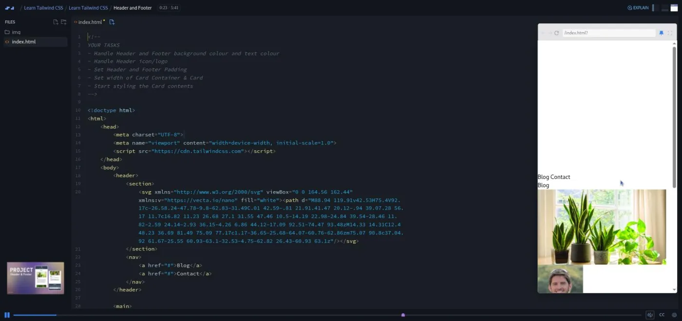
Header and Footer is where the project starts: "Our client would like us to style their plant enthusiasts' blog using Tailwind CSS." You get a plain HTML file, an img folder, a mockup slide, and a task list. The pattern for the rest of the module is set here. A theory scrim comes with a small throwaway exercise (a stack of book spines, a game character card, a newspaper preview, potion bottles on shelves, a cafe menu). Then a project scrim applies those classes to the blog against the mockup.
The typography run is three theory scrims (font families and weights, text size and alignment, then tracking, leading and line-clamp, which Rachel calls "one of my favorites") followed by the Typography project scrim, where the blog's excerpt gets line-clamp-3. Display and Position is short; Flexbox is the longest theory scrim at six minutes and the one to watch closely, because almost every layout in the challenges is flex flex-col items-center plus gap.
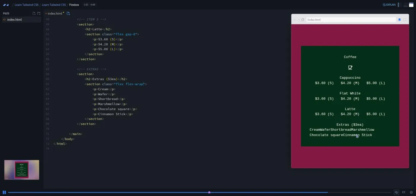
Borders has no challenge, just a demo (an orange photo with border-8 border-orange-400 rounded-full border-dashed, and a typo she catches on save). Layout takes those borders back to the blog: rounded cards, a double border under the header, and the newsletter form built with w-full flex and a flex-grow input. Other common utilities and Modifiers are demos with a polaroid of Rachel's cat Pickle: shadow-md, fill-, opacity-, cursor-pointer, sr-only, then hover:, focus:, placeholder: and stacking them ("the real power of tailwind modifiers come when you start combining them"). Extra Styling applies all of that to the blog, and by 2:53 "our web page matches the mobile mock up already, minus four missing blog posts."
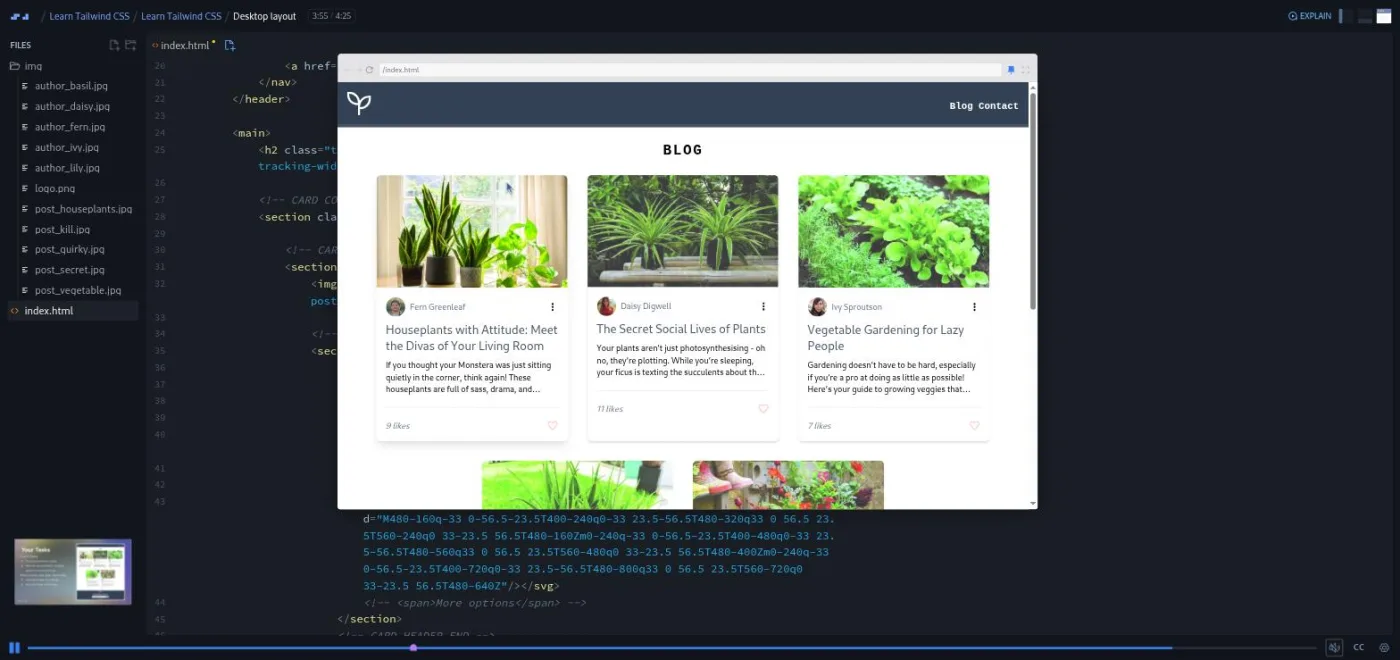
Responsive Design introduces the five breakpoint prefixes with a breakpoint visualizer that changes color as you widen the preview (slate, then sm: rose, md: blue, lg: lime). Desktop layout finishes the project: the four remaining cards are pre-filled for you, and your tasks are flex flex-wrap gap-8 justify-center on the card container, sm:flex sm:justify-between on the header, and a fixed sm:w-96 footer form.
The module closes with Congrats (a recap and "five challenges that ramp up in difficulty") and a two minute Scrimbassador referral pitch from Per Borgen that you can skip.
2. Tailwind CSS Challenges (48 min, 12 scrims): five mockups, five solutions
The one minute welcome sets the rules: "Each one will come with mobile, desktop, and state mock ups for you to replicate using Tailwind CSS," and the challenges "are designed to be completable with just the content from that course." Each challenge is a pair of scrims: a brief of under two and a half minutes that walks through the mockups and the provided HTML, then a "Possible Solution" where Rachel styles it top to bottom.
The Pomodoro App Challenge is the warm-up: a white card with a red bottom border, a motivational line, a big timer, three SVG buttons that turn red on hover. "Since we're only working with Tailwind CSS, these buttons won't actually function," she says, and that holds for all five: no JavaScript anywhere in this course. The solution is three and a half minutes.
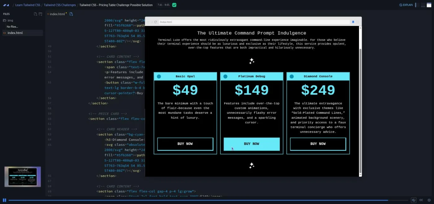
Testimonials Section is a cattery site with three cards (rounded-tr-2xl rounded-bl-2xl, opacity-50 images that go opaque on hover) and a six minute solution. Pricing Table is "TerminalLux," a black and cyan table styled like a terminal window, where the card header mimics a window title bar with an absolutely positioned circle. The solution runs eight minutes and is where lg:grow and lg:mt-auto appear to push buttons to the bottom of unequal cards.
Preferences Form is the hardest and the longest scrim in the course at ten minutes. It is a form for a tea subscription box with fieldsets, radio and checkbox groups, and card icons faded with opacity-20. The two-column md: layout needs md:order-4 and -top-12 placement. The brief says so plainly: "this challenge may require some Tailwind classes that we didn't cover in the Learn Tailwind CSS course. So check out Flexbox order and negative positioning values in the documentation." The 404 Page Layout finishes with a full header (hamburger hidden with lg:hidden, nav shown with lg:flex), a centered 404 block, and a footer with five sections that reflows into rows at lg:.
Every solution ends with the same disclaimer, which I think is the right one for Tailwind: "this is just my solution, and there are plenty of ways to achieve the same result." One correction to the listing: the About text promises Grid utilities, transitions and transforms in this module, but every solution I read is flexbox, and none of the five uses a grid-, transition- or transform class.
What a lesson feels like
Scrims run from under a minute to ten minutes; the theory scrims in module one are three to six minutes, and the challenge solutions are three to ten. Rachel talks over a live editor with the preview on the right. Theory scrims open on a slide (a table of classes with a link to the docs), then move into a small HTML file where she types classes and saves. Challenges are HTML comments in the file, or a "YOUR TASKS" comment at the top of the project, followed by "give it a go" and a pause; her solution comes next in the same recording, sometimes sped up ("I'll do this now, but I'll speed it up for you").
The course is entirely one index.html per scrim plus a few images. There are no dependencies, no CSS file of your own, and no terminal. The editor state is the finished state when you open a scrim, so scrub to the start if you want to attempt the challenge blind. Every scrim has captions, a timestamped transcript under the settings menu, subtitles in ten languages, and playback speed.
Rachel's voice is friendly and unhurried, with a few running jokes (her cat Pickle, "my favorite combo" for flex flex-col items-center). She does not test you, and she repeats that different class choices are fine.
Free or Pro: exactly what is gated
The first three scrims are free previews marked SAMPLE: the welcome, What is Tailwind CSS?, and Element Sizing. Everything else, from Colours onward and all five challenges, needs Pro. There are no Solo Projects in this course; the five challenges are the practice, and their solutions are included.
Pro also unlocks the certificate (the "How to Utilize Your Certificate" clip at the end is Per Borgen's usual LinkedIn pitch) and the Pro-only Discord channels. Basic Discord access is free on Scrimba's pricing page, so the server alone is not a reason to upgrade. If Tailwind is the only thing you want, three free scrims give you a fair sample of the pace before you decide. See current plans (opens in a new tab) for what Pro includes in your region.
How long it takes
2.2 hours is video runtime. Plan for five to seven hours: the theory challenges are two to five minutes each if you know CSS, but the five module-two challenges are the real cost. Each brief hands you mobile, desktop and hover mockups and a bare HTML file, and matching them takes 20 to 45 minutes before you watch the solution. That is one weekend, or a week at 45 minutes a day. If your flexbox is shaky, double it, because every solution leans on it.
Who it's for, and who should skip it
It fits you if you write CSS comfortably and are joining a codebase that uses Tailwind, or you keep seeing utility classes in React and Next.js projects and want them to stop looking like noise. It is also a sensible pick if you want to prototype faster: the whole course is proof that a styled card is ten classes and no stylesheet.
Skip it, for now, if flex, justify-content, and the box model are not second nature. The course names the property, gives you the class, and moves on; it does not teach the property. Do Learn Responsive Web Design or Learn Flexbox first. Skip it too if you want Tailwind's configuration side (custom themes, plugins, @apply, dark mode, grid utilities, the build pipeline). None of that is here, and the outro sends you to the documentation for it.
Prerequisites
Working HTML and CSS: the box model, rem units, flexbox, and the position values. Rachel assumes all of these and says so for flexbox. No JavaScript is used anywhere in the course. No install is needed either; every scrim loads Tailwind from the CDN script tag inside the browser editor.
Where it fits
This course stands outside Scrimba's four career paths; none of them include it. Take it after your core CSS and before you start a React or Next.js project that ships with Tailwind. The product card course is the follow-up Rachel names in the outro, where "we dive into more intermediate utility classes."
Strengths and limits
What it does well: it teaches the naming scheme in the order you will need it, applies each family to a real mockup within a scrim or two, and gives you five practice briefs with recorded solutions. It is compact enough to finish in a weekend and the free previews are representative.
Where it is limited: it is Pro-only past scrim three, and it does not cover configuration, grid, dark mode or installation. It uses the Tailwind 3 Play CDN rather than a local build, and the module-two briefs occasionally need classes the course never taught (the form challenge says so). The referral and certificate pitches at the end of each module are padding.
Related courses and comparisons
- Build a Product Card with Tailwind CSS, the follow-up Rachel points to
- Learn Responsive Web Design, the CSS foundation underneath Tailwind
- Learn Flexbox, the layout model every solution here leans on
- Learn HTML and CSS, the free CSS starting point
- Learn Bootstrap, the component framework alternative
- Scrimba pricing: Pro vs free, if the Pro gate is the question
No. Only the first three scrims (the welcome, What is Tailwind CSS?, and Element Sizing) are free previews. Colours onward and all five challenges need a Pro subscription. There are no Solo Projects; the challenges and their recorded solutions are the practice.
Rachel Johnson, who also teaches the shorter Build a Product Card with Tailwind CSS course. The course page notes that an older Tailwind course by Victor Gonzalez still exists separately.
One build-along project, a responsive blog for plant lovers styled from a mobile and desktop mockup across five project scrims, plus five challenges in module two: a Pomodoro timer layout, a cattery testimonials section, a TerminalLux pricing table, a tea subscription preferences form, and a 404 page with reusable header and footer.
Yes. Every lesson names a CSS property and gives you the Tailwind class for it without teaching the property. Rachel says outright that she assumes you already know flexbox. If you do not, do Learn Responsive Web Design or Learn Flexbox first.
Nothing to install. Every scrim loads Tailwind from the cdn.tailwindcss.com script tag, which is the Tailwind 3 Play CDN, and the intro warns about the production notice it prints on save. The classes taught also work in Tailwind 4, but the course does not cover a local setup or configuration.
Yes. Twelve scrims in module one carry Scrimba's Challenge with Instant Feedback icon, with the tasks written as HTML comments and Rachel's solution in the same scrim. Module two is five mockup-to-code challenges, each followed by a Possible Solution scrim of three to ten minutes.
About 2.2 hours of video. Plan for five to seven hours if you attempt each challenge before watching the solution, roughly a weekend or a week at 45 minutes a day.
No. The outro calls the course an introduction and sends you to the Tailwind documentation for everything else. Layout in every lesson and solution is flexbox; the form challenge is the only place grid-style two-column layout appears, and it is done with flex-wrap and md:w-1/2.
Yes. Every scrim has captions, a timestamped transcript panel under the settings menu, subtitles in ten languages, and playback speed.