Build a Multi-Page Website with HTML and CSS
Kevin Powell's free, project-only course runs 6.8 hours and turns a Frontend Mentor space tourism design into a working multi-page site: a CSS design system first, then the homepage, navigation, destination and crew pages, and an accessible tab system in vanilla JavaScript. It's a strong, real-project pick for a developer who already writes HTML and CSS.
Reviewed inside the course with a Pro account, September 2026: every module expanded, 31 of the 67 scrims opened and transcribed.
This page is part of our Scrimba JavaScript courses catalog. Scrimba's course page does not list it under any career path.
Quick answer
This fits developers who already write HTML and CSS and want practice turning a real design into a site. The catch: it's tied to a single layout, and the JavaScript is two small files in service of the design, not a language lesson. Finish it and Learn JavaScript is the natural next stop.
Build a Multi-Page Website with HTML and CSS
FreeTaught by Kevin Powell (opens in a new tab)
Build a multi-page space travel site from a real Frontend Mentor design: design system first, then layout, navigation, and tabs in vanilla JavaScript.
Start free on Scrimba (opens in a new tab)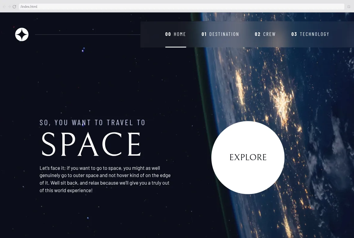
Is it worth your time?
Yes, if you sit in the gap this course is aimed at. You can style a page, but when someone hands you a Figma file with four pages and three breakpoints you do not know where to start. Kevin's answer is to not start with a page at all. In the design system overview he says the point is to avoid "trying to style everything page by page," so you build the tokens and utilities once and "work really fast when we wanna start working on the actual pages." Two hours in, you have a design-system.html page that shows every color, font size, button and indicator in the design, and the homepage then comes together in under an hour.
The second thing that earns the time is accessibility, which is not a bolt-on module here. It arrives in the reset (a prefers-reduced-motion rule), in the first utility classes (.sr-only), in the navigation (aria-controls, aria-expanded, a skip link), and in the tabs (roles, keyboard arrows, the hidden attribute instead of visual hiding). You pick it up as a habit rather than a topic.
It is one layout, and the techniques are tied to it. There is no build tooling, no framework, and the JavaScript is deliberately basic. Kevin also says in the intro that "this course is not for people at the very beginning of their front end journey," and the pace backs him up: if you have not built a responsive page before, it will lose you.
What you'll learn
Course curriculum
5 modules · 66 lessons
- The design system
- The homepage
- Navigation
- The destination page
- The tabs
Lesson counts are the scrims I counted after expanding each module in September 2026, which comes to 66 plus a one-minute certificate scrim after the last module; Scrimba's own module headers show far fewer (11, 3, 7, 8 and 0, and I could not work out what they count), while the course listing says 68 lessons.
Inside the course, module by module
1. The design system (2.1 hrs, 20 scrims)
The eight-minute introduction explains the setup: the design and assets come from Frontend Mentor's free tier (Figma and Sketch files included), Kevin provides a GitHub repo with the start and end state of every lesson, and everything else happens in Scrimba's editor. He also sets expectations early. Basic JavaScript "will definitely be helpful," he says, "though it is not a prerequisite," and he encourages you not to copy him: "I would actually encourage you not to follow along exactly as I'm doing things."
The work starts with a reset (scrim 3), which is a variation of Andy Bell's modern CSS reset explained line by line: box-sizing on pseudo-elements too, margins zeroed on headings and paragraphs, font: inherit on form controls, and the reduced-motion media query. Then come the general utilities (scrim 4): .flex and .grid with gap: var(--gap, 1rem), a .container using padding-inline and margin-inline (Kevin points out that Scrimba's editor underlines these logical properties because they were new at the time), and .sr-only.
Colors are where the course gets clever. Custom properties store HSL triplets (231 77% 90%) rather than finished colors, so a component can write hsl(var(--clr-light) / .2) and get a 20 percent alpha without a second variable. The Color challenge (scrim 7) tests exactly that: three boxes to style with utilities, the third needing the alpha trick. Typography follows the same pattern with a --fs-200 to --fs-900 scale in rems, three Google font families (Bellefair, Barlow, Barlow Condensed), and utility classes for each. Kevin refuses the 62.5% font-size hack on the grounds that "you're just remembering five, six, seven, eight, or nine hundred."
The spacing scrim introduces the .flow utility (* + *, which Kevin calls "the lobotomized owl") and then wraps it in :where() so it adds no specificity, with a --flow-space property you can override per component. The remaining scrims build the interactive pieces: the round Explore button (display: grid, aspect-ratio: 1, place-items: center, then a challenge to create its glow), and the underline, dot and number indicators shared by the navigation and the tabs. Scrim 20 is a three-minute pause where Kevin lays out the three ways to handle the multi-page content (separate HTML pages, one page with JavaScript tabs, or rendering from the provided data.json) and says which one he will take.
2. The homepage (59 min, 9 scrims)
The homepage module is short because the design system did the work. Scrim 1 writes the markup, with a semantic argument worth remembering: "So you want to travel to space" is one h1, with a span for the big word, "not a heading five followed by an heading one of space." Kevin also explains his habit: he writes HTML looking at the desktop design and writes CSS mobile first.
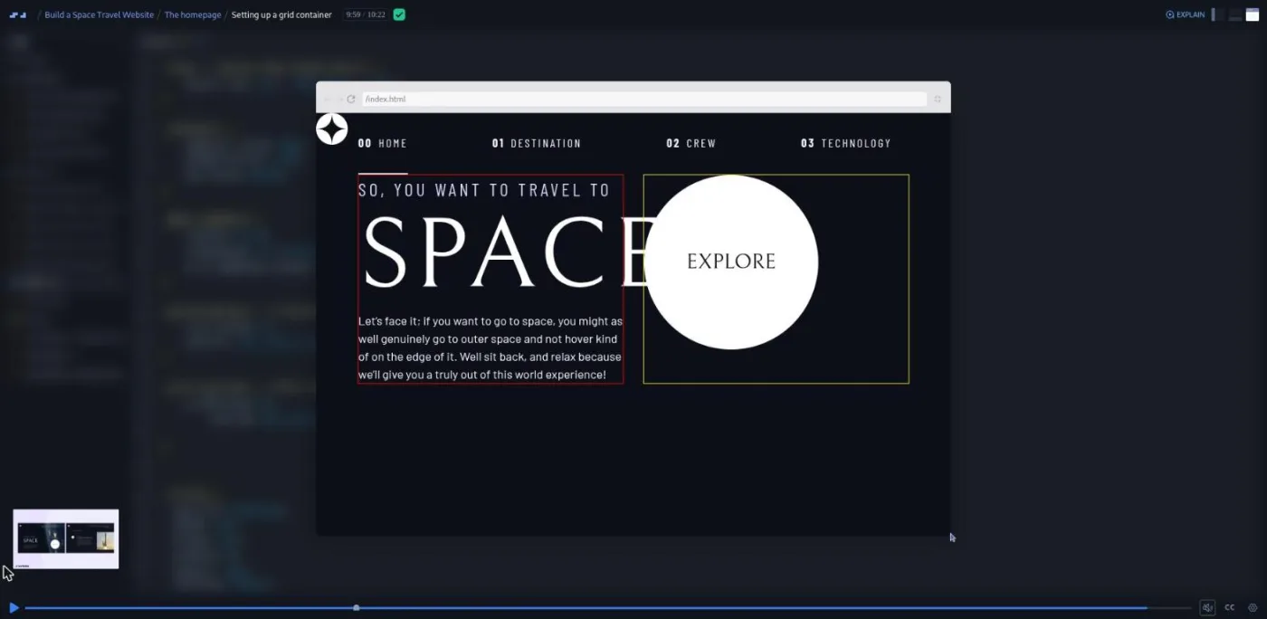
The grid container scrim (10 minutes) is the technical center of the module. The page is laid out on four columns, minmax(2rem, 1fr) repeat(2, minmax(0, 40rem)) minmax(2rem, 1fr), with content pinned to the two middle tracks and a --container-gap property for the gutter. Then comes A layout challenge (scrim 6), which asks you to rebuild the same layout with flexbox so that you feel why grid was chosen: "grid is much more structured and the parent has so much control over everything." Final touches adds max-width: 45ch on text, place-items, a .grid-container--home modifier, and a padding-bottom: max(6rem, 20vh) for very tall screens. The module ends with a 77-second cameo from Scrimba's Per Borgen pointing to Netlify deploy guides.
3. Navigation (76 min, 14 scrims)
"Navigation, which are always these little simple components that end up being more work than anything else on the entire page," Kevin says in the first scrim, and the module proves it. The mobile version is a hamburger button whose text is a visually hidden "Menu", with aria-controls pointing at the nav's id and aria-expanded="false". You are challenged to lay it out yourself before he does.
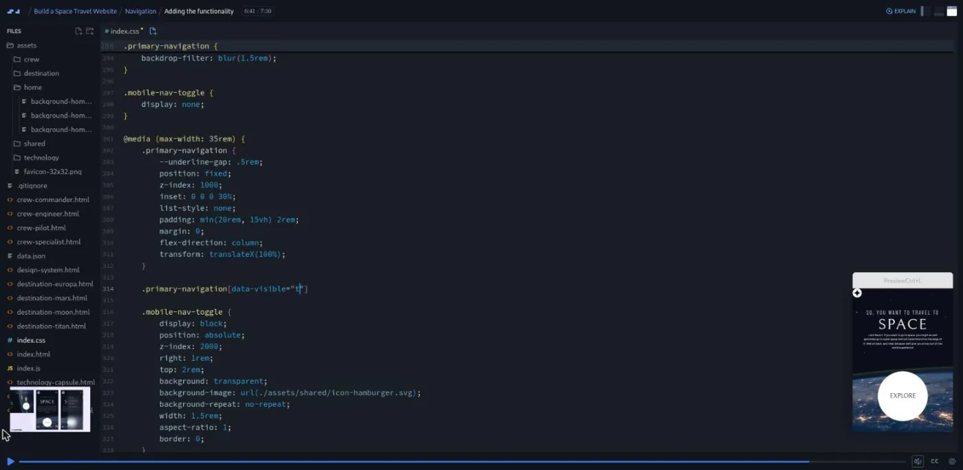
Scrim 6, Adding the functionality, is the first JavaScript in the course: a deferred script, two const references, a click listener, and a data-visible attribute that CSS reads to slide the menu in. Kevin explains his split plainly: "my classes are for styling, and then I know that my data attributes are for JavaScript." He also stops to say what const is, which tells you who the code is written for. Later scrims handle the tablet and desktop layouts with a min-width: 45em media query, padding-inline: clamp(3rem, 5vw, 7rem), and the decorative line beside the logo, which he builds as a pseudo-element flex item after admitting his first absolute-positioned attempt was a dead end. Accessibility tweaks and a skip-to-content link close the module; the skip link is hidden with translateY(-100%) and slides in on focus.
One scrim in this module, Want to become a Scrimbassador?, is a two-minute Per Borgen advert for Scrimba's referral program. It counts toward the 14 but teaches nothing.
4. The destination page (71 min, 10 scrims)
The module name undersells it: it covers both the destination page and the crew page. The two-minute intro is where Kevin commits to the middle route, one HTML page per section with JavaScript switching the content, and asks you to "do as much coding on this as possible and not just sitting back and enjoying the ride."
Getting the destination page started (11 minutes) reuses the header, turns "Pick your destination" into a numbered title, wraps the planet content in an article, and ends with a warning that grid-template-areas will be used "quite heavily." The three layout scrims that follow (mobile, medium, large) each redefine only the areas, which is the cleanest demonstration of that property I have seen in a course. The layout scrim (scrim 8) repeats the exercise for the crew page, with two small challenges left open. The picture element scrim compares the moon PNG (71 KB) with its WebP (28 KB) and builds <picture> with a WebP source and a PNG fallback, then challenges you to do the same for the crew images.
5. The tabs (75 min, 13 scrims)
Setting the stage duplicates the four planets' content on one page and hides three of them with the hidden attribute, not .sr-only, because hidden "hides it from both screen readers and assistive technologies as well as from visually hiding the content." Kevin moves the nav code into navigation.js and starts tabs.js, selecting the tab list by role="tablist" so that the script only works on markup with correct roles.
Keyboard navigation comes before clicking: three scrims on a keydown listener, the arrow key codes, and moving focus between tabs. Activating the tab then uses the button's aria-controls value to find the matching panel, walks up the DOM to the shared container, and removes hidden. Hiding the previous tab, Changing the image and Highlighting the active tab finish the loop, and Refactoring folds the repeated code into hideContent() and showContent() helpers. Cleaning up some loose ends fixes the shifting image with align-self: start, mentions scrollbar-gutter, and gives the crew page its own column widths.
The final scrim is 97 seconds long and is the course's real test. "You are on your own for this one," Kevin says of the technology page. "I am not holding your hand." He adds that "watching something and understanding it is very different from being able to apply it yourself." The starter files for that page are there; the solution is not.
What a lesson feels like
Scrims run from two to thirteen minutes, most between five and nine, which is long by Scrimba standards. Kevin talks over a live editor with the preview beside it, and he tests every change in the preview as he goes, often adding a temporary red outline or a pink background to show what a rule is doing. Challenges are frequent but informal: he says "go ahead and give it a try" or "I'll leave you to your own devices," you pause, write, and press play for his version. I counted a challenge prompt in roughly two thirds of the scrims I opened. The table of contents also shows a small icon beside 23 scrims; on other courses that icon marks challenges with instant AI feedback, but none of the transcripts I read mention AI feedback, so treat it as unconfirmed here.
The voice is patient and a little digressive. He will stop a spacing lesson to explain why :where() exists, or a picture-element lesson to tell you that a trip to Titan would take seven years. Every scrim has captions, a timestamped transcript panel under the settings menu, subtitles in ten languages, and speed controls.
Free or Pro: exactly what is gated
The whole course is free: all five modules, every challenge, the design files (from Frontend Mentor, not Scrimba), the GitHub repo, and the technology page exercise. There are no Solo Project items and only one scrim carries a SAMPLE badge, which is the free-preview marker on the introduction. The single Pro item is the Certificate of Completion at the bottom of the table of contents; Scrimba's pricing page lists certificates as a Pro feature. Pro also unlocks the Pro-only Discord channels, but the pricing page lists basic Discord access as free, so asking questions in the community does not require a subscription.
If you only want this course, stay free. See current plans (opens in a new tab) if you want the certificate or the career paths.
How long it takes
The 6.8 hours is video runtime. Because most scrims stop for a challenge and the layout scrims expect you to keep the Figma file open, budget two to three times that: 14 to 20 hours, or two to three weeks at an hour a day. The technology page has no video, so add three to six hours to build it properly, and more if you take Kevin's suggestion to render the content from data.json. The design system module alone is a weekend.
Who it's for, and who should skip it
It fits self-taught developers who have finished a first HTML and CSS course and want one substantial, portfolio-ready project built the way a working front-end developer would build it. It is a good fit for designers moving toward code, because the whole course is about translating a design faithfully, and for anyone who wants their first look at custom properties, logical properties, clamp(), aspect-ratio and grid-template-areas in one place.
Skip it if you are still learning what a class or a media query is; start with Learn HTML and CSS or Learn Responsive Web Design instead. Skip it too if you want a JavaScript course: the JavaScript here is two small files in service of the layout. And if you want to learn a framework, Kevin says you can use this design as a project for that, but the lessons will not help you with it.
Start Build a Multi-Page Website for free (opens in a new tab)Prerequisites
Comfortable HTML and CSS, including one responsive layout you have built before. Flexbox and grid basics help; Kevin says grid is used lightly enough that "it could be a nice introduction to it." A little JavaScript helps in the navigation and tabs modules, but he explains const, event listeners and querySelector as he goes. You will want a Figma or Sketch viewer for the design files, and nothing installed on your machine.
Where it fits
Scrimba does not sequence this course into a path. It works best as the project you build after Learn Responsive Web Design and before Learn JavaScript, or alongside Learn CSS Variables if the custom property tricks in module 1 are new to you. The natural follow-up is Kevin's own Build and Deploy Your Portfolio, and Deploying with Netlify is the guide Per points to in module 2.
Strengths and limits
What it does well: a real, four-page design from Frontend Mentor rather than a toy; a design system built before any page, which is how the course stays fast later; accessibility woven through every module instead of a separate lecture; a GitHub repo with the state of every lesson; and an ending that makes you build a page without help.
Where it is limited: it is one layout, so the utilities and grid setup are tuned to it; the JavaScript is basic and Kevin never builds the version that reads data.json, though he mentions it three times; some scrims run long and a few of the leftover Frontend Mentor HTML files sit unused in the file tree; and two of the 67 scrims are Scrimba promos rather than lessons.
Related courses and comparisons
- Build and Deploy Your Portfolio, the natural Kevin Powell follow-up
- Learn Responsive Web Design, Kevin's larger CSS course, the better first stop if this one feels fast
- Learn CSS Variables, for the custom property techniques used in module 1
- Deploying with Netlify, to get the finished site online
- Learn JavaScript, when you are ready to go past two small scripts
- All JavaScript courses, the full category hub
- Scrimba vs freeCodeCamp, if you are choosing a platform
Yes. All five modules, every challenge and the technology page exercise are free, with no card required. The only Pro item is the Certificate of Completion at the end of the table of contents.
No, but it is not JavaScript-free either. Modules 3 and 5 write two small vanilla JavaScript files, navigation.js for the mobile menu and tabs.js for the accessible tab system. Kevin explains const, event listeners and querySelector as he uses them.
Kevin Powell, the CSS educator, teaches every lesson. Per Borgen from Scrimba appears in three short scrims: a Netlify deployment pointer, a referral program advert, and the certificate wrap-up.
A four-page space tourism site from a Frontend Mentor design: a homepage, a responsive navigation with a mobile menu, a destination page and a crew page with tabs, and a technology page that you build on your own at the end.
I counted 66 scrims across the five modules after expanding each one, plus a one-minute certificate scrim, 67 in all. Scrimba's module headers add up to 29 and the course listing says 68, so the number you see depends on where you look.
6.8 hours of video. Plan for 14 to 20 hours including the challenges, plus three to six hours for the technology page, which has no video.
No. Everything runs in Scrimba's editor. Kevin also provides a GitHub repo with the start and end of every lesson if you prefer to work locally, and the design files come from Frontend Mentor.
No. The design, assets and Figma or Sketch files are provided. The course is about turning that design into clean, responsive HTML and CSS.
Yes. Every scrim has captions, a timestamped transcript panel under the settings menu and subtitles in ten languages.
Not in any transcript I read. The challenges are Kevin pausing the recording and asking you to try something before he shows his solution. The table of contents shows a small icon beside 23 scrims that on other courses means instant AI feedback, but I could not confirm it here.