Build Websites with Figma, HTML, and CSS
Gary Simon's Pro design-to-code course on Scrimba runs about 3.6 hours across five modules: you open a Figma mockup, try to build it yourself, then watch Gary rebuild it mobile first with media queries, turning five Figma mockups into responsive websites with a little vanilla JavaScript for the menus. It is the most direct design-to-code practice in the catalog.
Reviewed inside the course with a Pro account, September 2026.
Quick answer
Take it if you already write basic HTML and CSS and want to get good at matching a design pixel for pixel. The catch is the JavaScript: three scrims, about 13 minutes total, so despite the title this is CSS practice with a little JS bolted on, not a JavaScript course. Finish it and go to Gary's own follow-up, Learn UI Design, for the Figma side of the same workflow.
Build Websites with Figma, HTML, and CSS
ProTaught by Gary Simon (opens in a new tab)
Five Figma mockups built as responsive websites, mobile first, with a little vanilla JavaScript for the menus.
View on Scrimba (opens in a new tab)Is it worth your time?
If your problem is "I know CSS syntax but my pages never look like the design," yes. The whole course is that one skill, practiced five times with rising difficulty. Every module starts with a slide that links to the Figma file. Gary tells you to pause and build it, then walks through his own version property by property, reading each value off the Figma inspector and converting it to rem or em out loud. By the third project you are doing the 108 divided by 16 math without thinking.
The teaching is plain and unhurried. Gary explains why he picks a unit, a breakpoint, or a pseudo element, and he leaves his mistakes in: a typo in scaleX, a forgotten position: relative, an h1 that had quietly become a p. Those moments are useful because they are the errors you will make.
The course dates from around 2021. Gary calls clamp() and aspect-ratio "relatively new" and notes that grid-gap has just been renamed gap. A few of his cautions about browser support are out of date, and nothing here touches container queries or newer layout features. It is also a Pro course, and the Figma files need a free Figma account to inspect.
What you'll learn
Course curriculum
5 modules · 46 lessons
- Welcome & First Project - Simple Card
- Simple Landing Page
- Data Analytics Dashboard
- Car Sales Site
- Drone Event Landing Page
Lesson counts are the scrims I counted in each expanded module in September 2026, 46 in total. Scrimba's module headers show 1, 2, 2, 1 and 1 because they count only the challenge scrims. The course listing says 47 lessons; when other pages on this site quote 47, that is Scrimba's number.
Inside the course, module by module
1. Welcome and first project: simple card (32 min, 9 scrims)
Four short setup scrims, then the first build. The intro states the requirement in one line: "the only requirement that we have is that you should have a basic understanding of HTML and CSS." Gary points anyone who lacks it to "this Scrimba course by my friend Kevin Powell." The beginner course in the current catalog that covers that ground is Learn HTML and CSS. "Using Figma" shows you the property inspector, the font panel, and the orange spacing lines that appear when you hover between elements. "Saving the Figma Prototypes Locally" is 48 seconds on making your own copy so other students' cursors stop wandering across the design.
"ems and rems" is the lesson that pays off for the rest of the course. Gary builds a gray box, sets margin: 1em, then bumps the root font size from 16 to 20 pixels so you can watch the margin grow with it. His rule: em for margin and padding, rem for font sizes. "So that sounds a little bit word salad," he admits at 0:55, and then makes it concrete: 32 pixels in Figma, divided by 16, is 2em.
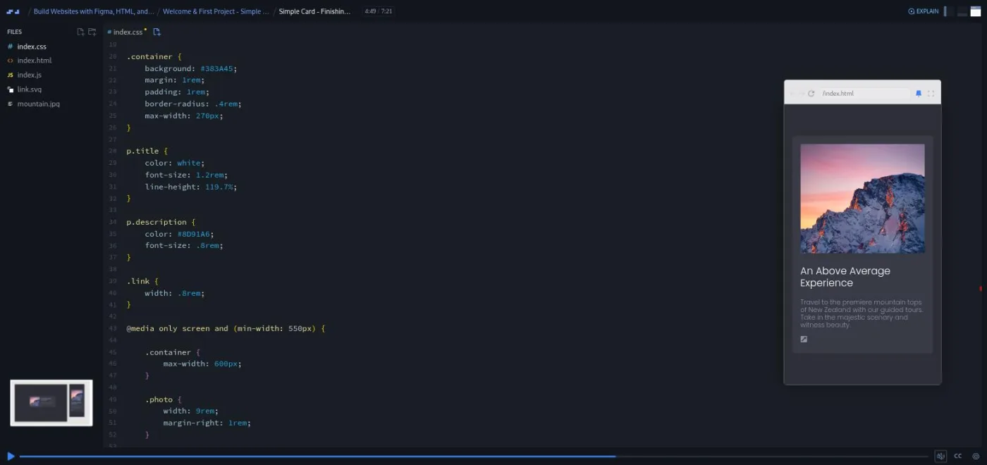
The card itself takes three scrims. The HTML wraps the whole card in an a tag so the entire thing is clickable ("At least, I do," as Gary puts it in the HTML lesson). The CSS centers it with display: grid; place-items: center, loads Poppins from Google Fonts, and stays mobile first: "whenever you structure your CSS, you wanna go mobile first." The finishing lesson adds a 550 pixel media query that turns the stacked card into two columns with display: flex. A second query raises the root font size so the whole card scales.
The module ends with a one minute guest scrim from Per Borgen on deploying to Netlify, with links to a drag-and-drop route and a GitHub route. All of this module except that deploy scrim is marked SAMPLE, so you can try it without Pro.
2. Simple landing page (30 min, 5 scrims)
Three Figma frames this time: mobile, small tablet, and desktop. The challenge intro makes the point that "there's no such thing as responsive HTML," so the markup has to account for every layout up front. That is why the name and email fields each get their own wrapper div before any CSS exists.
Two things in "CSS: Initial Styles" stuck with me. The purple hero background is a photo at 22 percent opacity on a colored layer. Gary rebuilds it with a ::before pseudo element, absolutely positioned inside a position: relative parent. He calls it "a sort of like a trick, if you will, that I use personally quite frequently" at 4:41. Then he measures the 108 pixel padding in Figma and refuses to type it as pixels. His reason: "we don't want to use pixel values for this because those are absolute, and we want this to be an accessible responsive design." It becomes 6.75rem vertically and 8vw horizontally, so the side padding grows with the viewport.
The desktop lesson reads the breakpoints straight off the Figma frame widths (770 and 1260 pixels) and introduces flex-basis: 0; flex-grow: 1 for equal columns. A short accessibility note closes the module. Gary had set outline: none on the inputs and comes back to add a visible focus style, "as long as you yourself create a style to give us that visual indicator."
3. Data analytics dashboard (44 min, 7 scrims)

"This one's going to be a little bit more challenging than the previous two." The design has a sidebar navigation that slides in from the left on mobile and sits in place on desktop, plus hover states. Gary suggests either building the whole thing in one go or taking it lesson by lesson.
The CSS lessons introduce a CSS variable for the brand blue, a gradient background built with a visual gradient tool and pasted in, and background-blend-mode: screen to match the Figma layer. Then comes fluid typography with clamp(2.5rem, -0.875rem + 8.333vw, 4rem). In "CSS: typography, buttons and more" the heading grows and then stops on its own, and Gary's reaction is "Very, very cool for a fluid typography." He also adds a fallback font-size for browsers that do not support clamp(), a caution that has aged.
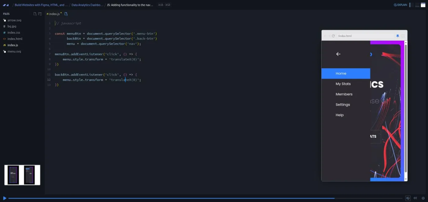
The JavaScript scrim is under four minutes and is the whole module's interactivity: hide the nav with translateX(-100%), add a transition, then set the transform on click. The desktop lesson ends with a lesson in specificity, because the inline style set by JavaScript survives a resize and overrides the media query. Gary shows both fixes, an !important flag or a resize listener, and explains why the problem exists rather than hand-waving it.
4. Car sales site (41 min, 10 scrims)
A listings page: a heading, a search box, a three-dot menu that opens a checkbox filter panel, and a repeating row of cars with heart icons. Gary says so himself in the challenge intro: "a lot of it's just repeating. So once you nail one, it's a matter of replicating the rest." The brief adds three interactions: the panel should animate in, clicking anywhere outside should close it, and the hearts should fill when clicked.
The filter panel is the module's set piece. It opens with clip-path: circle() growing from the corner where you clicked, transitioned over 0.3 seconds. The JavaScript reads the panel's current clip-path through getComputedStyle. Gary explains why in "CSS/JS: Wiring Up the Options Panel": "JavaScript itself does not have access to the styles that are applied to HTML elements from a CSS file." A mouseup listener on the document closes it unless the click landed inside the panel. The hearts are Font Awesome icons toggled between the outline and filled classes in a two line function.
The desktop lesson lays the listings out with grid-template-columns: 40% 30% 20% auto. It also has the course's best debugging moment. A margin refuses to apply, and after some searching Gary finds that "our h1 element, for some reason, has been changed to a p element." His advice: "Make sure you always check your markup to avoid such scenarios." The module closes with a short Scrimba promo scrim about the affiliate program, which you can skip.
5. Drone event landing page (71 min, 15 scrims)
"Welcome to the final project here. And this one's going to be the most involved." A full landing page: an overlapping hero with an animated drone, a slide-in mobile nav with a close button, a quote section over a stadium photo, a staggered photo gallery, and a registration form. Each comes in a mobile and a desktop version. The intro gives hints rather than answers. Use position: absolute for the overlapping hero, make the dash before the quote's author with a pseudo element instead of an extra tag, and build the gallery with CSS grid and grid-template-areas. If you have not met that property, Gary's advice in the intro is to "just go to Google, research it."
The hero lesson stacks a drone image over a blurred copy of itself, then the animation lesson makes both move. @keyframes hover translates the drone up 30 pixels and @keyframes pulse fades the shadow, both 2s alternate-reverse infinite. Gary admits the animation name is a placeholder ("maybe we could think of something better, but that's what I used").
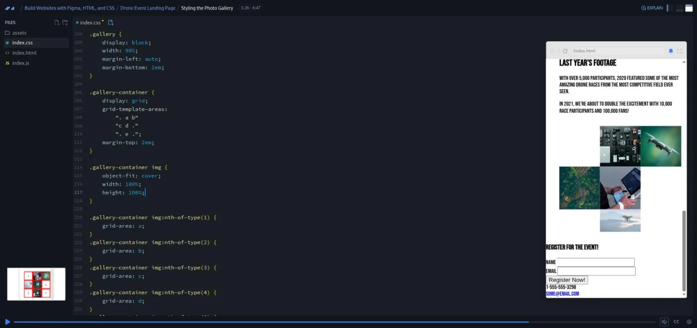
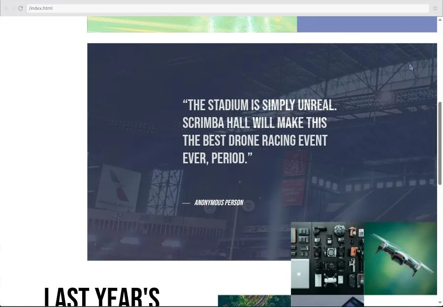
The gallery lesson is the one I would show someone who thinks grid is hard. Three strings of letters and dots describe the layout, five nth-of-type rules assign each image a letter, and the pictures fall into place. The quote section uses the same ::before overlay trick from module 2 for the stadium photo at 17 percent opacity, and a cite::before with a 1em border-bottom for the dash. The desktop lesson finishes with flex columns for the form and a negative margin to pull the gallery up over the quote. A z-index bug on the drone surfaces in Gary's final mobile check, and he fixes it on camera.
The closing scrim is 87 seconds. "Now that you have some muscle memory under your belt, it's not enough," Gary says. He suggests coding designs from Dribbble or Behance, telling the designer you did it, and designing your own next project in Figma.
What a lesson feels like
Scrims run from under a minute to just over ten, most between four and seven. Each project follows the same rhythm: a challenge intro slide with the Figma link and the brief, then Gary's build split into HTML, mobile CSS, desktop CSS, and JavaScript where needed. The challenge is the pause. There are no numbered comments in the file and no AI-checked answers; you build from the Figma file, then compare. The course table of contents shows no "Challenge with Instant Feedback" icons at all.
Gary types with the preview open on the right, drags it wider to trigger breakpoints, and narrates every value. He repeats "make sure you view the prototype" at the start of almost every CSS scrim, and it is good advice: the lessons make far more sense with the Figma inspector open in another tab. Every scrim has captions, a timestamped transcript under the settings menu, and subtitles in ten languages.
Free or Pro: exactly what is gated
The course is Pro. Eight scrims are marked SAMPLE and open without a subscription: the welcome, the two Figma scrims, "ems and rems," and the four Simple Card scrims. That is the whole first project, 31 minutes of the 3.6 hours, and enough to judge whether Gary's pace suits you. The Netlify deploy scrim and modules 2 to 5 (37 scrims) need Pro, as does the certificate of completion at the end.
There are no separate Solo Projects to unlock; each module is itself the challenge. The course description points to a Design Help channel on Scrimba's Discord for feedback. Scrimba's pricing page lists basic Discord access as free and only the Pro-only channels as Pro, so the server itself is not a reason to upgrade. See current plans (opens in a new tab) for what Pro includes in your region.
How long it takes
3.6 hours is video runtime, and it is the least useful number here. If you watch Gary build without attempting the designs first, you can finish in a weekend and learn a fraction of what is on offer. If you do what the course asks, opening each Figma file and building it before you watch, budget 10 to 20 hours. The card and landing page take an hour or two each, the dashboard and car site an afternoon each, and the drone site a full day. At an hour a day that is two to four weeks.
Who it's for, and who should skip it
It fits designers who already think in Figma and want to ship their own layouts. It also fits self-taught developers whose CSS works but never quite matches the mockup, and anyone who has finished a basic HTML and CSS course and wants project practice without a tutorial holding their hand. See the guide for designers for how it fits a designer's route.
Skip it if you have never written CSS: do Learn HTML and CSS first, which is what Gary's intro asks of you. Skip it if you want to learn JavaScript; the three JavaScript scrims here total about 13 minutes and assume you can follow querySelector and addEventListener already. And skip it if you want the newest CSS: this was recorded when clamp() was new, and it does not cover container queries, :has(), or logical properties.
Prerequisites
Basic HTML and CSS: you should know what a div, a class, and a media query are. A free Figma account, because you need to be logged in to read colors, spacing, and font sizes from the prototypes. No JavaScript is required, though the modules 3 to 5 scrims will make more sense if you have seen a click handler before.
Where it fits
Scrimba's course page lists it under the Frontend Developer Path and the Fullstack Developer Path. It is the natural project course after Learn HTML and CSS, and pairs well with Learn Responsive Web Design and Learn CSS Grid, which teach the techniques this course applies. Gary's own follow-up, plugged in the last scrim, is his UI Design course, which teaches the Figma side of the same workflow.
Strengths and limits
What it does well: five real designs of rising difficulty and a mobile-first method you can reuse on any mockup. It drills the em and rem conversion until it is automatic, and it teaches useful tricks: pseudo element overlays, clamp(), clip-path reveals, grid-template-areas. Gary leaves his mistakes in and explains them.
Where it is limited: it is a Pro course with only the first project free. The recording is a few years old, so some browser-support warnings are stale. There is no feedback on your own build beyond comparing it with Gary's, and the JavaScript is minimal and unexplained beyond what the projects need.
Related courses and comparisons
- All JavaScript courses, the category this course sits in
- Learn HTML and CSS, the beginner course that covers what this one assumes
- Learn Responsive Web Design and Learn CSS Grid, the techniques this course applies
- Learn UI Design, Gary's course on the Figma side of the workflow
- Practical Math for Frontend Developers, the math behind precise layout
- Learn JavaScript, if the JavaScript scrims here left you wanting more
- Guide for designers, where this fits a designer's path
No, it is a Pro course. Eight scrims are free to preview: the welcome, both Figma scrims, the ems and rems lesson, and the four Simple Card scrims, which is the whole first project. Modules 2 to 5, the Netlify deploy scrim, and the certificate need Pro.
A little. Three scrims use vanilla JavaScript: sliding the dashboard nav in and out, opening and closing the car site's filter panel with clip-path and getComputedStyle, and toggling heart icons. They total about 13 minutes and assume you can already read a click handler. It is not a JavaScript course.
Gary Simon, a UI and UX designer and frontend developer who runs the Design Course YouTube channel. Per Borgen appears in one short scrim about deploying to Netlify.
Five projects from Figma mockups: a simple card, a landing page with a signup form, a data analytics dashboard with a slide-out nav, a car listings page with a filter panel and like buttons, and a drone racing event site with an animated hero, a photo gallery, and a registration form.
Yes, a free one. Each challenge slide links to a Figma prototype, and you need to be logged in to read colors, spacing, and font sizes from the inspector. One scrim shows how to save a local copy so other students' cursors do not distract you.
Yes. It assumes you can read a Figma file and teaches the developer side: reading pixel values and converting them to rem and em, mobile-first CSS, media queries at the frame widths, and the small JavaScript that menus need.
No. There are no Challenge with Instant Feedback scrims in this course. You build from the Figma file, pause, and compare your result with Gary's walkthrough.
3.6 hours of video. Plan for 10 to 20 hours if you build each design yourself before watching, or two to four weeks at an hour a day.
Yes. Every scrim has captions, a timestamped transcript under the settings menu, and subtitles in ten languages.
The techniques hold up, but the recording is a few years old: Gary calls clamp() and aspect-ratio new and adds fallbacks you no longer need. It does not cover container queries or other CSS from after about 2021.